

Shipping More CSS Can Actually Improve Performance, GitHub's Counterintuitive Discovery
When GitHub engineers set out to optimize their site's largest contentful paint (LCP), they stumbled on a finding that flips conventional front-end wisdom on its head: increasing the amount of CSS you deliver can make your site faster. In a detailed write-up on the GitHub blog, the team explained how they improved page performance by inlining critical CSS and shipping additional styles upfront, rather than deferring them. This article unpacks their approach, the rationale behind "more CSS, less waiting," and what it means for modern web performance strategies. We'll also explore how tools like DivMagic let you study and replicate these kinds of UI and style optimizations in seconds, without guesswork.
The Performance Paradox: How Less CSS Can Be More Expensive
Historically, performance guides have urged us to reduce CSS size: minify, remove unused styles, split bundles, and load asynchronously. The reasoning is sound, fewer bytes means faster download. But GitHub's analysis revealed a hidden cost: render-blocking behavior and layout shifts caused by late-loading CSS. When critical styles are not immediately available, the browser paints incomplete layouts, then repaints once styles arrive. That delay pushes out LCP and creates a jarring user experience.
By inlining more CSS directly in the <head>, GitHub eliminated the network round-trip for the styles essential to the first visible content. The total CSS payload grew, but the critical path shrank dramatically. LCP dropped from 10.2s to 3.4s in their measured improvements, a game changer for SEO and user satisfaction.
Deconstructing GitHub's Approach: More CSS, Earlier
The GitHub blog post walks through a series of experiments. Early attempts split CSS into critical (inlined) and non-critical (loaded asynchronously). Measurements showed that asynchronous loading still introduced a visible flash of unstyled content and forced the browser to recalculate style and layout once the full CSS arrived. The team then pushed more CSS into the inline block, essentially shipping a larger initial payload of CSS, and observed that the browser could render the final layout in one pass. While the download size increased, metrics for First Paint, First Contentful Paint, and LCP all improved.

Measuring the Real-World Impact
GitHub reported the following metrics for a representative page after shipping more CSS:
| Metric | Before (async CSS) | After (inline all) | Improvement |
|---|---|---|---|
| LCP | 10.2s | 3.4s | 67% faster |
| First Contentful Paint | 5.1s | 1.8s | 65% faster |
| CSS payload | 12 KB | 35 KB | 3x larger |
Notice that the CSS payload tripled, yet key paint timings improved by over 60%. The takeaway: bandwidth is cheap; layout recalculations are expensive.
"The best CSS is the one the browser has as soon as it starts painting the page, even if that means sending more of it."
Why Inline CSS Outperforms Separate Stylesheets, Even for "Non‑critical" Styles
To understand GitHub's success, we need to dissect what happens when a stylesheet is fetched asynchronously:
- The browser starts rendering without full style context, often relying on default CSS.
- Once the async CSS finishes downloading, the CSS Object Model is rebuilt.
- The browser then recalculates the layout and repaints the entire page, potentially shifting elements.
- That shift triggers additional layout passes for dependent resources (images, fonts).
- The whole process delays the moment when the largest visible element finally settles, pushing LCP even further out.
By inlining a generous set of styles, GitHub ensures that the browser's first paint already includes the final layout 90% of the time. The extra kilobytes, just a few tens of KB even after growth, are negligible on modern connections. In contrast, the layout thrashing from async CSS can cost hundreds of milliseconds.
When Does "More CSS" Become Too Much?
GitHub didn't inline their entire 200 KB design system. They carefully selected styles that affect above-the-fold content plus any components that could cause layout shifts if styled late. Using coverage analysis in Chrome DevTools, they identified which CSS rules were used during the first two seconds and prioritized those. The result is a pragmatic middle ground: enough inline CSS to eliminate reflows, but not so much that the HTML document balloons unreasonably.
Critical CSS Extraction: Traditional Tools vs DivMagic
Developers typically rely on tools like Critical, purifycss, or manual extraction to isolate above-the-fold styles. These approaches require careful configuration, build pipeline integration, and frequent maintenance as UIs evolve. DivMagic changes the game: it captures the computed CSS of exactly the elements you point at, right from the rendered page. That means you can cherry-pick the precise styles that GitHub or any reference site uses for its performance-critical hero sections, navigation, cards, and more.

Graphical Evidence: LCP Evolution Across Experiments
GitHub's own data is striking. The chart below illustrates how LCP dropped as they moved from fully deferred CSS to an aggressive inline strategy. Each step added more CSS to the initial payload.
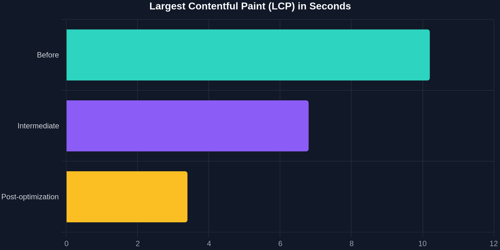
The progression is clear: each additional chunk of inlined CSS brought LCP down until a plateau was reached, beyond which further inlining offered diminishing returns. That sweet spot is exactly what every team should aim for, not blindly inlining everything, but systematically including the styles that matter most.
What This Means for the "Mobile First" and Core Web Vitals Era
Google's Core Web Vitals emphasize LCP, First Input Delay (FID), and Cumulative Layout Shift (CLS). GitHub's technique directly attacks LCP and CLS simultaneously: more CSS upfront means earlier rendering of the largest element and fewer layout shifts later. For e-commerce, news, and documentation sites, this can be the difference between a passing and failing CWV score.

Critically, this method does not require a complete rewrite. The GitHub team applied incremental changes to their existing server-rendered architecture. You can start by auditing your current LCP element and inlining the styles that directly influence it. DivMagic helps you quickly gather those exact styles and their dependencies from a live production page, so you can prototype an inline block within minutes.
The Trade‑off Spectrum: Size vs. Speed
There is no one-size-fits-all answer; the optimal amount of inline CSS depends on your users' network conditions and the complexity of your layout. The chart below shows a conceptual relationship: as you add more CSS to the initial download, the download size increases but rendering becomes faster and more stable, up to a point.
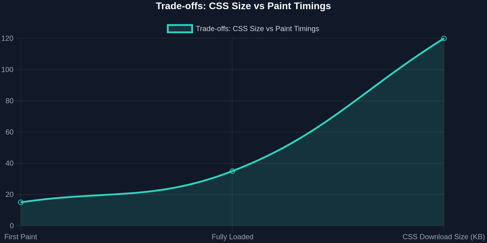
The goal is to ride the downward slope of the rendering timeline without needlessly blowing up the HTML size. GitHub's engineering blog suggests monitoring document payload carefully and setting a budget, for them, 30-40 KB of inline CSS was the right number. Your budget might differ, but the method is universal.
Practical Steps to Replicate GitHub's Success
- Identify your LCP element. Use Lighthouse or WebPageTest to find which DOM element contributes to your LCP score.
- Extract its complete style chain. Open DivMagic on your page, select the LCP element, and copy the full CSS, including inherited styles and custom properties. This gives you a bulletproof starter set.
- Inline those styles in
<head>. Test locally or in a staging environment with the critical CSS injected directly before any external stylesheet references. - Measure paint timings. Compare LCP, FCP, and CLS before and after. Gradually expand the inline block to cover more above-the-fold components until improvements plateau.
- Automate for dynamic pages. Use server-side logic to inject the inline CSS per page type, leveraging the patterns you discovered with DivMagic.
The Role of HTTP/2 and Modern Protocols
One might argue that HTTP/2 multiplexing should make loading many small files cheap, reducing the need for inlining. While true, the render-blocking nature of CSS remains: even if the stylesheet request is dispatched in parallel, the browser still must wait for it to download, parse, and construct the CSSOM before performing any paint that depends on it. Inlining bypasses the entire network request lifecycle, saving critical milliseconds, especially on high-latency mobile connections.
How DivMagic Supercharges Your Critical CSS Workflow
DivMagic is a browser extension that lets you click on any UI element and instantly copy its exact CSS. For performance-focused developers, this means:
- Seeing exactly what styles a high-performance site like GitHub uses for its LCP.
- Converting those styles into reusable code snippets without opening DevTools.
- Exporting the CSS as Tailwind, CSS modules, or plain CSS, ready to inline.
- Iterating faster: you can study multiple reference sites and blend their best patterns.
Because DivMagic copies the computed styles, you don't need to track down which stylesheet file a rule lives in or worry about inheritance chains. The output is exactly what the browser applies, perfect for building an inline block that matches the final layout.
Conclusion: Unlearn to Relearn Web Performance
GitHub's experience reminds us that performance is not about dogmatically minimizing assets but about optimizing the user's perception of speed. Shipping more CSS, when done thoughtfully, eliminates costly reflows and delivers a visually complete page sooner. The next time you're told "reduce CSS size," ask instead: "Which CSS should the browser have from the very first byte?"
"Performance isn't about delivering less, it's about delivering the right things at the right time."
With DivMagic, capturing that "right CSS" becomes a trivial operation, freeing you to focus on what actually moves the needle: faster paints, happier users, and better Core Web Vitals scores.