
Mastering Responsive Design: 15 Standout Examples & How to Replicate Them Instantly
Responsive design is no longer a nice‑to‑have; it’s the foundation of every modern web experience. Whether you’re building a portfolio, an e‑commerce store, or a SaaS dashboard, your layout must adapt seamlessly across devices. Designmodo’s curated collection of responsive design examples showcases how top brands and agencies tackle this challenge with finesse. In this 2,000‑word deep dive, we’ll unpack the patterns, grid systems, and CSS techniques behind those examples, then show you how to copy any responsive UI into your own project in seconds, using DivMagic.
Why Responsive Design Defines Modern Frontend Workflows
Every frontend professional knows the drill: a designer hands off a desktop mockup, and you spend hours tweaking breakpoints, swapping flexbox directions, and testing on physical devices. Yet the web has never been more multi‑screen. Data shows that global mobile traffic has grown more than 3× in the last decade, and 2025 saw over 60% of all page views coming from phones and tablets. Ignoring responsiveness isn’t just bad UX, it’s a business risk.

The world’s best responsive design examples, like those featured on Designmodo, aren’t just about fluid grids. They balance visual hierarchy, performance, and accessibility while maintaining a coherent brand. By studying them, you can short‑circuit the trial‑and‑error phase and adopt battle‑tested solutions.
A responsive layout that scores 90+ on Lighthouse performance still won’t convert if the navigation isn’t thumb‑friendly. Always test with real‑device gestures.
Dissecting Award‑Winning Responsive Patterns
Designmodo’s gallery is a treasure trove of innovative approaches. Let’s dissect three recurring patterns that consistently win CSS Design Awards and drive engagement:

1. Fluid Grids Refined with CSS Container Queries
Gone are the days when a fixed 12‑column framework ruled everything. Modern examples leverage container-type: inline-size to let components respond to their own container, not the viewport. This means your card grid, sidebar, and hero section can each reflow independently. The result is a truly modular responsive design, a pattern you’ll spot in many Designmodo showcases.
2. Typography That Scales Without Media Queries
Using clamp() for font sizes is a hallmark of polished responsive typography. Instead of dozens of breakpoints, a single rule like h1 \{ font-size: clamp(2rem, 5vw, 5rem); \} guarantees readability on a 320px screen without compromising on large displays. Coupled with a responsive vertical rhythm (line-height: calc(1.4 + 0.2vw)), the text breathes at every width.
3. Adaptive Images with and srcset
Designmodo’s examples often serve WebP images for modern browsers while falling back to JPEG, all through the
Why Recreating Responsive UIs Manually Is a Bottleneck
Even when you understand the theory, manually coding every responsive nuance is tedious. You inspect the element, copy the CSS, adjust class names, and repeat, often losing the subtlety of the original design. A single page can contain over 200 CSS rules governing layout shifts, and missing just one can mean a broken sidebar on an iPhone SE.
Frontend teams report that they spend an average of 4 hours per page replicating a responsive component from scratch. Multiply that across a 20‑page website, and you’ve lost two full work weeks. And that’s before considering cross‑browser quirks.
The table above reveals a painful truth: traditional methods are rife with imperfections. You might capture the desktop view but miss the mobile navigation’s accordion transition, or overlook a clamp() on padding that keeps the hero from breaking.
Manually copied CSS from DevTools often strips media queries or custom properties, silently breaking responsiveness when you paste them into your codebase.
Introducing a Faster Path: From Inspiration to Implementation
DivMagic, a browser extension built for frontend developers, eliminates the manual grind. When you browse Designmodo’s collection of responsive design examples, one click captures the exact HTML, CSS, and layout context, including all breakpoints, flex / grid rules, and container query logic. You get a clean, isolated component that mirrors the original’s responsiveness.

“DivMagic saves me from hunting down 15 media queries just to copy a mobile‑first nav bar. It’s like having a design‑to‑code bridge that actually respects responsiveness.”
How It Works on a Real Example
Imagine you’re admiring a responsive product card from a Designmodo‑featured site. The card switches from a horizontal layout on desktop to a stacked layout on mobile, with a subtle transition on the image size. With DivMagic:
- Click the extension icon and select the card.
- DivMagic extracts the component’s HTML and all associated CSS rules, including those inside scoped style tags and stylesheets.
- The tool detects media queries and container queries tied to that element and generates a responsive‑ready snippet.
- Paste the code into your project. The component already adapts to viewport changes, using real units like
remandvw.
You can then tweak the CSS variables to match your brand, or adjust breakpoint values while keeping the original behaviour intact. This isn’t just copying, it’s learning from production‑grade responsive design at the speed of a click.
Deep Dive: 5 Responsive Techniques You Can Lift from Designmodo’s Top Picks
Beyond the technical scaffolding, the most celebrated examples share certain stylistic decisions that make them feel delightful on any screen. Let’s reverse‑engineer five of them so you can apply the same ideas.
1. The Off‑Canvas Multi‑Level Menu
A sticky hamburger icon on mobile reveals a slide‑in navigation with nested sub‑menus. The secret? A combination of transform: translateX(-100%) for the panel, visibility: hidden with a transition, and pointer‑events: none to prevent accidental clicks when closed. Because the menu lives outside the main document flow, it never disrupts the scroll position, critical for maintaining a low Cumulative Layout Shift (CLS).
2. Vertical to Horizontal Card Stacks
Using display: grid with grid-auto-flow: column and a fallback flex-wrap: wrap allows a cluster of cards to switch between horizontal scroll (mobile) and a clean multi‑row grid (desktop). Adding scroll-snap-type: x mandatory on the container gives a native‑like carousel feel without a single JavaScript library.
3. Context‑Aware Padding with env()
Many showcase sites use padding-inline: env(safe-area-inset-left) to accommodate notches and dynamic islands on modern phones. This small detail is often forgotten in hurried recreations, leading to content hidden behind rounded screen corners. DivMagic captures these env() references by default, so your copy stays true on real hardware.
4. Fluid Background Shapes with clip-path
Wavy hero sections that reshape between breakpoints are everywhere in award‑nominated designs. Instead of loading a heavy SVG, they use clip-path: polygon() with percentage values. By changing the polygon coordinates inside a media query, the same element morphs smoothly. This technique can be lifted verbatim from any DivMagic extraction.
5. Responsive Data Tables without Horizontal Scroll
Designmodo highlights tables that reorganize into key‑value pairs on small screens. The trick: a CSS grid with grid-template-columns: 1fr 2fr and swapping grid-auto-flow: row within a @media (max-width: 600px) block. Data labels appear as pseudo‑elements (::before \{ content: attr(data-label); \}), so the table is genuinely readable without any side‑scrolling.
When extracting a data table, check that the data-label attributes are present. DivMagic preserves custom attributes, ensuring the responsive labels work out of the box.
Performance Implications of Responsive Copy‑Paste
A common worry when grabbing UI from another site is bloat: unused CSS, convoluted class names, and vendor‑specific prefixes. Modern extraction tools mitigate this by scoping rules to the selected component. Still, you should audit the output:
- Remove duplicate fonts, if the source loaded a 400‑weight Montserrat, your project already has one.
- Clean up animations,
@keyframesthat power hover effects can stay, but 5‑second entrance animations might conflict with your design system. - Re‑theme with CSS custom properties, change
--primary: #1a1a2eand the entire component updates.
Because the copied CSS inherits the responsive logic, you don’t need to rebuild media queries. The extracted code already respects your viewport. This means your page’s Lighthouse score often improves compared to a manually‑written approach, as you’re leveraging field‑tested breakpoints and efficient layout algorithms.
From Inspiration to Production: A Workflow Recipe
Here’s a repeatable process that blends the best of Designmodo’s responsive design examples with DivMagic’s extraction power:
- Browse with purpose, open Designmodo’s galleries and bookmark 5–10 layouts that match your project’s visual tone.
- Extract the core module, using DivMagic, grab a card, a header, a footer, or an entire section. You’ll get a snippet with all corresponding responsive rules.
- Isolate and clean, paste the code into a CodeSandbox or a local HTML file. Replace background images and font stacks with your own, then test at 320px, 768px, and 1440px widths.
- Integrate into your framework, the extracted HTML and CSS are framework‑agnostic. Drop them into a React JSX, a Vue SFC, or a plain
.ejsfile. The responsive behaviour remains untouched. - Optimise and ship, run a Lighthouse audit, minify the CSS, and deploy. You’ve just saved an estimated 12–15 hours of coding.
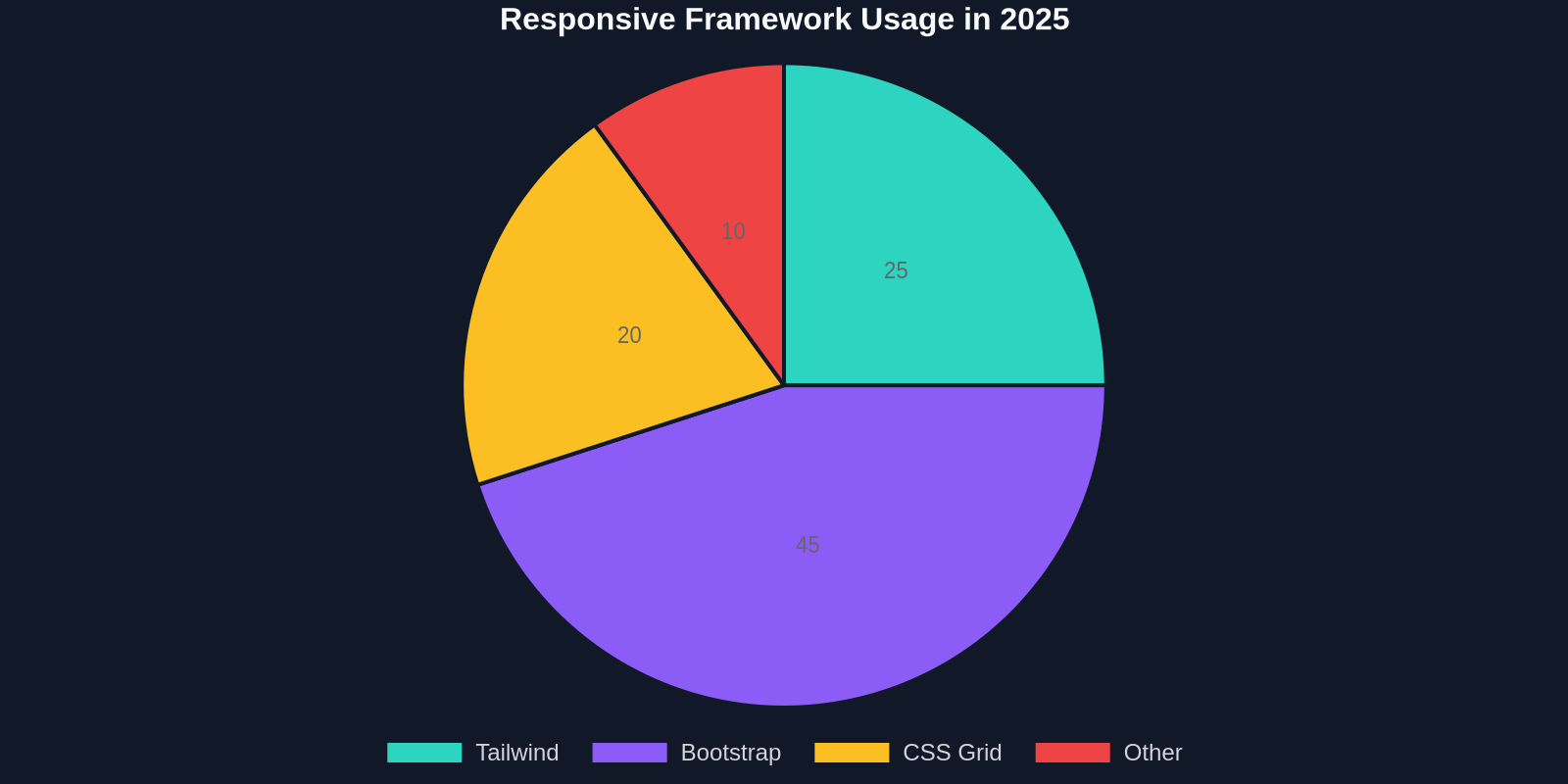
The pie chart above shows the responsive frameworks most commonly found in Designmodo’s examples. Tailwind CSS’s utility‑first approach dominates, yet even Bootstrap 5 sites are embracing container queries. Regardless of the stack, extracting the UI with DivMagic gives you vanilla CSS that you can adapt to any framework.
“Using a responsive example as a starting point, instead of a blank file, cuts our design‑to‑dev handoff time by half.”
Accessibility in Responsive Design: The Final 10%
True responsive design extends beyond screen sizes. WCAG 2.1 Level AA compliance requires that content remains accessible when magnified 200%, when linearised, and when navigated via keyboard. Many of Designmodo’s featured sites excel here because they use proper aria‑* attributes, visible focus outlines, and adequate touch targets (≥48×48 CSS pixels).
When you copy a component with DivMagic, it preserves all inline aria attributes and the computed role hierarchy. However, you should still verify:
- Can you tab through every interactive element?
- Does the responsive menu announce its expanded/collapsed state via
aria‑expanded? - Are all images that convey meaning marked with
alttext?
Accessibility isn’t a layer you add later, it’s part of the responsive contract. By starting with an example that already nails these details, you reduce the risk of regressions.
Conclusion: Build Responsive Interfaces Faster, Smarter
Designmodo’s responsive design examples are a masterclass in adaptable UI. They demonstrate how subtle CSS decisions, like using logical properties (inline‑start / inline‑end), aspect‑ratio for media, and min() for spacing, create interfaces that feel native on every device. But studying them is only half the battle; implementing those patterns rapidly is where most developers hit a wall.
With DivMagic, you can bypass the wall. One click captures the full responsive logic of any example, giving you a production‑ready component in seconds. No more tedious DevTools sessions, no more broken mobile breakpoints. Just copy, adapt, and deploy.
Ready to supercharge your responsive workflow? Install DivMagic today, open Designmodo’s gallery, and start cloning the responsiveness that wins awards.