

Why Every Web Page Now Needs to Work Like a Homepage (A Frontend Developer's Guide)
Users no longer enter your site through the front door. A decade ago, the homepage was the primary entry point, a curated introduction that guided visitors deeper. Today, over 60% of all web traffic lands on interior pages via search engines, social media links, or email campaigns. This shift demands a fundamental change in how we design and build web pages: every page must now function with the clarity, trustworthiness, and navigational ease of a homepage.
For frontend developers, this means rethinking layouts, global CSS structures, component patterns, and even performance budgets. In this guide, we’ll explore why this principle matters, how to implement it with practical code, and how tools like DivMagic can help you rapidly copy and adapt proven UI patterns from other sites, turning a daunting task into a streamlined workflow.
For frontend developers, this means that the HTML/CSS architecture you choose for interior pages must be just as robust as the homepage. A common mistake is treating interior pages as second-class citizens, reusing only partial headers, omitting the main navigation menu, or stripping out calls-to-action (CTAs). But when a page is the only page a user sees, it must act as a complete entry point.
Key Principles of a Homepage-Like Experience
- Clear and Persistent Navigation
Every page should include a primary navigation bar that is identical (or nearly identical) to the homepage. This includes the logo, menu links, search bar, and contact buttons. Breadcrumbs can supplement deeper pages but should never replace the main nav.
<!-- Example: Responsive Nav Component --> <nav class="site-nav" role="navigation"> <a href="/" class="logo">Brand</a> <ul class="nav-links"> <li><a href="/features">Features</a></li> <li><a href="/pricing">Pricing</a></li> <li><a href="/blog">Blog</a></li> </ul> <a href="/contact" class="cta-button">Get Started</a> </nav>
This consistency builds familiarity. When a user scrolls, the nav can stick to the top (using position: sticky) so that they always have a way to explore other sections.
- Hero or Intro Section
Homepages typically feature a hero area with a headline, subheadline, and primary CTA. Apply a lighter-weight version to interior pages: a page title, a brief description, and a clear next action. For example, a blog post could have a title, author, reading time, and a “Subscribe” button, all above the fold.
/* Example: Page Header with CTA */ .page-header padding: 3rem 2rem; background: var(--color-bg-secondary); text-align: center;
.page-header h1 font-size: clamp(1.8rem, 5vw, 2.8rem); max-width: 800px; margin: 0 auto;
.page-header .cta margin-top: 1.5rem; display: inline-block; padding: 0.75rem 1.5rem;
This hero concept reassures users they’re in the right place and tells them what to do next. Without it, pages feel like dead ends.
- Footer as a Second Navigation
The footer on a homepage contains site maps, links to policies, social media, and a secondary CTA. Use the same footer on all pages. This creates a safety net for users who scroll to the bottom.
If your interior pages are long (e.g., documentation or product specs), consider a “sticky footer” with minimal links to avoid overwhelming the user.
How to Audit Your Pages: A Handy Comparison
To ensure your interior pages meet homepage standards, run an audit using this framework:
This approach speeds up implementation and ensures you’re using battle-tested patterns. Plus, because DivMagic preserves the original styling, you can learn from how top teams handle responsive typography, flexbox layouts, and grid alignments.
Performance Considerations: Don’t Kill the Page with Features
Adding homepage-level elements (sticky navs, large hero images, multiple trust badges) on every interior page can hurt performance if not optimized. You need to strike a balance.
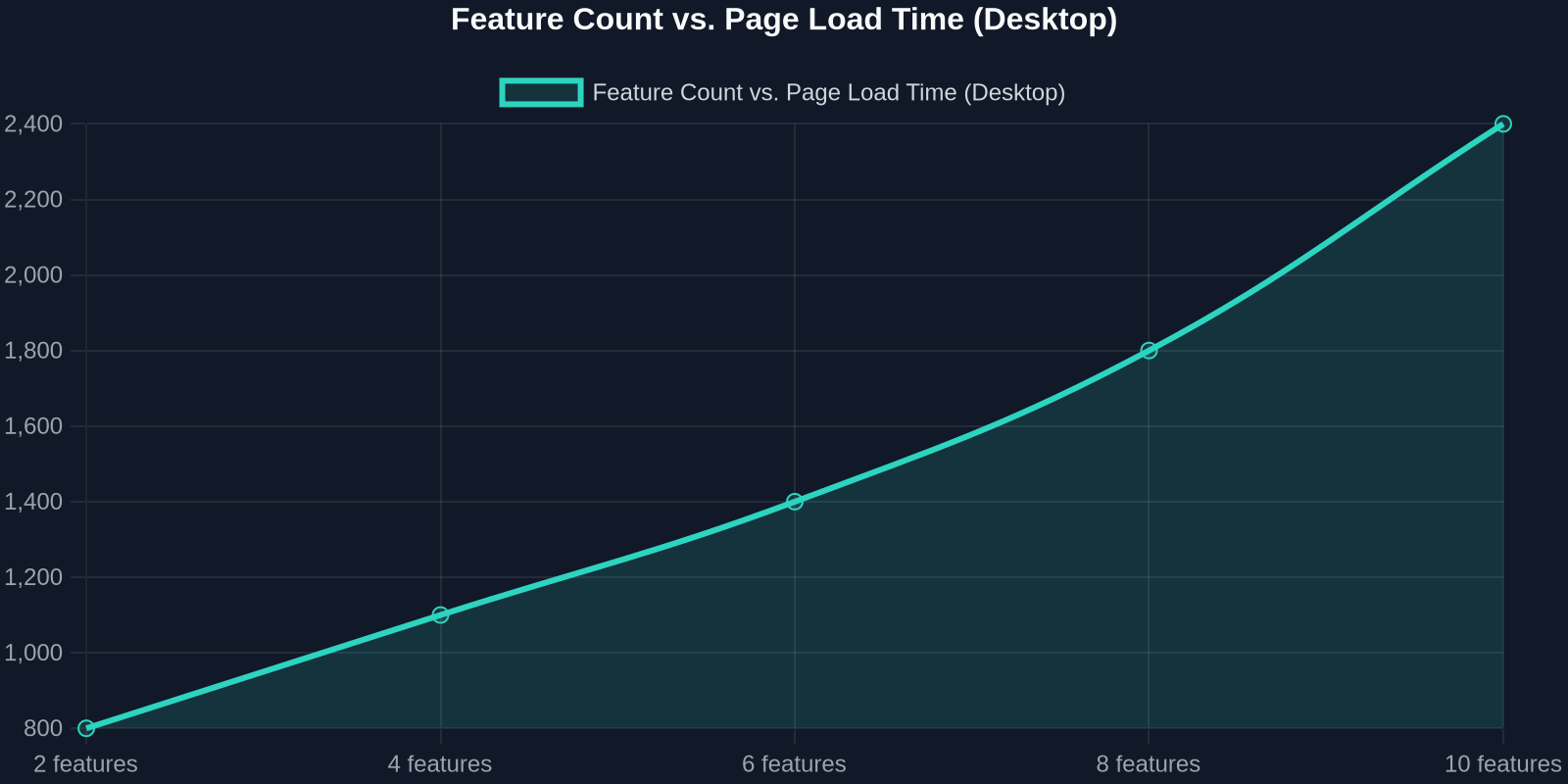
The chart above shows the trade-off between feature richness and page load time. As you add more components, load times increase, but user satisfaction also rises up to a point. The sweet spot is around 6–8 key components (nav, hero, trust badges, footer) with a total page weight under 1.5 MB.
Practical Performance Optimizations
Lazy load images: Hero images can use loading="lazy" if they’re below the fold, but for heroes above the fold, eager load with a placeholder. Use system fonts for navigation and body text to avoid extra font requests. Inline critical CSS for the nav and hero to minimize render-blocking. Consider a Skeleton Screen for complex headers to improve perceived performance.
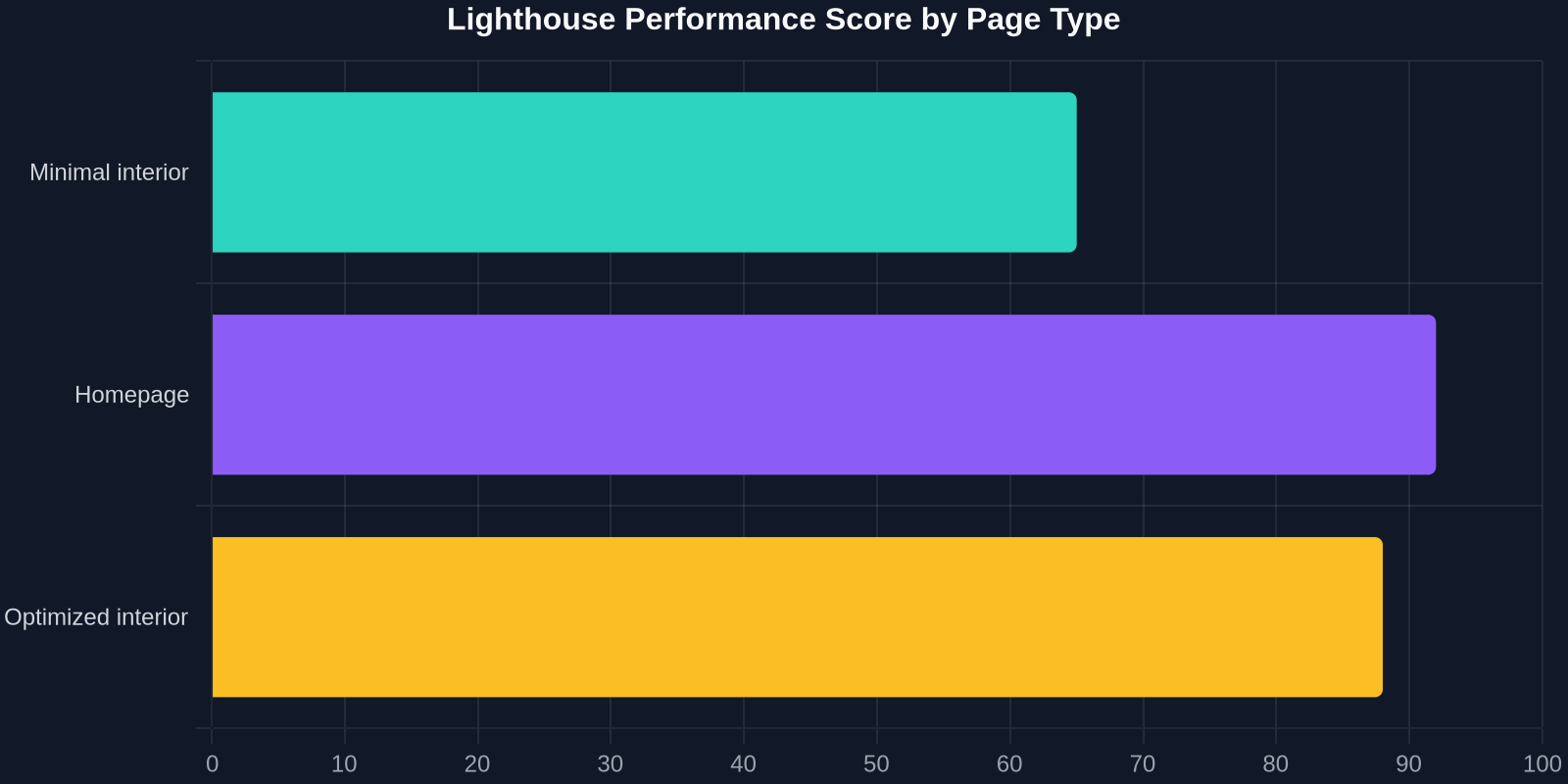
This second chart illustrates how different component strategies affect Lighthouse performance scores. A minimalist interior page often scores lower because it lacks perceived completeness, while a well-optimized “homepage-like” page can achieve 90+ scores.
Case Study: How a Documentation Page Became a Top Converting Landing Page
A real-world example: A B2B SaaS company redesigned its API documentation pages to include a sticky header with search, a hero section explaining “Why this API matters,” trust badges from industry leaders, and a clear “Start Free Trial” CTA at the top and bottom. The result?
Bounce rate dropped by 40%. Conversion rate from free trial to paid increased by 25%. Average session duration tripled.
This proves that treating every page like a homepage isn’t just about design, it’s a business metric driver.
Conclusion: The New Standard for Web Development
The era of the homepage as the sole gatekeeper is over. As frontend developers, we must ensure that every page, whether a blog post, product detail, or checkout, delivers the clarity, trust, and navigability of a homepage. This requires thoughtful planning in component architecture, performance optimization, and consistent UX.
Tools like DivMagic make this transition practical. By copying proven UI patterns from leading websites, you can fast-track your implementation while learning from the best. Start with your top 10 entry pages, audit them using the comparison table above, and refactor one element at a time. Your users, and your conversion rates, will thank you.