

CSS Container Queries & Subgrid: The 2026 Blueprint for Resilient Component Layouts
Responsive design has evolved. For years, media queries were our only tool for adapting layouts to different screens, but they forced components to react to the viewport, not to their actual available space. In 2026, CSS container queries and subgrid have become the standard for building truly resilient, self-contained components that adapt wherever they are placed.
Combining Container Queries and Subgrid
The real power emerges when you combine both: use container queries to adapt a card’s internal layout based on available space, and subgrid to keep those internal grids aligned with siblings in the same parent container.
Building a Product Card System
Let’s build a product card that works in both wide and narrow containers. The card will contain an image, title, description, price, and a button. When the container is narrow, stack vertically; when wide, use a subgrid-aligned row layout.
HTML
<div class="product-grid">
  <div class="product-card-container">
    <div class="product-card">
      <img src="product.jpg" alt="Product" />
      <div class="content">
        <h2>Product Title</h2>
        <p>Description text that might vary in length.</p>
        <span class="price">$29.99</span>
        <button>Add to Cart</button>
      </div>
    </div>
  </div>
  <!-- more cards -->
</div>
CSS
.product-grid {
  display: grid;
  grid-template-columns: repeat(auto-fill, minmax(300px, 1fr));
  gap: 1rem;
}

.product-card-container {
  container-type: inline-size;
  container-name: product;
}

.product-card {
  display: grid;
  grid-template-rows: auto 1fr auto;
  gap: 0.5rem;
  padding: 1rem;
  border: 1px solid #ddd;
  border-radius: 8px;
}

.product-card img {
  width: 100%;
  height: auto;
  border-radius: 4px;
}

.content {
  display: grid;
  grid-template-rows: subgrid;
  grid-row: span 3;
}

@container product (min-width: 400px) {
  .product-card {
    grid-template-columns: 200px 1fr;
  }
}
When the container is ≥400px, the card switches to a side-by-side layout with image on the left and content on the right. The subgrid ensures all content rows align perfectly across cards even if one card has a longer title.
2. Dashboard Widgets
Dashboards often place widgets in resizable panels or grid cells. Container queries let each widget reflow its internal content (charts, tables, text) based on the cell width, while subgrid aligns header rows across widgets in the same row.
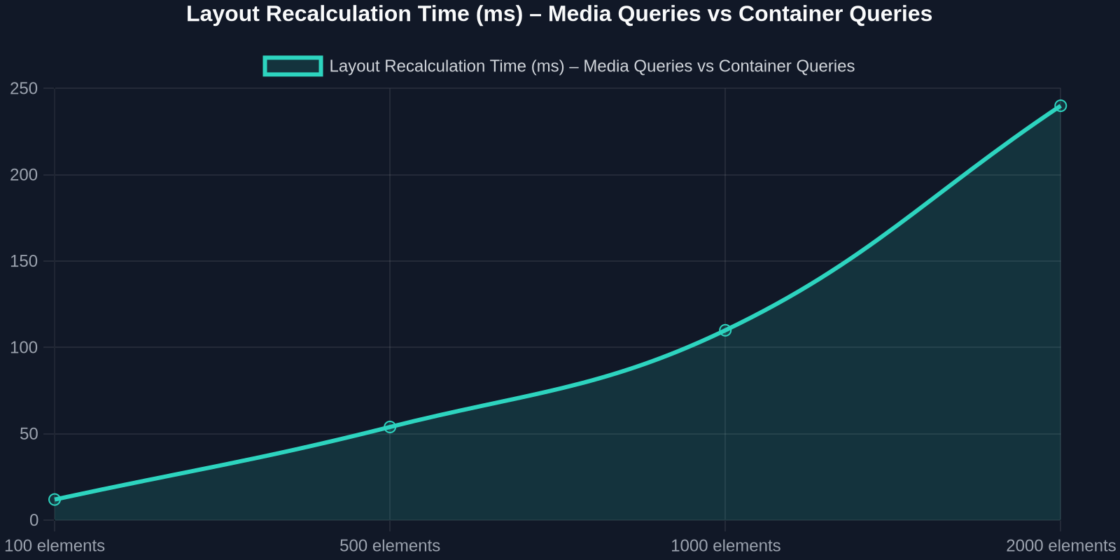
3. E-commerce Product Cards
Product cards appear in search results, recommendations, and category pages, each with different container sizes. Container queries handle the card’s internal layout; subgrid aligns prices and buttons across multiple cards in a grid.
Future-Proofing in 2026
The combination of container queries and subgrid is already enabled by the CSS spec and implementation. Future developments include:

- Container Queries for style queries (
@container style(--theme: dark)), currently experimental. - Container scroll-state queries, adapt to scrollable overflow state.
- Subgrid improvements for nested subgrids (subgrid of a subgrid).
We are moving toward a component-driven CSS where reusability is first-class. The days of writing separate mobile and desktop CSS for every component are over.
Conclusion
Container queries and subgrid are not just new tools, they represent a fundamental shift in how we think about responsive design. By decoupling component layout from the viewport and enabling true alignment across nested grids, they empower frontend developers to build systems that are resilient, maintainable, and performant.
Whether you’re building a design system, a dashboard, or an e-commerce site, adopting container queries and subgrid in 2026 will drastically simplify your code and improve the user experience.
Start small: pick one component, add a containment context, and replace your viewport-based breakpoints with container-size breakpoints. You’ll wonder how you ever lived without them.