

Responsive Design Examples: 15 Sites That Nail Mobile UX (2025)
In a world where over half of web traffic comes from mobile devices, responsive design is not a luxury, it's a fundamental requirement. Yet many developers still struggle to create layouts that look and feel native on every screen size. The best way to learn? Study real-world examples that execute responsive principles brilliantly.
This article breaks down 15 hand-picked websites that excel at responsive design, analyzes what makes them work, and shows you how to capture their patterns for your own projects. Along the way, we’ll back up best practices with data and reveal a tool that lets you copy any UI from any website in one click.
Why Responsive Design Matters More Than Ever
Mobile devices generated 58.67% of global website traffic in the first quarter of 2024. If your site isn't responsive, you're not just frustrating users, you're actively losing business. Google’s mobile-first indexing means that a poor mobile experience will drag down your entire SEO performance.
A recent conversion study evaluated 33 HR technology websites against 60+ criteria, revealing that homepage patterns driving demo requests and signups were almost exclusively those optimized for mobile. The takeaway is clear: responsive design directly impacts your bottom line.
Mobile-first design isn't just about shrinking content, it's about rethinking information hierarchy based on how users interact with smaller screens.
The Business Case for Responsive Web Design
When you invest in responsive design, you’re investing in:
- Higher conversion rates: simplified mobile journeys reduce friction.
- Lower bounce rates: fast, readable layouts keep visitors engaged.
- Improved SEO: Google rewards mobile-friendly pages.
- Cost efficiency: one codebase instead of separate mobile and desktop versions.
What Makes a Responsive Design Great?
Before diving into examples, let’s define the hallmarks of an excellent responsive design:

- Fluid grids: Layouts use relative units (%, vw, fr) rather than fixed pixels.
- Flexible images and media: max-width: 100% ensures visuals never overflow.
- CSS media queries: Breakpoints adapt content at specific screen widths.
- Touch-friendly navigation: Menus, buttons, and links are sized for fingers, not cursors.
- Performance parity: Mobile versions aren't slower, thanks to lazy loading and optimized assets.
Modern CSS tools like clamp(), min(), and max() make fluid typography effortless. For example:
h1 {
  font-size: clamp(1.75rem, 4vw, 3.5rem);
}
This single line scales text seamlessly from 1.75rem on a phone to 3.5rem on a large monitor, without a single media query.
Use tools like DivMagic to instantly copy responsive UI elements from any website into your project. Inspect, tweak, and learn from live implementations, no need to manually recreate each component.
15 Inspiring Responsive Design Examples
We selected these examples because they showcase different navigation patterns, content strategies, and visual treatments, all while maintaining impeccable mobile UX.
1. Dropbox
Dropbox rethinks its entire user journey for mobile. The desktop mega-menu collapses into a clean hamburger menu, and the hero section uses a single column with bold typography and a prominent CTA. On smaller screens, secondary content moves below the fold without losing impact.
Key takeaway: Prioritize your primary action. Dropbox knows users are there to sign in or download, so those options are thumb-reachable on mobile.
2. GitHub
GitHub’s repository pages use a two-column layout that gracefully stacks on narrow screens. Code blocks, commit logs, and file trees all reflow without horizontal scrolling. The mobile navigation places project actions in a sticky bottom bar for quick access.
Key takeaway: Data-heavy interfaces can be responsive. Use CSS Grid to define column tracks that collapse with auto-fit and minmax.
3. Smashing Magazine
As a resource for web designers, Smashing Magazine practices what it preaches. Its article layout uses a beautiful responsive typographic scale, where headings, body text, and line lengths adjust perfectly. The sidebar disappears into a drawer on mobile, keeping focus on the content.
Key takeaway: Reading comfort matters. Aim for a line length of 45-75 characters on all devices.
4. Shopify
Shopify’s marketing site demonstrates how e-commerce can sell effectively on mobile. Product showcases become vertical slices, and the navigation transforms into a full-screen overlay with large tap targets. The checkout demo adapts its multi-step form to a single-column wizard.
Key takeaway: Every interactive element must be at least 48x48px on touch screens.
5. Stripe
Stripe’s developer documentation is a masterclass in responsive code presentation. Code snippets use syntax highlighting that remains legible on phones, and the two-pane layout becomes a single scrollable column. The top navigation condenses into a compact search-first menu.
Key takeaway: Don’t just shrink, reorganize. Stripe moves the sidebar content into collapsible sections.
6. Airbnb
Airbnb’s search experience on mobile is entirely different from desktop, yet feels native to each platform. The desktop map-and-list view becomes a full-screen map with a pull-up card for results. Lazy-loading images and skeleton screens maintain perceived performance.
Key takeaway: Contextual adaptation is king. Consider device-specific user goals.
7. The New York Times
A content-heavy news site that maintains readability at every size. The NYT uses a modular grid system that rearranges story cards based on available space. Typography adapts with media queries, and interactive infographics reflow gracefully.
Key takeway: Responsive design isn’t just for apps, editorial layouts benefit enormously from fluid columns.
8. Dribbble
Dribbble’s grid of shots adjusts the number of columns using CSS grid’s auto-fill and minmax(). On mobile, the filter bar becomes a horizontal scrollable chip list, and the user profile sidebar slides into a tab.
Key takeaway: Use grid-template-columns: repeat(auto-fill, minmax(200px, 1fr)); for a grid that works on any screen.
9. Mailchimp
Mailchimp’s playful branding doesn’t break at small sizes. The illustration-heavy hero section resizes SVG assets using viewBox, and the animated elements degrade to static images on low-memory devices. Navigation items collapse into a hamburger with a branded animation.
Key takeaway: SVGs and responsive images (srcset) are your friends for brand-heavy sites.
10. Figma
Figma’s marketing site uses a bento-box layout that flows from a 3-column desktop arrangement to a single column on mobile. The design system documentation adapts its color swatches and spacing tokens without sacrificing visual clarity.
Key takeaway: Design systems themselves must be responsive; use design tokens to manage breakpoints.
All these examples share one trait: they treat responsiveness as a design feature, not an afterthought. The best mobile experiences emerge from mobile-first design thinking.
11. Medium
Medium’s minimal reading experience is built on a responsive foundation. The article sidebar vanishes, and the top navigation shrinks to a minimalist bar. Inline images respect the reader’s viewport width, and code embeds use a pre element that scrolls horizontally only as a last resort.
12. Spotify Design
Spotify’s design blog uses bold, full-width photography that crops intelligently with object-fit. Text overlays shift position using absolute positioning and media queries. The card-based archive page reflows into a single column on phones.
13. A List Apart
A classic in the web design community, this site uses a simple but effective responsive pattern: a main content column with a max-width and a sidebar that moves below. The navigation becomes a vertical accordion.
14. Etsy
Etsy’s marketplace proves that dense e-commerce grids can be mobile-friendly. The product cards use a horizontal scroll on desktop but stack vertically on mobile. The search filter transforms into a bottom sheet.
15. Apple
Apple’s product pages are famous for lavish, interactive experiences. On mobile, they replace video backgrounds with optimized still images, and complex animations are disabled to preserve battery and performance. The navigation becomes a full-screen overlay.
Key takeaway: Performance is a core responsive concern. Deliver the best experience each device can handle.
How to Replicate These Responsive Patterns
Studying examples is the first step; implementing them is where the real learning happens. You could inspect each site, copy its HTML and CSS, and adapt it to your codebase. But that process is slow and error-prone.

DivMagic changes the game. As a browser extension, it lets you click on any element, a navigation bar, a card, a dashboard, and instantly copy its clean, readable HTML and CSS. You can paste it into your code editor and immediately see how the responsive breakpoints work.
“With DivMagic, I turned a competitor’s hero section into a fully responsive template in under two minutes. It’s like having a cheat code for frontend development.”
Step-by-Step: Clone a Responsive Navbar
- Install the DivMagic extension for Chrome or Firefox.
- Visit any of the example sites above.
- Click the DivMagic icon and select the navigation element.
- Copy the generated HTML and CSS.
- Paste into your project and tweak colors, fonts, and branding.
- Use your browser’s responsive design mode to test.
You’ll see that the media queries are already in place. You can analyze how they define breakpoints, adjust padding, and hide/show elements. It’s an incredible way to learn by reverse-engineering.
Responsive Design Statistics You Should Know
Data backs up the importance of responsive design. Here are key figures that shape modern web development:
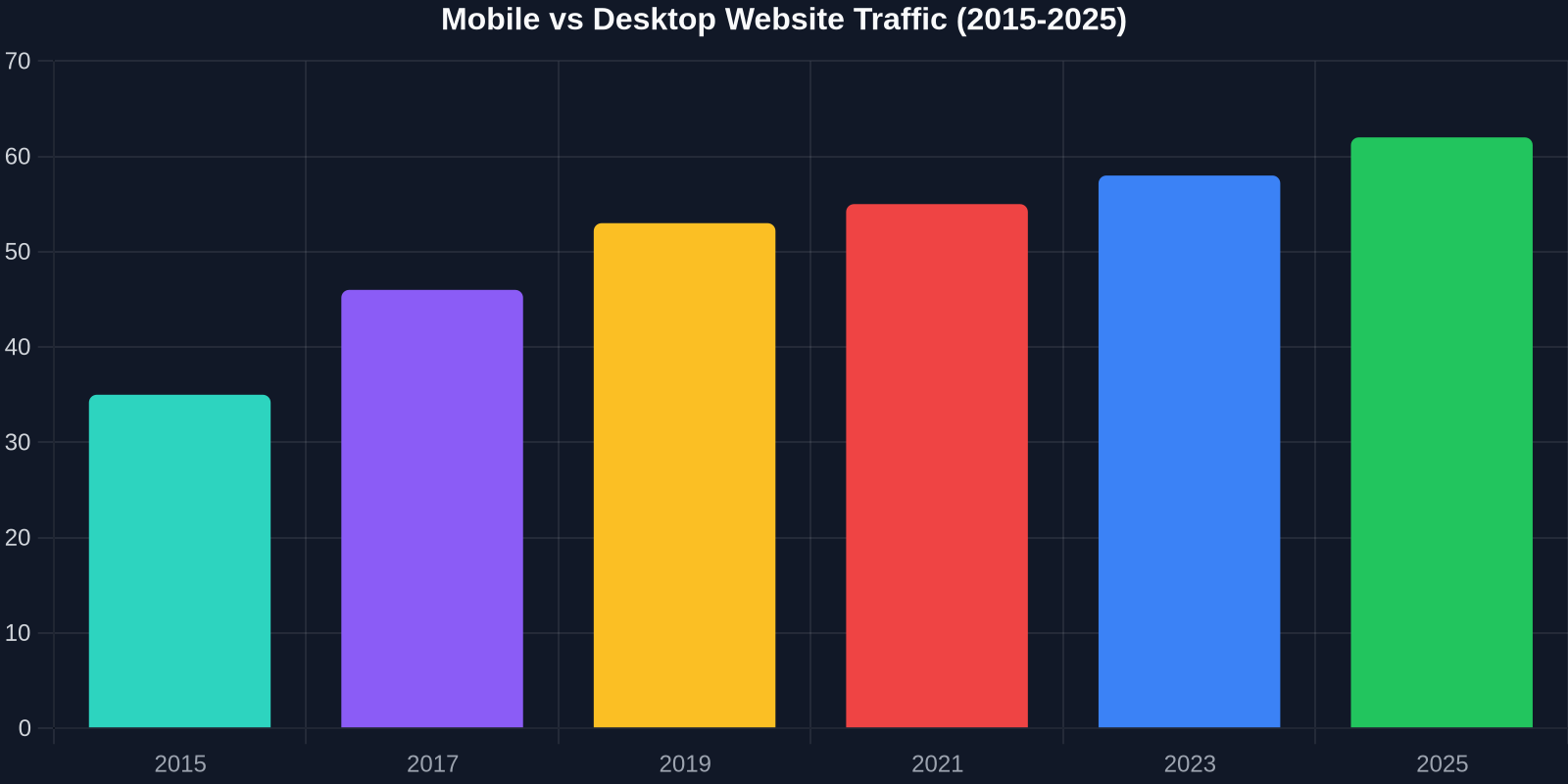
- Mobile devices accounted for 58.67% of global website traffic in early 2024, a number that has been rising year over year.
- 57% of users say they won’t recommend a business with a poorly designed mobile site.
- 88% of online shoppers are less likely to return after a bad user experience.
These numbers emphasize why every front-end developer needs to master responsive techniques. The bar chart above illustrates the trend of mobile versus desktop usage over the last decade.
The Evolution of CSS for Responsive Design
Modern CSS has made responsive design more intuitive than ever. Here’s how the technology has progressed:

- Media Queries (2012): The first real responsive tool, allowing developers to test screen width, orientation, and resolution.
- Flexbox (2017): Streamlined one-dimensional layouts, handling dynamic sizing and alignment.
- CSS Grid (2018): Enabled two-dimensional layouts with fraction units and auto-placement, dramatically simplifying complex grids.
- Container Queries (2023): A game-changer that lets components respond to their container’s size, not just the viewport.
- New CSS Functions (clamp, min, max, calc): Make fluid typography and spacing possible without any media queries.
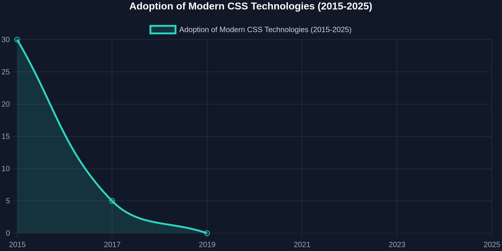
The line chart below tracks the adoption of these technologies among professional developers. As you can see, Flexbox and Grid have reached near-universal usage, while Container Queries are quickly gaining traction.
“The future of responsive design is component-based. Container queries are making truly reusable, self-adapting UI modules a reality.”, Jen Simmons, Mozilla
Responsive Frameworks: Pros and Cons
Frameworks like Bootstrap, Tailwind CSS, and Foundation have built-in responsive utilities. They can speed up development, but sometimes at the cost of flexibility and performance.
- Bootstrap: Excellent for rapid prototyping with a mature grid system and prebuilt components. However, it can lead to heavy CSS and generic-looking sites if not customized.
- Tailwind CSS: A utility-first framework that encourages responsive design at the class level. It produces minimal unused CSS but requires a learning curve.
- Pure CSS / Custom: Offers total control and the smallest footprint, but demands more time and expertise.
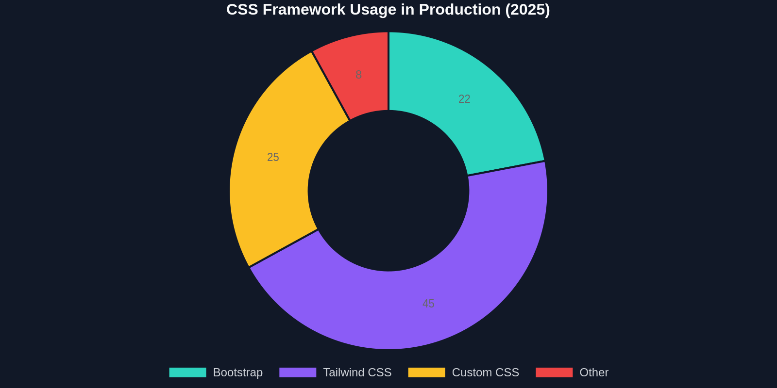
The doughnut chart above shows the distribution of framework usage in production projects, highlighting Tailwind’s rapid growth.
Common Responsive Design Mistakes to Avoid
Even experienced developers slip up. Watch out for these pitfalls:
- Hiding content on mobile – If it’s important on desktop, find a way to include it gracefully on smaller screens.
- Fixed viewport values – Never hardcode the meta viewport tag incorrectly; use
<meta name="viewport" content="width=device-width, initial-scale=1">. - Ignoring touch targets – Buttons and links too close together frustrate users.
- Poorly scaled images – Always specify image dimensions and use
srcsetandsizesattributes. - Over-reliance on JavaScript for layout – CSS Grid and Flexbox can replace most JS-driven layouts.
The DivMagic Advantage for Responsive Development
Let’s face it: studying responsive design examples is essential, but manually rebuilding them each time you need inspiration is impractical. DivMagic bridges the gap between observation and implementation. By capturing the exact CSS rules, including media queries and pseudo-classes, it lets you instantly see how professional sites achieve their responsive behavior.
Whether you’re building a portfolio, an e-commerce dashboard, or a SaaS landing page, start by cloning a section you admire, then adapt it. It’s the fastest way to internalize responsive patterns and ship pixel-perfect UIs.
Use DivMagic’s “Responsive Tester” to instantly preview the copied component at different screen widths. See exactly how padding, margins, and font sizes change, and learn to write better CSS.
Conclusion
Responsive design is no longer a niche skill, it’s the baseline expectation for every web project. The 15 examples we covered prove that great mobile UX is achieved through careful planning, modern CSS, and user-centered thinking. The data reinforces that companies investing in responsiveness see higher engagement, better SEO, and improved conversion rates.
Don’t let implementation slow you down. Embrace tools that accelerate your workflow, learn from live code, and always put the user’s device context first. Now go explore those examples, copy what works, and make the web a better place for everyone, regardless of screen size.