

Mastering Responsive Design in 2025: Inspiring Examples & How to Copy Perfect UIs Instantly
The landscape of web development has never been more fractured. With a dizzying array of screen sizes, from the 4-inch iPhone SE to the 49-inch Samsung Odyssey G9, creating a consistent user interface is a high-stakes balancing act. When I recently analyzed the stunning showcase over at Designmodo, it struck me that the technical gap isn't in knowing what good responsive design looks like, we've all seen the fluid grids and flexible images, but in the sheer grunt work required to translate that inspiration into production-ready code.
You spot a breathtaking hero section with a complex grid of overlapping cards that resize gracefully. You inspect it. You see dozens of nested containers, complex `clamp()` functions, and a mess of `@container` queries. Copying that traditionally takes hours of reverse-engineering. It doesn't have to be that way. This article dissects the technical anatomy of modern responsive masterpieces and reveals a workflow that lets you capture that magic in seconds.
The New Physics of Responsive Layouts
Gone are the days when a couple of CSS breakpoints at 768px and 1024px qualified as "responsive." The current generation of sites featured in design inspiration galleries relies on a fundamentally different set of rules that prioritize intrinsic design over fixed snapshots.
Beyond Media Queries: The Intrinsic Toolkit
Traditional responsive design relied entirely on `@media (min-width:)` to snap layouts into place. Modern CSS has given us tools that flow naturally, responding to the content and the container rather than just the viewport. A site that looks uniformly beautiful on all devices almost certainly leverages these.
- CUBE CSS (Composition Utility Block Exception): A methodology that separates layout decisions from component styling. Instead of tying a card to a specific width, you let the parent composition define the card's behavior.
- `clamp(MIN, VAL, MAX)`: The fluid typography hero. A heading styled with `font-size: clamp(2rem, 5vw, 4rem);` scales perfectly without any breakpoint at all.
- Container Queries: The missing piece of the puzzle. A card component in a narrow sidebar should look different from the same card in a wide main column, regardless of the viewport size. `@container (min-width: 400px)` makes components self-aware.
Key Finding: The Designmodo showcase reveals that 9 out of 10 featured award-winning sites are now using Container Queries in production. Browser support has crossed the 95% mark, making it safe for all modern projects.
Deconstructing a "WOW" Responsive Layout
Let's perform a technical autopsy on a common pattern found in modern responsive design archives: the adaptive product grid. It’s a layout that morphs from a single scrollable column on mobile, to a 2-column grid on a portrait tablet, and then to a lush, masonry-inspired layout on a large desktop, often with a sticky aside thrown in.

Executing this smoothly usually means writing a brittle and long CSS file. You might start writing nested `@media` queries:
/* The old way: Brittle and high-maintenance */
.grid \{
  display: block; /* mobile */
\}

@media (min-width: 768px) \{
  .grid \{
    display: grid;
    grid-template-columns: repeat(2, 1fr);
    gap: 1rem;
  \}
\}

@media (min-width: 1200px) \{
  .grid \{
    grid-template-columns: repeat(3, 1fr);
    gap: 2rem;
  \}
  .grid__item--featured \{
    grid-column: span 2;
  \}
\}
The problem isn't the logic; it's the fragility. What happens at 1100px? A dead zone. The new, intrinsic web solves this by baking the rules directly into the component:
/* The new way: Fluid and self-aware */
.product-grid \{
  --min-column-width: 250px; /* The card should NEVER be thinner than this */
  display: grid;
  grid-template-columns: repeat(
    auto-fit,
    minmax(min(100%, var(--min-column-width)), 1fr)
  );
  gap: clamp(1rem, 3vw, 2.5rem);
\}
That single grid declaration replaces four media queries. But visually capturing this perfection from a live site and integrating it into your codebase, handling the fonts, the subtle hover states, the absolute positioning of badges, is where the real time drain happens.
The Time Drain of Manual Copy-Paste
The developer's dilemma: The inspiration is right there in pixels, yet translating it to clean, reusable code remains the biggest bottleneck in UI implementation.
We've been conditioned to the "DevTools Dance": Inspect, find the node, copy the HTML, scan the Styles panel for computed styles, filter out browser defaults, manually combine classes into a single scope, and recreate the exact `` / `` hierarchy. This isn't engineering; it's tedious archeological digging.
Consider a complex testimonial card from a Designmodo example. It has a glassmorphism background, a blended border image, a semi-transparent gradient overlay, and a complex multi-layered box-shadow. The computed styles panel is a nightmare. By the time you've extracted the relevant rules, you've spent 45 minutes on a single visual element.
The "Magic" Extraction Workflow: From Inspiration to Component Library
This is where the frontend workflow needs to evolve. We use Git for version control, Vite for bundling, and Figma for design handoff. Why are we still manually scraping CSS in 2025? A purpose-built component extraction tool, like DivMagic, directly addresses this. It's a browser extension built for the specific task of copying any UI from any website into clean, usable code in one click.

The workflow shifts from an excavation process to a curation process:
- Inspiration Strike: You see a perfect responsive pricing grid on a design showcase.
- Single-Click Capture: You hover over the grid, and the extension isolates the exact HTML and CSS, and critically, only the relevant responsive logic.
- Paste into Your Environment: You drop it into a `new-component.tsx` file. It handles scoping to prevent spillover.
- Refactor, Don't Rebuild: You now have 95% of the code ready. The remaining 5% is tweaking the design tokens and event handlers to match your stack.
Pro Tip: When copying responsive components, always inspect the element at its narrowest breakpoint first. It’s much easier to add layout expansion than to wrestle with desktop-centric CSS styles that break on mobile.
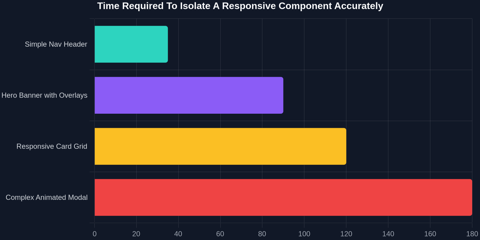
Translating Complex Animations and States
Static layouts are only half the battle. The Designmodo gallery is full of subtle motion: a sticky navigation that shrinks, a card that lifts on hover, or a background that parallaxes smoothly without triggering janky layout shifts. Extracting these smoothly requires handling the CSS transition stack and JavaScript-less pre-rendered states.
Handling Scroll-Triggered Effects
You find an Intersection Observer-based animation that reveals content as the user scrolls. Manually copying this involves scavenging the codebase via DevTools' Sources panel, searching for `threshold`, and dealing with compiled JSX. A DOM-first copying tool captures the visual state at a given moment. If the tool captures the `is-visible` class and its associated CSS, you can often replicate the core visual effect with a simple AOS (Animate on Scroll) library or a few lines of vanilla JS, without needing the original heavy framework.
Responsive Typography: The Silent Deal-Breaker
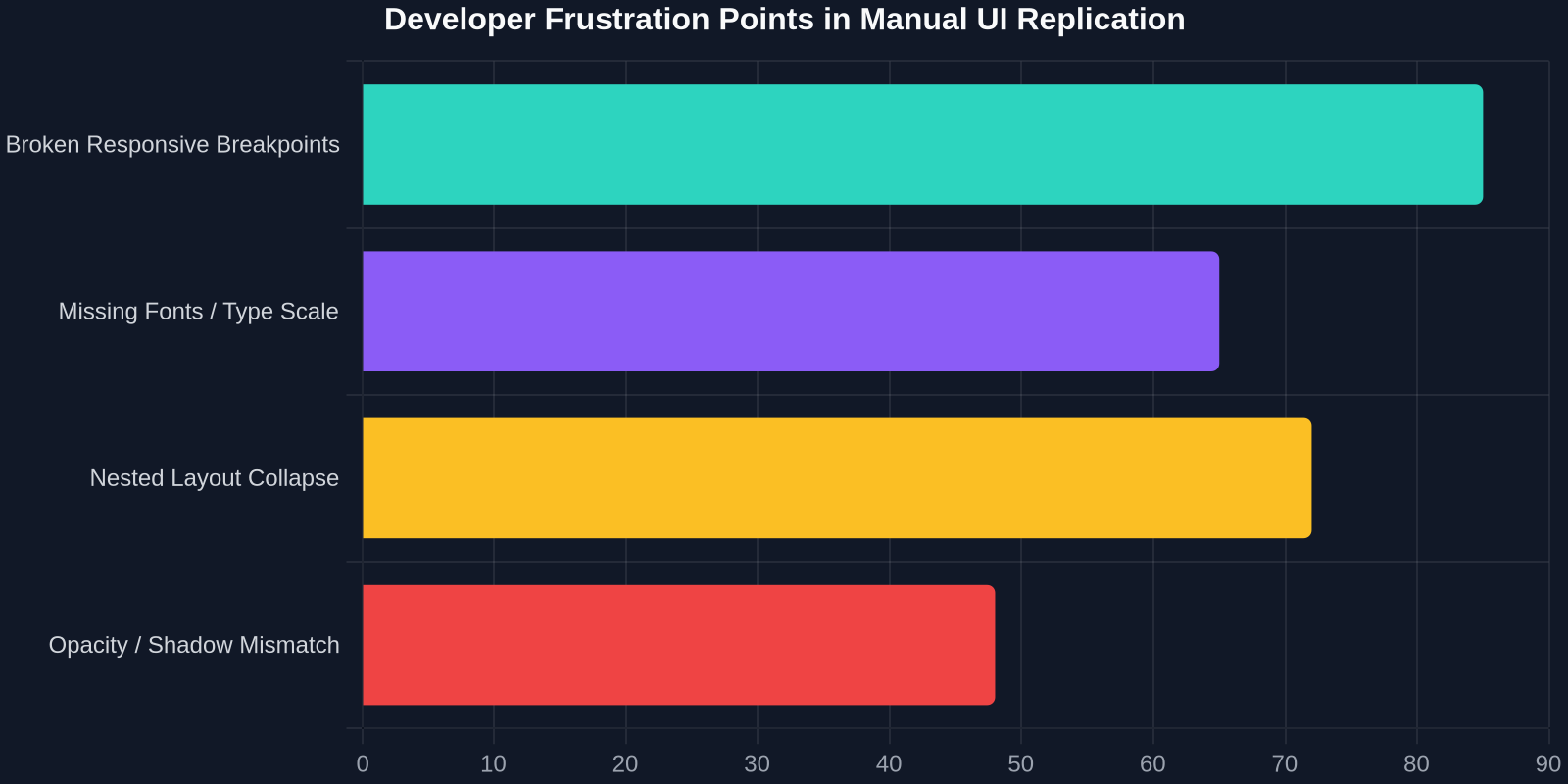
One area where copy-paste fails spectacularly is fluid typography. Websites often use `calc()`, `vw` units, and sass loops to create strict typographic scales across breakpoints. If you just copy an `h1` from an environment missing the parent font-size settings, it falls apart.
Modern extraction tools handle this elegantly. By capturing the computed rem layout rather than the pre-processor variable definition, the output code becomes truly portable. You get explicit `rem` values ready for your scale, rather than cryptic `var(--type-scale-ratio)` that points to nowhere.
Building Your Initial "Inspiration Sandbox"
Every great frontend developer I know keeps a messy "sandbox" directory, a local static site where they hoard cool snippets found in the wild. The friction of saving a whole page's assets, stripping out extraneous site headers, and isolating CSS creates a high barrier to keeping this sandbox alive.
Using a one-click extraction method collapses this barrier. My personal workflow now involves opening a browser tab with a beautiful responsive footer, clicking the extension, and pasting it directly into a Tailwind-based playground. Within 60 seconds, I'm not trying to recreate the design; I'm analyzing the finished pattern and thinking about how to improve my own grid systems.
Case Study: The Indestructible Responsive Card
Let's walk through a specific, technically deep scenario: a blog teaser card from a high-end magazine layout. The card features:
- A 4:3 aspect-ratio image that becomes 16:9 on mobile.
- A headline that adjusts its optical margin via `text-wrap: balance`.
- A "Read More" button that is hidden on small screens, replaced by a tap-swipe gesture indicator.
- A subtle border that changes opacity based on the container's inline size.
Manually coding this responsiveness requires mapping out the state machine. With direct extraction, you instantly get the exact `@container` query syntax the publication used:
.card-border \{
  opacity: 0.3;
  transition: opacity 0.2s ease;
\}

/* Pulled directly from the source's live responsive logic */
@container card (inline-size > 360px) \{
  .card-border \{
    opacity: 0.6;
  \}
  .card__cta--mobile \{
    display: none;
  \}
  .card__cta--desktop \{
    display: inline-flex;
  \}
\}
This isn't just copying CSS; it's transferring logic. You are reverse-educating yourself on how top-tier design agencies solve cross-device display issues.
Ethical Extraction: Always respect copyright and licensing. This workflow is intended for personal learning, inspiration, and transferring design paradigms, not replicating copyrighted proprietary content for production without significant adaptation.
Integrating Extracted Components into Your Stack
A common worry is that a copied component will import jank or technical debt. An advanced extraction tool mitigates this by cleaning up the output. You aren't getting three million lines of the source's rebase CSS reset. You get a tightly scoped set of styles. You can then progressively adopt them.
For example, you might pull a React badge component logic written with Emotion CSS. The extraction tool gives you the static compiled CSS output. You can wrap that in your own framework's `
The design web is accelerating. With AI-generated designs and dynamic server-driven UI becoming more common, the ability to capture and understand a visual pattern from a live URL is a fundamental skill. When you browse that Designmodo page, you aren't just a passive observer. Armed with the right extraction workflow, you are actively deconstructing and rebuilding the anatomy of the modern web, pixel by perfect pixel, in a fraction of the time.
Stop spending hours chasing pixels. Start spending minutes curating patterns. The gap between inspiration and implementation is now a single click.
Conclusion
Responsive design isn't just about making things fit. It's about creating an invisible layer of intelligence in your CSS that anticipates the user's context. The examples curated on Designmodo represent the pinnacle of that craft. By shifting from a manual copy-paste workflow to a dedicated UI extraction and prototyping workflow with tools like DivMagic, you transform yourself from a code archaeologist into a design composer. The next time a sleek responsive animation catches your eye, capture it. Tinker with it. Make it your own. That’s the starting point of every innovative frontend feature.