

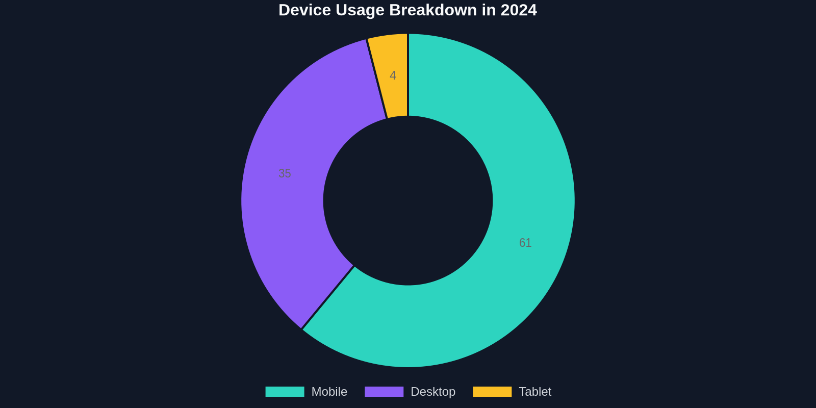
The way users access the web has transformed dramatically. In 2024, mobile devices accounted for over 60% of global website traffic, and that number climbs every year. If your website isn’t responsive, you’re not just missing out on a trend, you’re actively turning away the majority of your potential audience. Responsive design is no longer a luxury; it’s a fundamental requirement for any modern digital product.
At its core, responsive web design (RWD) ensures that a website looks and functions beautifully on any screen size, from a large desktop monitor to a smartphone. It’s built on a foundation of fluid grids, flexible images, and CSS media queries. But true responsiveness goes beyond technical implementation; it’s about crafting an experience that feels native to every device, prioritizing content hierarchy, touch targets, and performance.
In this comprehensive guide, we’ll explore 10 real-world responsive design examples that push the boundaries of what’s possible, dissect the principles they follow, and arm you with best practices and tools to elevate your own projects. Whether you’re a seasoned frontend developer or a designer dipping into code, these insights will help you build faster, more accessible, and delightful multi-device experiences.
Why Responsive Design Matters More Than Ever
The numbers don't lie, responsive design directly impacts your bottom line. A study by Google found that 53% of mobile site visits are abandoned if a page takes longer than 3 seconds to load. Meanwhile, a well-implemented responsive site can boost conversions by up to 2x compared to a non-optimized counterpart. In an era where user patience is razor-thin and competition is a tap away, delivering a seamless cross-device journey is a competitive advantage.
Moreover, search engines like Google prioritize mobile-friendly sites in their rankings. Since the shift to mobile-first indexing, having a responsive site is crucial for SEO. It’s not just about aesthetics, it’s about discoverability, user satisfaction, and revenue.
The Core Ingredients of Every Responsive Design
Before we jump into the examples, let’s revisit the three technical pillars that make responsive design possible:

- Fluid Grids: Instead of fixed pixel widths, layout components use relative units like percentages, vw, or fr. This allows columns and containers to resize proportionally.
- Flexible Media: Images and videos are constrained with
max-width: 100%to prevent overflow, often combined withsrcsetfor resolution switching. - Media Queries: CSS rules that apply based on device characteristics such as viewport width, height, orientation, or resolution, enabling distinct styles for different breakpoints.
However, modern responsive design has evolved to include new CSS features like container queries, CSS grid, and the clamp() function, which we’ll see in action in the examples below.

10 Inspiring Responsive Design Examples (from Designmodo)
Each of the following websites demonstrates a unique approach to responsive challenges. We’ve analyzed their design choices to extract valuable lessons you can apply immediately.
1. Shopify
Shopify’s homepage exemplifies a content-first responsive strategy. On mobile, the hero section collapses elegantly, the navigation transforms into a hamburger menu, and call-to-action buttons become full-width for easy thumb tapping. The fluid grid ensures product showcases scale smoothly, while typography scales using viewport units.
2. Airbnb
Airbnb’s responsive design is a masterclass in adaptive imagery and whitespace. Large background photos resize with object-fit: cover, and card layouts reflow into a single column on small screens. Subtle animations are preserved across devices without compromising performance.
3. Dropbox
Dropbox uses a bold, minimal color palette that adapts seamlessly. Notice how the illustration sizes change with breakpoints, and complex multi-column layouts collapse into stacked sections, preserving reading order.
4. Starbucks
Starbucks employs a hybrid approach: the desktop version shows a rich, image-driven menu, while the mobile version simplifies navigation with an accordion-style product list. Touch-friendly icons and fast loading times make the experience feel native.
5. GitHub
GitHub’s dashboard is a data-heavy interface that remains usable on mobile thanks to a thoughtful grid system. Tables become scrollable cards, and the navigation adapts with off-canvas menus. The use of min-width breakpoints ensures no information is lost.
6. Mailchimp
Mailchimp’s quirky illustrations and playful copy shine across all devices. The responsive type scale, powered by a modular scale, keeps headlines readable. Custom breakpoints align with content reflow, not just device widths.
7. Wired
Wired’s magazine-style layout uses CSS grid to create a dynamic responsive reading experience. Columns reflow effortlessly, and images employ lazy loading and sizes attributes for optimal performance.
8. The Next Web
This tech publication demonstrates how to handle long-form content and ad placements without breaking responsive flow. Sticky sidebars become inline on mobile, and font sizes adjust with clamp() for perfect readability.
9. Etsy
Etsy’s search results page is a showcase of responsive product grids. Using CSS Grid with auto-fill and minmax, items reflow without media queries. Filters collapse into a drawer, and infinite scroll is optimized for touch.
10. Bootstrap
The Bootstrap documentation itself is a responsive marvel. The sidebar converts to a top navbar on small screens, and code examples are wrapped in pre-scrollable containers. It’s a testament to the framework’s own principles.
Best Practices for Modern Responsive Workflows
Building on the lessons from the examples, here are actionable best practices to integrate into your development process:

Adopt a Mobile-First Mindset
Start designing for the smallest screen first, then progressively enhance for larger ones. This forces you to prioritize core content and makes your code more efficient. Use min-width media queries rather than max-width to build up layers of complexity.
| Approach | Philosophy | Pros | Cons | Best For |
|---|---|---|---|---|
| Mobile-First | Start with minimal mobile layout, then expand | Performance-friendly, content-focused, future-proof | Requires more planning; desktop may feel bloated if overdone | New projects, progressive enhancement |
| Desktop-First | Design for large screens, then scale down | Familiar to traditional designers; easier to add mobile constraints | Often leads to poor mobile performance, hidden content issues | Legacy projects with existing desktop assets |
Embrace Modern CSS Layout Techniques
CSS Grid and Flexbox have revolutionized responsive design. Use grid-template-columns: repeat(auto-fit, minmax(250px, 1fr)) to create intrinsically responsive grids without a single media query. Pair them with container queries (now supported in all modern browsers) to style elements based on their parent’s size, not the viewport.
Optimize Images and Media
Always serve appropriately sized images. Use srcset and sizes to deliver different resolutions, and leverage modern formats like WebP and AVIF. For background videos, use CSS media queries to hide them on mobile or replace with a static poster.
Design for Touch and Interaction
Buttons and links must have a minimum touch target of 44x44px (WCAG 2.1). Ensure interactive elements are spaced apart to prevent accidental taps. Use pointer: coarse media query to adapt UI specifically for touch devices.
Performance Budgeting
Responsive design without performance is an empty promise. Set a strict performance budget, e.g., < 2s load time on 3G. Compress assets, defer non-critical JavaScript, and inline critical CSS. Use tools like Lighthouse to measure and enforce your budget.
Tools and Resources to Supercharge Your Responsive Workflow
While hand-coding responsiveness is essential, the right tools can shave hours off your development time:
- Browser DevTools: Chrome and Firefox device modes let you simulate different screens and network throttling.
- DivMagic: Copy any responsive UI element from any website directly into your codebase, inspecting breakpoints and style automatically.
- CSS Frameworks: Tailwind CSS and Bootstrap provide utility-first responsive classes that speed up prototyping.
- Responsive Design Checker: Online tools that render your site at multiple breakpoints simultaneously.
- Media Query Debuggers: Browser extensions that overlay current breakpoint info.
"Compare the top web design companies of 2026 across 14 industries. Verified reviews, real pricing, and specialist recommendations, choosing the right partner has never been easier."
Common Responsive Design Mistakes (and How to Avoid Them)
Even seasoned developers fall into these traps. Stay vigilant:

1. Hiding Content on Mobile
It’s tempting to display: none elements that don’t fit. This can hide crucial information or links, harming SEO and accessibility. Instead, restructure using accordions, tabs, or priority+ navigation patterns.
2. Using Maximum-Scale in Viewport Meta
Adding maximum-scale=1.0 prevents users from zooming, which is an accessibility violation. Always allow user scaling.
3. Fixed-Width Viewport Assumptions
Never design for specific device widths (e.g., iPhone 14). Instead, let content guide breakpoints. Test on a range of viewports, including 320px (old phones) to 2560px (ultrawide monitors).
4. Overusing Media Queries
Too many breakpoints lead to brittle, hard-to-maintain code. Lean on fluid grid and intrinsic sizing to reduce media query dependency.
5. Ignoring Landscape and Portrait
Test both orientations, especially on tablets. A layout that works in portrait may break awkwardly when rotated.
The Future of Responsive Design
As new devices like foldable phones and AR glasses emerge, responsive design will continue to evolve. Container queries are already transforming component-based architectures, while CSS user preference queries (e.g., prefers-reduced-motion) add a layer of personalization.
AI is also making waves. As one report suggests, "Vibe coding is expected to continue growing as artificial intelligence (AI) makes software development more accessible." This means we’ll see smarter design tools that can auto-generate responsive layouts from wireframes, further blurring the line between design and code.
"The path to a learning utility begins in academic medical centers… where research, clinical operations, and innovation converge.", A reminder that responsive design principles can be applied even in highly specialized digital platforms.
Conclusion: Responsive by Default
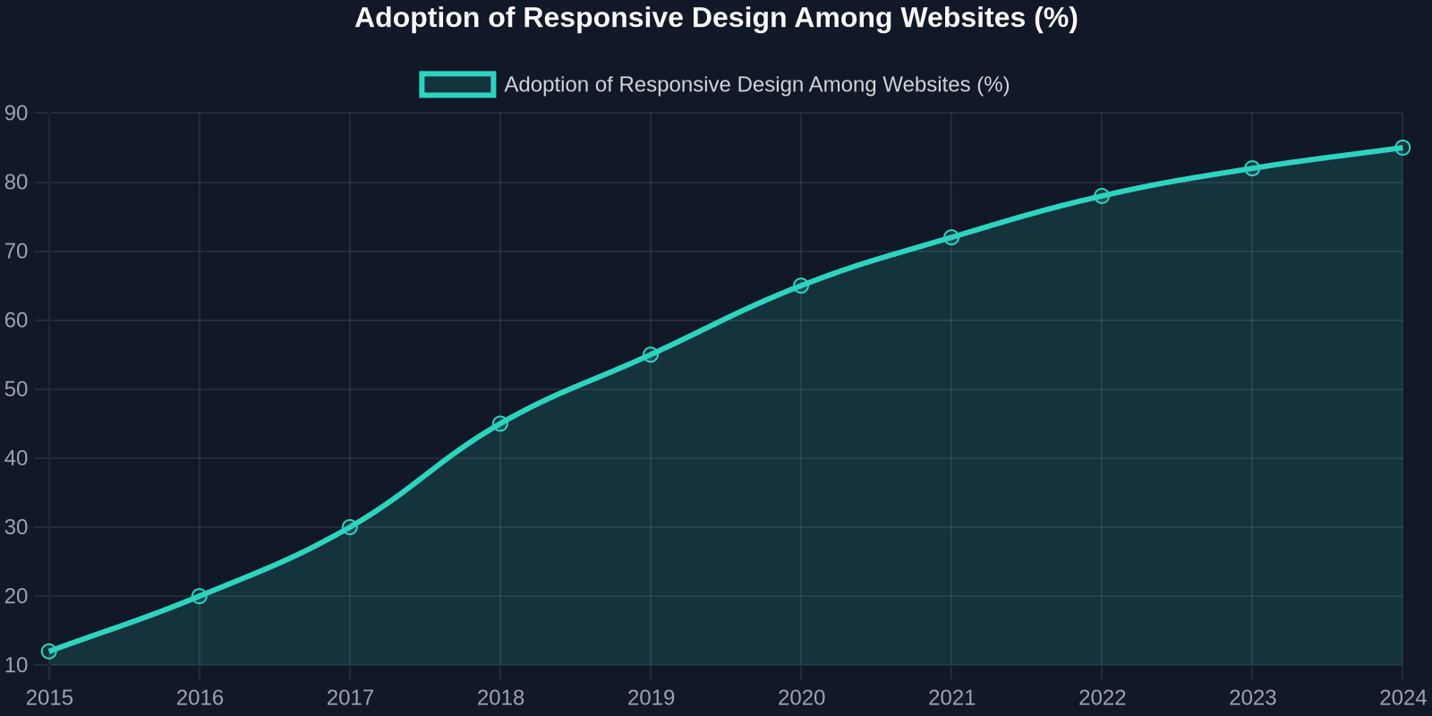
Responsive web design is not a feature, it’s the foundation of every web project. The examples we’ve explored demonstrate that with a thoughtful approach to grids, media, and interaction, you can create experiences that feel tailor-made for every screen. As web technologies advance, the line between device categories will only fade further, making responsiveness even more critical.
Start by auditing your current projects against the best practices outlined here. Experiment with modern CSS techniques, set a performance budget, and never stop testing on real devices. Tools like DivMagic can help you reverse-engineer inspiring responsive components, saving you time when implementing complex layouts.
In a world where your users are constantly on the move, a responsive site isn’t just a nice-to-have, it’s your brand’s handshake with the mobile majority. Make it count.