

How to Uncover Small Business Client Needs for Web Design When There's No Clear Brief
Blind dates and mystery dinner parties can be fun. A web design project without a discovery brief? Not so much. You're staring at a blank code editor, a vague client email that reads "make it pop," and a deadline that's rapidly approaching. We've all been there.
For frontend developers and web designers, the real challenge isn't usually writing the CSS Grid layout or debugging asynchronous JavaScript. It's extracting a functional, actionable design specification from a client who just knows they need to "look better than the competitor." This crucial discovery phase determines whether a project sails smoothly or descends into the ninth circle of revision hell. We're diving deep into the concrete, repeatable tactics you can use to decode a small business client's unspoken needs, and how to translate those insights into clean, maintainable UI code.
The Silent Killer of Profitable Projects: Ignoring Discovery
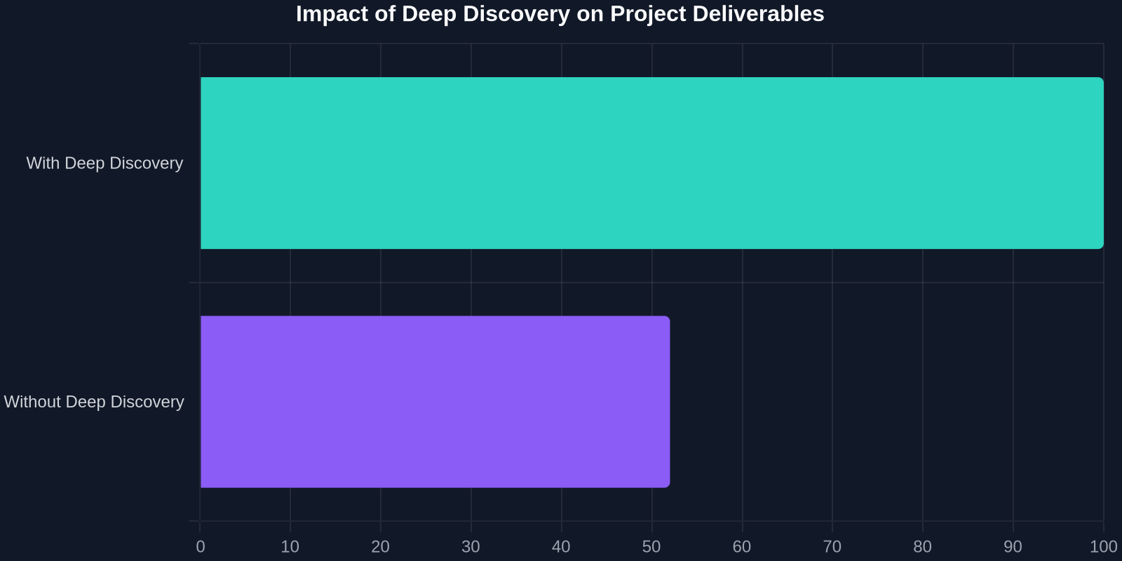
Skipping the formal discovery process is the single most expensive mistake a freelance developer or small agency can make. Anecdotally, we might think of it as just a "chat before the contract," but the data shows a direct correlation between poor discovery and catastrophic scope creep.
When a client says "I need a website," they are actually making a business statement masked as a technical request. A local bakery might say they need online ordering, but their real pain point is that they're losing phone orders during the morning rush because they can't handle the volume. A consultant might ask for a "modern UI," but underneath, they're realizing their cluttered 2010-era tables are making them look like a commodity to premium prospects. Without digging into this, developers end up building a perfect technical implementation of the wrong solution, or worse, a perpetually half-finished project.
Mapping the As-Is Experience to Define the To-Be UI
You cannot define a target user interface until you literally see what the client currently tolerates. This is a hands-on technical audit that goes far beyond “what are your favorite colors.” It involves a structured performance and heuristic evaluation of their current digital presence, whether it's a five-page HTML site or a sprawling Shopify mess.

1. The 5-Minute Brutal Heuristic Audit
Open the client's current site. Don't just scroll. Render it with JavaScript disabled (using a browser extension or DevTools settings). Does the navigation still work? Is critical text invisible behind a lazy-loaded script? This immediately exposes the business impact of their current codebase. A physical therapist client didn't realize that Google couldn't read their appointment booking link because it was generated by a non-SEO-friendly JavaScript function. This technical discovery positioned the redesign not as a “facelift” but as a critical revenue fix.
2. The Competitor “Gap and Grab” Technique
Small business owners often define “good design” as “what my competitor has.” Rather than fighting this instinct, you can systematize it. Have the client pick three competitors, plus your team picks two industry-adjacent leaders (e.g., for a local real estate agent, look at hospitality booking sites).
This is where a tool like DivMagic completely transforms the discovery session from a subjective argument into an objective technical catalog. Instead of saying "I like the search bar over there," you can instantly copy the exact CSS component from a competitor's site. You export the raw Tailwind CSS or pure CSS for that navigation pattern, drop it into a staging environment, and immediately ask, "Does this specific pattern solve the filtering problem you're describing?"
| Discovery Phase | Traditional Method | Modern CSS Replication Method |
|---|---|---|
| Capturing Inspiration | Taking screenshots and guessing CSS values | Copying live HTML/CSS directly into a staging area |
| Recreating a Component | Manually writing from scratch (2-4 hours) | Instantly converting to Tailwind or Vanilla CSS (minutes) |
| Client Feedback Loop | Abstract discussions about 'vibes' | Tangible interaction with real code, allowing immediate 'yes/no' decisions |
| Time to Functional Prototype | 8-16 hours | 30-60 minutes |
The Three Lenses of Small Business UI Needs
When a client is not a digital native, their "needs" can be visualized through three distinct technical filters. Miss one, and the UI fails under production traffic.
1. The Functional Lens: "What Must It Do on a Tuesday at 9 AM?"
Ignore the aesthetic for an hour. Map the physical workflows of the business.
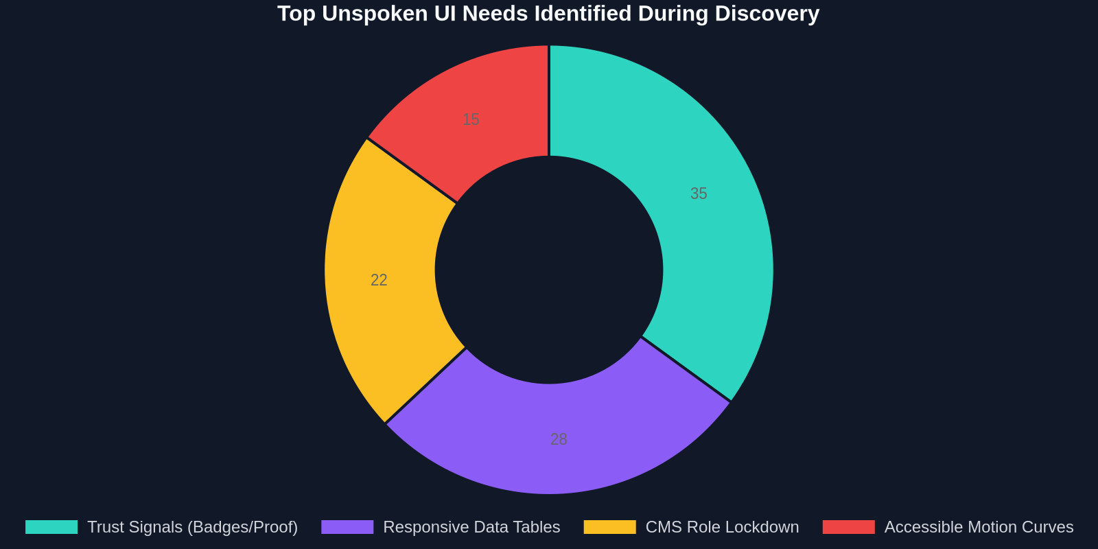
For a home services contractor, the “book a quote” button isn't a UI element; it's a digital representation of a physical clipboard. To translate this to code, you need to think in state machines. The button exists in several real-world states: "Available," "Pending Confirmation," "Emergency Override," and "Seasonal Pause." If your React component or Vue template doesn't handle the logic for a rainy day when roofers are not taking new quotes, the UI fails the business, even if the border-radius is perfect.
2. The Perceptual Lens: "How Do We Digitize Trust?"
Small businesses sell trust, not products. Their UI needs subtle, often non-verbal cues that large brands can skip.
A massive retailer can get away with a generic design system because their brand is ubiquitous. A local florist cannot. The digital discovery here revolves around "earned trust signals." You need to map out where real-time social proof (like an Instagram feed of actual, un-staged deliveries) lives relative to the purchase path. This is a layout dependency requirement. If you place the "freshness proof" below the fold because of a rigid grid, you've technically met the requirement of "I have a gallery," but you've missed the business need of "I need to prove I'm not a wire-service broker."
3. The Maintenance Lens: "Who Changes the Specials?"
The scariest moment for a small business owner isn't launch day; it's the day after. Ask them "At 10 PM on a Friday, when you sell out of the special, how do you update the site?"
If the answer is a hesitant pause, you need to build a no-code admin dashboard integration, or at least a simple content management markup structure. But you also need to lock down the design tokens. If they can slap a 28px neon green headline into the CMS via a WYSIWYG editor, they will, and your beautiful design system collapses in a week. The hidden need here is a technical constraint boundary, a set of utility classes and rigid component slots that preserve the perceptual lens while allowing functional autonomy.
Translating Discovery Notes into a Technical Specification
You've asked the right questions. You have a messy document of hopes, fears, and competitor screenshots. How does this become a design-tokens.json or a root CSS variables file?
Step 1: The UX-to-CSS Audit List
For every business workflow discovered, assign a CSS feasibility score.
If the client's core need is “a table that sorts tax deadlines by urgency,” your CSS requirement is not just display: table. It's a demand for absolute positioning for action icons, sticky column headers (position: sticky; top: 0; with a z-index layer), and responsive collapse strategies (Reddit-style stacking vs. horizontal scroll). Writing these constraints out during the design phase prevents you from realizing later that the HTML structure you picked can't visually communicate the urgency they need.
Step 2: The Design Token Extraction
Small businesses rarely come with a style guide. They come with a truck wrap or a 10-year-old business card. Use a digital color picker on their physical logo file to extract hex codes.
But go deeper. Use a tool to copy the CSS from their favorite competitor’s button. You'll often find specific box-shadow techniques (like 3D raised edges for “click me” clarity) or font-weight combinations (600 bold for headings paired with 400 for body on a 1.5 line-height) that they implicitly associate with "professionalism." You aren't plagiarizing; you are reverse-engineering a visual vocabulary that the target market already responds to. This is significantly faster than iterating through 200 variations of a gradient.
Solving the "Make the Logo Bigger" Paradox
Every web designer has received the feedback. The gut reaction is defensive: "That will wreck the golden ratio." But the underlying business need is legitimate. The user doesn't feel grounded. They don't know where they are. The feedback translated into code means: "The scannable visual hierarchy is weak."
Before you adjust the width attribute of the img tag, check the Gestalt proximity in your header. If the navigation links are closer to the logo than the logo is to the white space around it, the logo visually merges with the navigation. The business owner senses this as "the logo is too small" when the reality is "the grouping is too tight." Fixing the padding (padding-left: 2rem; padding-right: 2rem;) and adding a clear separator border often resolves the issue without altering the width at all. This is the difference between treating feedback as a literal CSS command and treating it as a diagnostic observation.
Automating the Boring Discovery Workflow
The manual gathering of design inspiration, screenshot annotation, and recreation of baseline components is a massive time sink that eats into your hourly rate. Modern frontend workflows allow for a completely different professional conversation.

During a video call with a small business client, instead of saying "I'll go off, design something, and you'll see it next week," say "Let's demo the e-commerce interaction pattern you're describing."
You navigate to a reference site. Using DivMagic, you copy the exact card component, the image zoom interaction, the "quick add" hover layer, the price typography scale, and drop it directly into a Codepen or a local dev environment. The code is already cleaned, your preferred CSS framework extension is applied, and it's live. You and the client are now debating business logic on top of a real, styled DOM node, not a speculative wireframe. The ambiguity is dead. The need is captured, signed off on, and ready to be integrated into the frontend architecture in minutes, not days.
Discovery isn't about documenting a wish-list; it's about capturing a visual decision. The moment a client sees a real DOM element and says 'yes, exactly like that,' the scope is locked.
Handling the “We Don't Know What We Don't Know” Clients
A start-up or a brand-new brick-and-mortar might have zero historical data. You have to build the discovery from first principles. This is where component-based heuristic walkthroughs are essential.
The Component Onboarding
Don't ask "What do you want?" Show them 10 hero section components extracted from various industries. One is video-led, one uses CSS morphing animation, one is stark Swiss minimalism.
By injecting these real, clickable HTML/CSS components into a conversation (easily grabbed from award-winning sites using a browser extension), you build a menu of visual business strategies. Watch their face. The moment they see a hero, you'll hear "That's us." That's not just a design pick; it's a business identity realization that your discovery session just facilitated.
Future-Proofing the Data Model
A UI need might seem simple: "We need a place for featured products."
During discovery, challenge the products data type. "Are these hard-coded HTML list items, or do they need to be pulled from a POS system?" If the answer is "we have an inventory spreadsheet," your UI CSS must be flexible enough to accommodate wildly irregular data lengths. An item title of "Organic Fair-Trade Single-Origin Ethiopian Yirgacheffe Coffee" breaks a fixed-width grid cell faster than you can say text-overflow: ellipsis. The hidden need is a data-agnostic layout. Your discovery uncovered this before you had to refactor a <div class="grid-container"> late on a Sunday night.
The Interaction Gap: What Hover Effects Reveal
In a pixel-perfect Figma file, everything looks static and safe. In a browser, the cursor moves. For small businesses, the interaction layer is often the biggest hidden need because they have never experienced a site with good affordance.
A generic button sends cursor: pointer. Nice. But a button for a high-anxiety action like "Submit Payment" requires transitional reassuring states. The discovery need here is psychological micro-protection. The CSS transition: all 0.2s ease and a transformation of a shield icon to a checkmark reduces cart abandonment. You won't find this in any brief. You'll only uncover it by watching a client nervously tap their trackpad during a demo of a similar tool.
The Final Discovery Deliverable: A root Variables Script
The output of a truly excellent design discovery session isn't a mood board or a PDF document. It's a living style guide starter script. Once you've uncovered the business logic and translated aesthetic preference into code, you can commit the initial design layer.
This might look like:
:root {
  /* Discovery Notes: Derived from bakery's physical packaging. Warm, flour-dusted texture. */
  --color-flour-white: #FDFBF7;
  --color-burnt-honey: #C58422;
  --color-dark-crust: #2E1E0F;

  /* Discovery Notes: Competitive gap analysis showed local rivals use 16px body, illegible for the store's older demographic. We'll set 18px as floor. */
  --font-size-body: 1.125rem;
  --font-family-heading: 'Playfair Display', Georgia, serif; /* Legacy: Matches the in-store signage type found on the 1972 oven door */

  /* Layout constraint from client: "I need to bend the grid for holiday messages" */
  --critical-alert-z-index: 1000;
  --layout-max-width: 82.5rem;

  /* Animation preference: "Nothing dizzy" */
  --transition-smooth: 250ms cubic-bezier(0.4, 0, 0.2, 1);
  --motion-reduce: none; /* Overridden to 'reduce' if user prefers */
}
This CSS is the business logic. It's the documentation. It proves you listened not just to the art direction, but to the operational constraints of the small business.
From Zero to Discovery Hero: Your Role as a Frontend Partner
Small business clients don't lack taste. They lack the technical grammar to bridge the gap between a bank deposit and a border-radius. They are experts in their craft, baking, law, plumbing, and your job during discovery is to be the simultaneous interpreter and code surgeon.
Stop looking for the perfect brief. Start building the tools to capture UI signals in real-time. When you can see a button on a site and capture its pure CSS instantly, or scrape a whole pricing table's layout logic without scrubbing through bloated source code, you shift from being a pixel pusher to a strategic revenue protector. You're no longer asking "What ratio should the hero image be?" You're asking "Does this grid-template-areas scheme support your highest-margin service in the first visual gulp path?"
Every hidden UI need is just a business logic node that hasn't been expressed yet. The craft is in the translation.