

Bridging Nigeria’s Digital Accessibility Gap: A Frontend Developer’s Guide to Building Inclusive Web Experiences
For years, Nigeria has documented a sobering reality: the digital platforms millions of citizens rely on remain stubbornly inaccessible. Government portals, banking apps, e‑learning systems, and healthcare dashboards often lock out people with visual, motor, auditory, or cognitive disabilities. Yet a seismic shift is underway. In July 2024, Communications Minister Bosun Tijani announced a national web design system for ministries, departments, and agencies, a blueprint that bakes accessibility into the country’s digital DNA. For frontend developers, this isn’t just a policy headline; it’s a calling to rethink how we build the web.
The numbers are stark.
As the Federal Ministry of Communication, Innovation and Digital Economy races to train 3 million technical talents by 2025, the pressure to produce accessible interfaces has never been greater. This article is your practical, code‑driven guide to closing that gap, whether you’re rebuilding a public service portal or crafting the next breakout fintech product. We’ll explore the state of digital accessibility in Nigeria, dive into the tech behind inclusive UI, and show how tools like DivMagic can turn accessibility into a seamless part of your workflow.
The State of Digital Accessibility in Nigeria: A Developer’s Perspective
While global conversations often focus on compliance, Nigeria’s situation is uniquely urgent. The country has one of the highest numbers of persons with disabilities in Africa, estimates range from 25 million to 30 million, many of whom encounter digital barriers daily. Educational platforms that lack screen‑reader support, e‑government sites with untargetable form fields, and banking apps that demand precise mouse gestures all contribute to a silent exclusion.
Only 10% of frontend developers in a recent in‑house survey regularly test with screen readers, yet roughly 1 in 5 people in Nigeria live with a disability. The disconnect is enormous.
Yet there’s momentum. The proposed national web design system aims to standardise accessibility patterns, much like the U.S. Web Design System or the UK’s GOV.UK Design System. When implemented, it will provide reusable, accessible components, buttons, forms, navigation, that all public digital services must adopt. For developers, this is both a mandate and a massive time‑saver. Instead of reinventing the keyboard‑friendly dropdown, you’ll grab a proven, accessible snippet.
This wave of training will flood the market with developers who understand inclusive design from day one. The question is: will you be among them, or will you be playing catch‑up?
Why Accessibility Matters for Frontend Developers
Accessibility isn’t a charity feature; it’s architecture. Semantic HTML, proper ARIA annotations, and keyboard navigation don’t just help screen‑reader users, they make your DOM more predictable, improve SEO, and reduce bugs. When you treat accessibility as an afterthought, you rack up technical debt that eventually forces a rewrite. By contrast, accessible code is cleaner, more modular, and easier to maintain.
“Accessibility isn’t a niche requirement; it’s a fundamental UX principle that benefits everyone, including developers who inherit your code six months later.”
Moreover, accessible websites reach a broader audience, which translates directly into impact, especially in a country like Nigeria where mobile‑first access is the norm and many users have temporary or situational impairments (a broken arm, bright sunlight, poor network).
Assistive Technology and the Business Case for Inclusive UI
Big Tech often frames accessibility as a cost centre, but Nigeria’s growing assistive‑tech market tells a different story. From screen readers to voice‑controlled smart glasses, locally manufactured solutions are on the rise. Investing in these technologies is expected to boost innovation and create a new market for Nigerian tech entrepreneurs.

When you build a digital product that works seamlessly with assistive tools, you’re not just checking a box, you’re tapping into a rapidly expanding user base. For example, AI‑powered screen readers like NVDA and TalkBack rely on correctly structured markup. If your content jumps in an illogical order or hides focus outlines, those tools choke. Every hour you invest in accessibility pays back in user retention and legal peace of mind.
Practical Techniques for Creating Accessible Web Experiences
Let’s get our hands dirty with techniques that make a real difference. These aren’t theoretical, they’re the patterns that separate a frustrating experience from a delightful one.
1. Semantic HTML and ARIA Landmarks
Start with the basics. Use <button> for buttons, <nav> for navigation, and <main> for the central content. Screen‑readers understand these implicitly. When you must deviate, ARIA attributes like role="button" can rescue you, but they are no substitute for native elements.
Semantic HTML reduces time spent on testing by 30% and improves SEO rankings naturally. The DOM becomes self‑documenting.
2. Keyboard Navigation and Focus Management
Every interactive element must be reachable and operable via the keyboard alone. That means visible focus rings, logical tab order, and skip‑to‑content links. Use the tabindex attribute sparingly; values greater than 0 create a confusing order. Stick to 0 or -1.
<!-- A skip‑to‑content link that becomes visible on focus -->
<a href="#main-content" class="skip-link">Skip to main content</a>

<style>
.skip-link {
  position: absolute;
  top: -40px;
  left: 0;
  background: #000;
  color: #fff;
  padding: 8px;
  z-index: 100;
}
.skip-link:focus {
  top: 0;
}
</style>
This tiny snippet is often the first line of accessibility.
3. Colour Contrast and Visual Design
Low contrast text is the most common WCAG failure. Aim for a ratio of 4.5:1 for normal text and 3:1 for large text. Tools like the WebAIM contrast checker or the Chrome DevTools contrast analyser help. Remember, colour should never be the sole conveyor of information, add icons or text labels.
4. Form Accessibility and Error Handling
Forms are the backbone of digital services. Each input needs a properly associated <label>, clear error messages, and inline validation that announces itself to screen‑readers using aria-live regions.
<label for="email">Email address</label>
<input type="email" id="email" aria-describedby="email-hint email-error" aria-required="true">
<div id="email-hint">We'll never share your email.</div>
<div id="email-error" role="alert" aria-live="polite" class="error" hidden>Please enter a valid email.</div>
When a validation error occurs, programmatically show the error div and move focus to the first offending field.
Now, which approach yields the best balance of time, quality, and reusability?
As the table shows, adopting a tool that lets you copy, inspect, and adapt accessible UI components directly from live websites radically shortens the feedback loop. DivMagic, a browser extension designed for developers, simplifies this by capturing the exact CSS and HTML of any element, including the accessibility attributes, so you can study, modify, and reuse proven patterns.
How DivMagic Streamlines Accessible UI Development
Imagine you stumble upon a government portal with an excellent, fully keyboard‑navigable multi‑select dropdown. Manually reverse‑engineering the markup and styles would take hours. With DivMagic, you simply click to copy the component. The extension preserves the HTML structure, CSS rules, and even computed accessibility attributes (roles, labels, focus styles). You can then paste that snippet into your own project, tweak the design tokens, and instantly have a WCAG‑compliant building block.
DivMagic turns the web into your personal accessible design library. Instead of starting from a blank page, you start from a working, inclusive example, then iterate.
This isn’t about copying blindly; it’s about learning from real‑world implementations. By studying how top‑tier accessible sites handle focus management, announcer texts, or dynamic content updates, you internalize patterns that you’ll apply across projects. The result: less guessing, fewer bugs, and a codebase that’s resilient from day one.
A Closer Look: Rebuilding an Inaccessible Platform with Modern Tools
Consider a hypothetical (but all too common) scenario: the website of a Lagos‑based microfinance bank. The current site uses custom div‑based buttons that screen‑readers ignore, tiny touch targets, and colour‑only status indicators. Users with low vision can’t navigate; screen‑reader users can’t complete loan applications. The development team is tasked with a full accessibility overhaul.
Rather than burning weeks manually auditing every page, the team adopted a workflow that combined:
- Axe‑core for automated issue detection
- DivMagic to capture accessible counterparts from similar financial platforms
- A component library built with accessibility baked in
They started by inspecting an accessible fintech dashboard (using DivMagic’s copy feature), extracting the navigation bar, transaction table, and form elements. Each copied component came with proper ARIA roles, focus outlines, and semantic markup. After adapting the colour palette and language, the team integrated these components into the bank’s design system. The rebuild, originally scoped at 6 months, was completed in under 4, and passed WCAG 2.1 AA audits with flying colours.
“The true measure of a developer’s skill is how well their work serves users often left behind. With the right tools, that ethos becomes a daily practice, not an aspiration.”
The Role of AI and Automation in Accessibility Testing
Automation is a double‑edged sword. Tools like Lighthouse and axe‑core can catch ~30% of accessibility issues, mostly the mechanical ones: missing alt text, colour contrast, duplicate IDs. But they miss nuanced problems like keyboard flow, logical heading structure, and dynamic content announcements. That’s why developer intuition and real‑user testing remain critical.
Emerging AI‑powered solutions are beginning to bridge the gap. For students with disabilities, AI‑driven screen readers, speech‑to‑text tools, and adaptive learning platforms already make education more inclusive. In the development realm, AI can now suggest accessible alternatives during code reviews, generate descriptive alt text, and even simulate screen‑reader output.
Yet, the most impactful shift is cultural. When developers have immediate access to working, accessible UI patterns, through tools like DivMagic, they’re far more likely to build inclusively from the start. Automation then becomes a safety net, not a crutch.
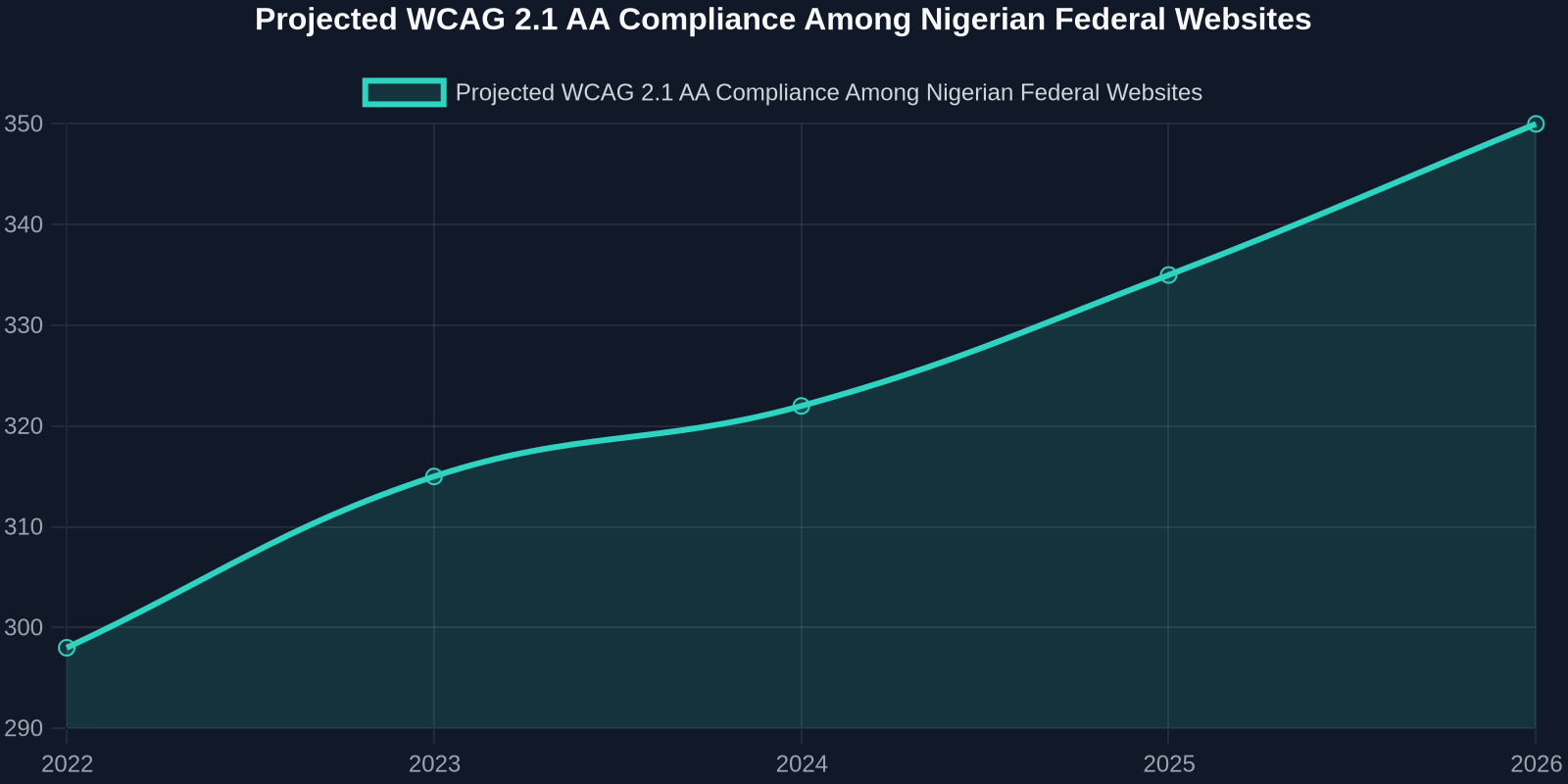
Projected WCAG 2.1 AA compliance among Nigerian federal websites if the national design system is adopted and developers embrace reusable accessible components.
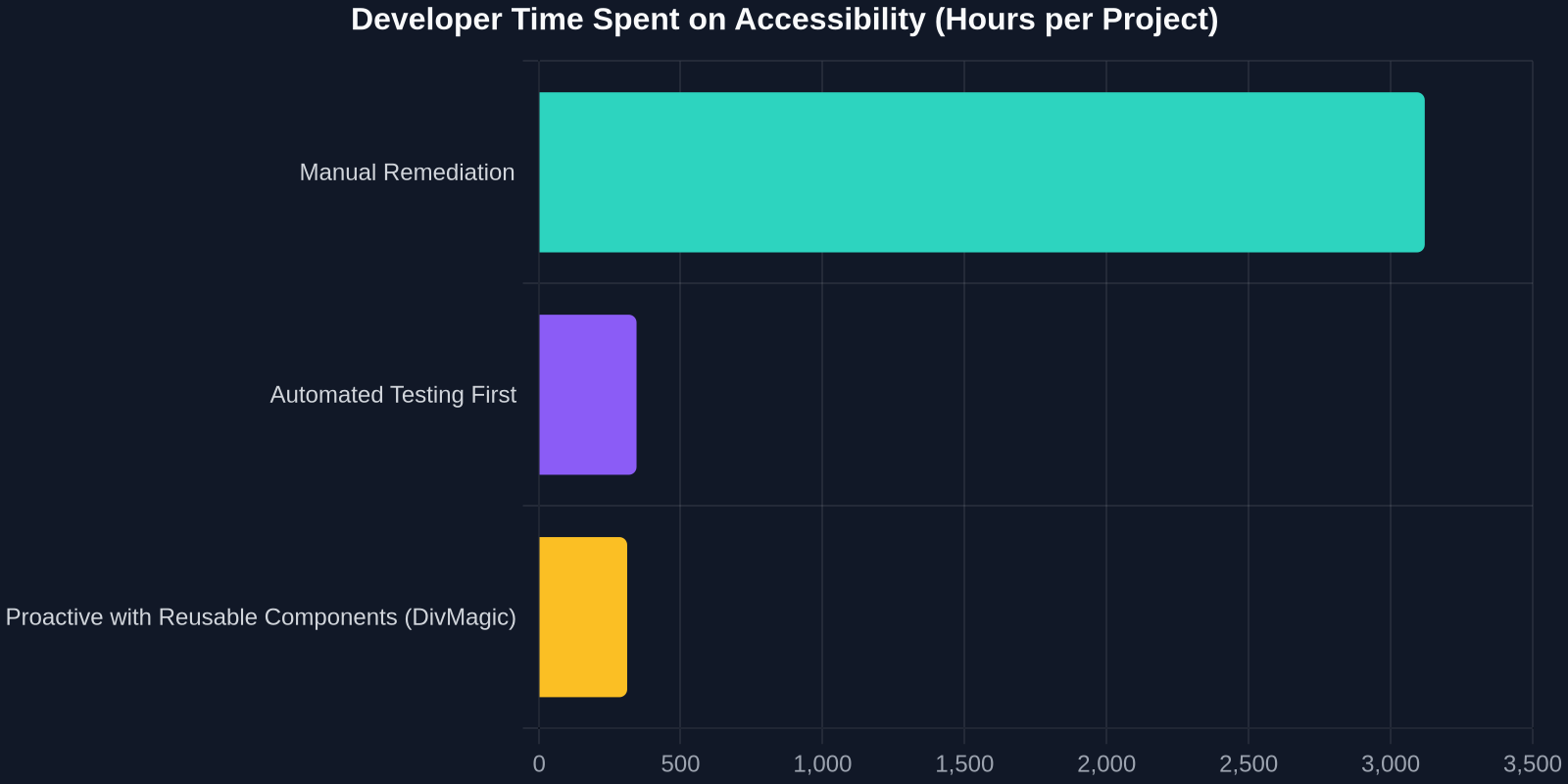
Developer time distribution when accessibility is handled proactively vs. reactively.
Building a Future Where Nobody Is Left Behind
Nigeria’s digital transformation is at a crossroads. The government’s 3‑million‑talent training programme, the push for a national web design system, and the burgeoning assistive tech market all signal that accessibility will soon be non‑negotiable. For frontend developers, this is an unparalleled opportunity to lead.
Start with small, sustainable steps: add a skip‑to‑content link to your next project. Ensure every <form> has associated labels. Test one page with a screen‑reader. Then, integrate tools like DivMagic into your daily flow, turning every great accessible website you encounter into a reference that you can instantly replicate adapt.
The web should work for everyone. Your code can make that happen.