

Responsive Design Examples That Inspire: From Breakpoints to Brilliance
In a digital landscape where users flick between phones, tablets, laptops, and desktops without a second thought, building a website that looks and functions brilliantly across every screen size is no longer optional, it’s the bare minimum. The web is inherently fluid, and our designs must be too. Whether you’re a seasoned frontend engineer or a designer who codes, studying real-world responsive design examples supercharges your ability to craft interfaces that feel at home on any device.
In this deep dive, we’ll walk through standout responsive websites, many drawn from Designmodo’s curated gallery of responsive design examples, and dissect the techniques behind their liquid layouts. More importantly, you’ll learn how to inject these strategies into your own workflow, and how a tool like DivMagic can cut hours from your responsive development cycles.
Why Responsive Design Remains a Cornerstone of Modern Development
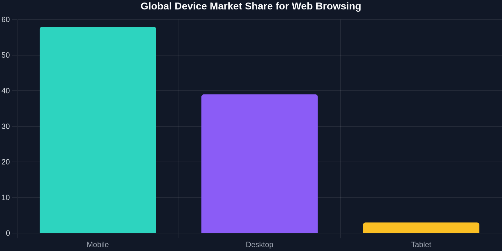
Before we jump into the eye candy, let’s ground ourselves in the business and usability drivers. Responsive design isn’t a buzzword; it’s a performance and conversion lever. Google’s mobile-first indexing, Core Web Vitals, and user expectations all mandate that sites adapt fluidly. When you ignore responsiveness, you hemorrhage visitors.
These numbers aren’t just alarmist stats, they reflect the reality of a multitasking, multi-screen audience. A site that forces horizontal scrolling, tiny tap targets, or squished text isn’t just a bad experience; it’s a lost opportunity. Responsive design directly impacts SEO, bounce rates, and ultimately revenue. The good news? Modern CSS and a healthy dose of inspiration from well-executed examples make it approachable.
Core Responsive Techniques You’ll See in Action
Every responsive design example we’ll explore rests on a few technical pillars. If you can master these, you can recreate almost any layout you see.

Fluid Grids and Relative Units
Forget fixed pixel widths. Fluid grids use percentages, em, rem, or vw to let columns stretch and shrink with the viewport. The classic formula: target / context = result. If a container is 1200px and you want a sidebar of 300px, that’s 25%. Combined with max-width constraints, you get flexible containers that don’t explode on ultrawide monitors.
Flexible Images and Media
Images demand special care. A 2000px-wide image will overflow a 375px screen unless you use max-width: 100% and height: auto. Modern techniques like the <picture> element and srcset offer art direction and resolution switching, ensuring users download appropriately sized assets. For background images, CSS object-fit and object-position give precise control.
CSS Media Queries as the Glue
Media queries let you apply styles when conditions are met, most commonly viewport width. The syntax @media (min-width: 768px) triggers tablet-and-above rules. Smart use of breakpoints (not tied to specific devices but to content) prevents the infamous “breakpoint spaghetti.” A common set: 480px (phones landscape), 768px (tablets), 1024px (small desktops), and 1440px (large screens).
10 Inspiring Responsive Design Examples from Designmodo & Beyond
Now, the part you came for: real websites that nail responsive design. Each example teaches a unique lesson in flexibility and user-centric thinking.
1. The Next Web
The Next Web’s layout is a masterclass in card-based design. On desktop, you see a multi-column hierarchy with featured stories large and secondary articles smaller. On mobile, the grid collapses into a single column, yet the cards maintain visual weight through consistent typography and spacing. The navigation simplifies to a hamburger menu, but the brand remains prominent. Takeaway: a well-defined card component can gracefully reflow anywhere.
2. Dropbox
Dropbox’s homepage uses a clean, centered layout with generous white space. On mobile, the hero section’s two-column split becomes a stacked sequence, and the main call-to-action button stays thumb-friendly. Interesting detail: the illustrations scale down but are replaced with simpler versions on small screens via <picture> and srcset. No bandwidth is wasted.
3. Airbnb
Airbnb’s search page demonstrates responsive image grids that adapt not only in column count but also in row height. Their custom grid relies heavily on CSS Grid’s auto-fill and minmax() functions, creating a masonry-like effect without JavaScript. The filter bar collapses into a horizontal scrollable list on mobile, an intentional pattern that preserves usability while saving vertical space.
4. Stripe
Stripe’s developer-focused site uses bold typography and subtle animations. Responsively, the line lengths are controlled (never exceeding 70 characters) via max-width on text containers. The sticky navigation hides and reappears based on scroll direction using a touch-friendly approach. Code snippets within the site use overflow-x: auto with custom scrollbars to stay readable on phones.
5. GitHub
GitHub’s repository view is dense with information. Their responsive strategy uses a combination of off-canvas panels, progressive disclosure, and collapsed table columns. The “Files changed” tab in pull requests hides side-by-side diffs on narrow screens, defaulting to a unified view. This conditional logic in the UI is a powerful pattern for data-heavy interfaces.
6. Shopify
Shopify’s marketing pages often incorporate video backgrounds that gracefully degrade to static images on mobile to save battery and data. They employ prefers-reduced-motion media queries to respect user accessibility settings. Their navigation uses a mega-menu on desktop and an accordion on mobile, proving that complex menus can remain usable on tiny screens.
7. Smashing Magazine
A publication rich in code snippets and long-form content, Smashing Magazine ensures readability through fluid typography. They use clamp() for font sizes: font-size: clamp(1rem, 0.8rem + 1vw, 1.25rem) creates a smooth scale without media queries. Images inside articles get a float on desktop but become block-level on mobile. This prevents awkward text wrapping around small images.
8. Mailchimp
Mailchimp’s quirky illustrations remain consistent across devices because they are SVG-based. SVGs scale infinitely without quality loss and can be animated with CSS. On mobile, the color palette stays vibrant, and buttons are sized at least 44x44 CSS pixels (Apple’s recommended minimum for touch). Their footer collapses into a vertical list, making links easy to tap.
9. Dribbble
Dribbble’s shot feed uses CSS columns with breakpoints that change from 4 columns to 3 to 2 to 1. However, the real magic is in the individual shot cards: a subtle hover state on desktop becomes a long-press on touch devices. The search bar expands full-width on mobile, and filters become a bottom sheet modal, a pattern that keeps the UI clean.
10. Apple
Apple’s product pages rely heavily on scroll-triggered animations and parallax effects. On mobile, these are simplified or replaced with static versions to maintain performance. Their use of @supports queries lets them progressively enhance for browsers that support position: sticky and IntersectionObserver. The result is a premium feel on every device without sacrificing speed.
Modern CSS Powers That Make These Examples Shine
Many of the standout responsive sites above leverage CSS features that were only theoretical a few years ago. Incorporating them into your arsenal will drastically reduce code and complexity.

Container Queries (The Game Changer)
While media queries look at the viewport, container queries let a component respond to its own container’s size. Finally, a card component can adapt independently when placed in a narrow sidebar versus a wide main content area. Supported in all modern browsers, this is the holy grail for true component-based responsive design.
CSS Grid’s Auto-Fill and Minmax
grid-template-columns: repeat(auto-fill, minmax(250px, 1fr)); gives you a self-orchestrating layout. Columns automatically wrap and redistribute space without any media queries. Combine with gap for gutters and you have a robust card grid that behaves across all widths.
Logical Properties
Instead of margin-left, padding-right, use margin-inline-start, padding-inline-end. These logical properties adapt to writing modes (LTR/RTL) automatically, making your responsive designs more internationalization-friendly.
Viewport Units and Clamp()
clamp(min, preferred, max) is a designer’s secret weapon for fluid typography, spacing, and sizing. No more juggling media queries for font sizes, just set a dynamic scale that never drops below nor exceeds your desired limits.
| Approach | Time to Build | Quality of Output |
|---|---|---|
| Desktop-First Development | 4h | Variable |
| Mobile-First Development | 5h | Consistent |
| DivMagic-Assisted Workflow | 2h | Excellent |
Turbocharge Your Responsive Workflow with DivMagic
Studying responsive design examples is invaluable, but manually reverse-engineering a complex responsive layout can drain hours. This is where DivMagic enters the scene. As a browser extension, DivMagic lets you copy any UI component from virtually any website and export it as clean, ready-to-use CSS, HTML, or React code. Need that elegant Airbnb card grid? Select it, copy it, and drop it into your project, instantly.
DivMagic doesn’t just grab the styles; it understands the responsive context. It extracts media queries, flex and grid configurations, and relative units so that the component you paste already behaves responsively. This means you can study real-world implementations by directly inspecting and reusing them, slashing the prototyping phase dramatically.
Beyond copying, DivMagic helps you build a personal library of responsive patterns. Collect cards, navigations, hero sections, and footers from various sites, then remix them into your own design system. Over time, you accumulate battle-tested components that work across devices without reinventing the wheel.
Responsive Design Adoption: The Trend Is Only Going Up
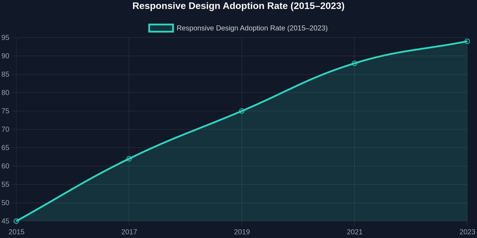
Looking at the data, the shift toward responsive-first mindsets is unmistakable. The line chart below illustrates the steady climb in responsive site adoption over the past decade. What once was a niche best practice is now mainstream, with over 90% of websites employing fluid breakpoints. However, adoption doesn’t automatically mean quality. Many sites still lack thoughtful touch handling, performance optimization, and accessible navigation on small screens.
That’s why studying the details in exceptional examples, and leveraging tools that accelerate quality implementation, makes a tangible difference in your output.
Best Practices to Extract from These Examples
To synthesize everything we’ve seen, here are the patterns that separate good from great responsive design:
- Mobile-First Mindset: Start with the smallest screen and progressively add complexity.
- Component Responsiveness: Use container queries to build self-aware components.
- Touch-Friendly Interactions: Minimum 44px tap targets, forgiving hover alternatives.
- Performance as a Feature: Lazy load below-the-fold assets, serve scaled images, and reduce motion on mobile.
- Fluid Typography: Use
clamp()and viewport units for a seamless reading experience. - Device-Agnostic Breakpoints: Base breakpoints on content, not manufacturer specs.
Conclusion: Your Responsive Design Transformation Starts Now
Responsive design isn’t a one-time checklist item; it’s an ongoing practice of empathy and technical skill. The inspiring websites from Designmodo and beyond show that a responsive site can be visually stunning, fast, and deeply usable all at once. By adopting modern CSS, studying live examples, and leveraging productivity boosters like DivMagic, you can craft mobile-friendly experiences that stand out, and do it in a fraction of the time.
Next time you encounter a responsive component that wows you, don’t just admire it. Inspect it, learn from it, or copy it with DivMagic for your own project. Your users (and your deadlines) will thank you.