
A 16-Year-Old Girl’s iPhone Theme Is Breaking UI Designers’ Brains: What It Means for Frontend Developers
A recent sensation on Creative Bloq spotlighted a 16‑year‑old who customised her iPhone home screen into a chaotic, deeply personal mosaic. The result sent shockwaves through design communities: icons randomly sized, layouts ignoring the grid, and a sheer aesthetic that some called “visual noise” while others hailed as the future of interface expression. As frontend developers, we can’t afford to dismiss this as teenage whimsy. Instead, it’s a wake‑up call about the growing gap between rigid design systems and the fluid, user‑driven interfaces people actually want.
This article dissects why this teenage iPhone theme is making UI designers’ brains short‑circuit, and, more importantly, what you can steal from it to build better, more personal web experiences, faster, with tools like DivMagic.
The Home Screen That Defied Every Rule
The girl’s iPhone was a collage of app icons clustered by colour, widgets oddly placed, and shortcuts overlapping in ways that break Apple’s own Human Interface Guidelines. For designers trained in the Bauhaus tradition of uniformity, it looked like a disaster. For the user, every arrangement told a story, grouping apps by emotional association, frequently used tools at thumb‑reach, and purely decorative elements that sparked joy.
Traditional UI thinking demands consistency, predictability, and a single source of truth. Yet here was a 16‑year‑old proving that when users are given even the limited customisation options of iOS, they will bend them to their will. It’s not about ignoring guidelines; it’s about augmenting them with a layer of personal meaning.
Key finding: The emotional usability of a personalised interface often trumps visual harmony for the end user. What professionals see as clutter, the user perceives as clarity that mirrors their mental model.
Why This Is Breaking UI Designers’ Brains
The cognitive dissonance stems from two competing truths. First, design systems exist to reduce cognitive load, speed up development, and create inclusive, accessible products. Second, people are messy, and their digital lives don’t fit into neat 8‑point grids. When a 16‑year‑old demonstrates that a “broken” layout can be more efficient for her, it questions the very paradigm of one‑size‑fits‑all interfaces.
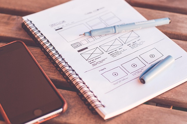
Designers aren’t angry, they’re fascinated. This iPhone theme exposes a bias: we often design for the “average” user, ignoring edge cases. But as the maker movement shows, edge cases are where innovation lives. The girl’s screen is an extreme example of what happens when someone treats technology as a canvas, not a tool.
“Design systems are not about restriction, they are about coherent communication. But maybe we’ve been too rigid for too long, forgetting that coherence and personal expression can coexist.”
The Rise of User‑Driven Design
This isn’t an isolated incident. The article highlights a broader trend: people solving their own problems, turning hobbies into apps, and even covering their Claude bills from small‑scale indie projects. The era of people waiting for corporations to design their digital experiences is fading. Instead, we’re seeing a Cambrian explosion of personal dashboards, custom widgets, and home‑brew UI mods.
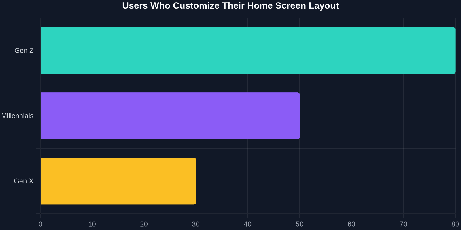
For frontend developers, this signals a shift. We need to build interfaces that are not just usable but malleable. CSS Grid, custom properties, and modern frameworks give us the tools, what we lack is the mindset to enable user‑level theming without breaking the core experience.
How Frontend Developers Can Embrace Flexibility
Instead of fighting the tide, savvy developers are already adopting strategies to support user expression:
- Theme‑aware CSS variables: Expose a palette that users can override via a settings panel or browser extension. A teen could then set their favourite Studio Ghibli colours without touching core layout.
- Grid‑agnostic components: Use CSS Grid with
auto‑fillandminmax()to allow icons and cards to flow organically, similar to how that iPhone home screen reorders itself based on personal rules. - Progressive customisation: Let users pin, hide, or resize sections. A
dashboardweb app that permits drag‑and‑drop reordering respects mental models.
Pro tip: When building customisable UIs, always separate data from presentation. Keep the core logic intact so that even extreme user theming doesn’t break functionality.
Recreate Unique UI Patterns Fast with DivMagic
One hurdle developers face when exploring unconventional designs is the time it takes to replicate interesting patterns seen in the wild. You spot a genius layout on a 16‑year‑old’s iPhone screenshot, maybe a timeline of overlapping circles or a colour‑coded app cluster, and you think, “I could use that in my next project.” Then you spend hours tweaking CSS, guessing at spacing, and debugging z‑index conflicts.
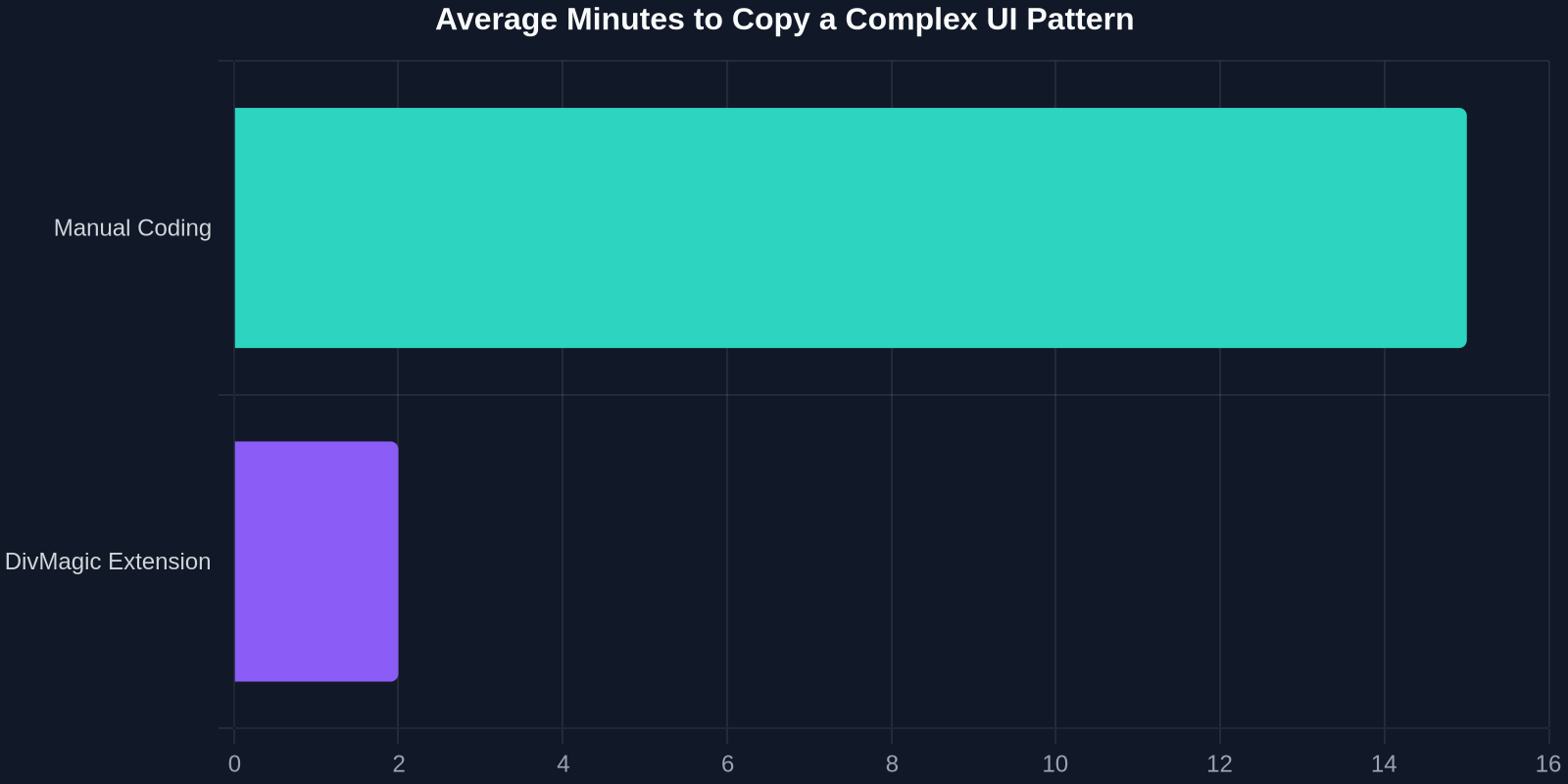
DivMagic changes that equation. The browser extension lets you click on any element, be it a button, a card, or an entire section, and instantly get clean, reusable HTML and CSS. Just as that teenager remixed iOS, you can remix any interface you encounter, legally and efficiently, for your own UI library.
Imagine finding a website with a non‑standard navigation that matches the chaotic brilliance of that iPhone theme. With DivMagic, you inspect, copy, and integrate it into your codebase in minutes. No more guesswork, no more “how did they do that?” rabbit holes. You shave hours off development while still honouring the original designer’s intent, and then you adapt it to your own twist.
Insight: The most innovative UIs often emerge when developers stop reinventing the wheel and start remixing existing patterns. DivMagic is the accelerator for that remix culture.
Lessons from a 16‑Year‑Old: Why “Broken” Might Be Better
“If a teenager can reformulate iOS into a more personal, joyful tool, what’s stopping enterprise software from letting users rearrange their dashboards?”

The iPhone theme is a testament to the hidden design literacy of everyday users. She didn’t break the interface; she re‑authored it. For frontend developers, this is a call to stop designing monoliths and start designing ecosystems. Provide the bones, but let users add the skin, the tattoos, and the accessories.
Accessibility, however, must remain a priority. Wild customisation can accidentally exclude people with visual or motor impairments. The sweet spot is a design system that offers a safe, accessible default while exposing enough “breaking” points for power users. Think of it as a car with a stock chassis but an adjustable seat, steering wheel, and ambient lighting. The core safety is never compromised.
Conclusion: Adapt or Be Broken
The story of a 16‑year‑old girl’s iPhone theme isn’t just a viral curiosity. It’s a stress test for the entire discipline of user interface design. It reveals that users crave ownership, that visual consistency can sometimes feel like control, and that the line between designer and user is blurring. Frontend developers who learn to build for this blurring, with tools like DivMagic to speed up the legwork, will create the next generation of beloved digital experiences. Those who cling to rigid, un‑themeable layouts will find their work increasingly ignored, broken by users who refuse to be boxed in.
Ready to stop fighting and start remixing? Try DivMagic and turn any UI you admire into code you can build upon, just as effortlessly as a teenager rearranges her home screen.