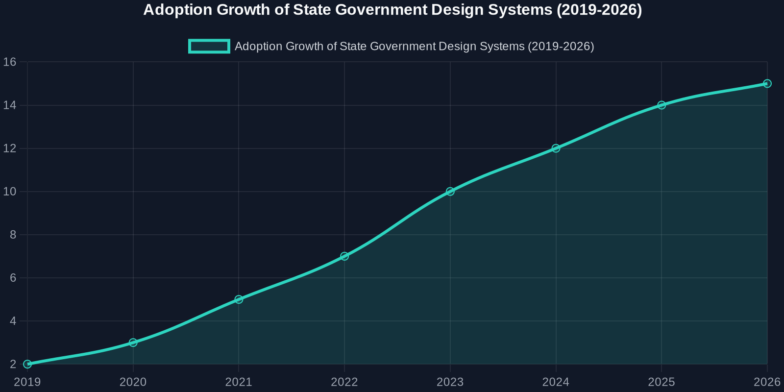
When Texas announced the launch of its accessible, standardized web design system to modernize agency sites, it wasn’t just a win for state government, it was a landmark moment for frontend developers everywhere. The initiative, reported by StateScoop, aims to bring consistency, accessibility, and efficiency to hundreds of state websites serving over 30 million residents.
For developers, this move signals a broader shift: design systems are no longer optional corporate luxuries; they are becoming public infrastructure. And the techniques used to build them, reusable components, accessibility-first CSS, and standardized UI patterns, are exactly what modern frontend developers need to master.
The Core Technical Challenges Texas Addressed
Building a design system for an entire state government presents unique technical hurdles:
- Diverse legacy systems: Agencies use different CMSes, frameworks, and hosting environments.
- Accessibility compliance: Legal requirements under Section 508 and WCAG 2.1 mean zero tolerance for non-compliance.
- Cross-agency collaboration: Design decisions must work for tourism, health services, transportation, and more.
- Long-term maintainability: The system must survive administration changes.
The Anatomy of an Accessibility-First Design System
Texas’ approach mirrors best practices from industry leaders like Google Material Design, IBM Carbon, and the U.S. Web Design System (USWDS). Let’s break down the key technical components.

1. Component-Based Architecture
Rather than providing templates, the Texas design system delivers reusable components with documented APIs. For example, a button component must support multiple states: default, hover, active, disabled, and focus (with visible outlines for keyboard navigation).
/* Example: Accessible button with focus ring */
.usa-button {
  --btn-bg: #005ea2;
  --btn-text: #ffffff;
  --btn-border: transparent;
  background-color: var(--btn-bg);
  color: var(--btn-text);
  border: 2px solid var(--btn-border);
  padding: 0.75rem 1.5rem;
  font-size: 1rem;
  line-height: 1.5;
  border-radius: 4px;
  cursor: pointer;
  transition: background-color 0.2s, box-shadow 0.2s;
}

.usa-button:focus-visible {
  outline: none;
  box-shadow: 0 0 0 4px #2491ff;
}

.usa-button:disabled {
  opacity: 0.5;
  cursor: not-allowed;
}
2. Accessibility Tokens
Design tokens in CSS custom properties and Sass variables ensure accessibility is built into the visual language. Contrast ratios, spacing, and typography all follow pre-set accessibility thresholds.
:root {
  --color-primary: #005ea2;
  --color-primary-dark: #1a4480;
  --color-focus: #2491ff;
  --font-heading: 'Public Sans', sans-serif;
  --font-body: 'Source Sans Pro', sans-serif;
  --line-height-heading: 1.2;
  --line-height-body: 1.6;
  --spacing-unit: 8px;
}
3. Responsive & Mobile-First
Government sites now see over 60% of traffic from mobile devices. The Texas system uses a mobile-first CSS approach with breakpoints tied to content, not devices.
/* Mobile-first grid */
.grid-container {
  display: grid;
  grid-template-columns: 1fr;
  gap: 1rem;
  max-width: 64rem;
  margin: 0 auto;
  padding: 0 1rem;
}

@media (min-width: 48em) {
  .grid-container {
    grid-template-columns: repeat(12, 1fr);
  }
}
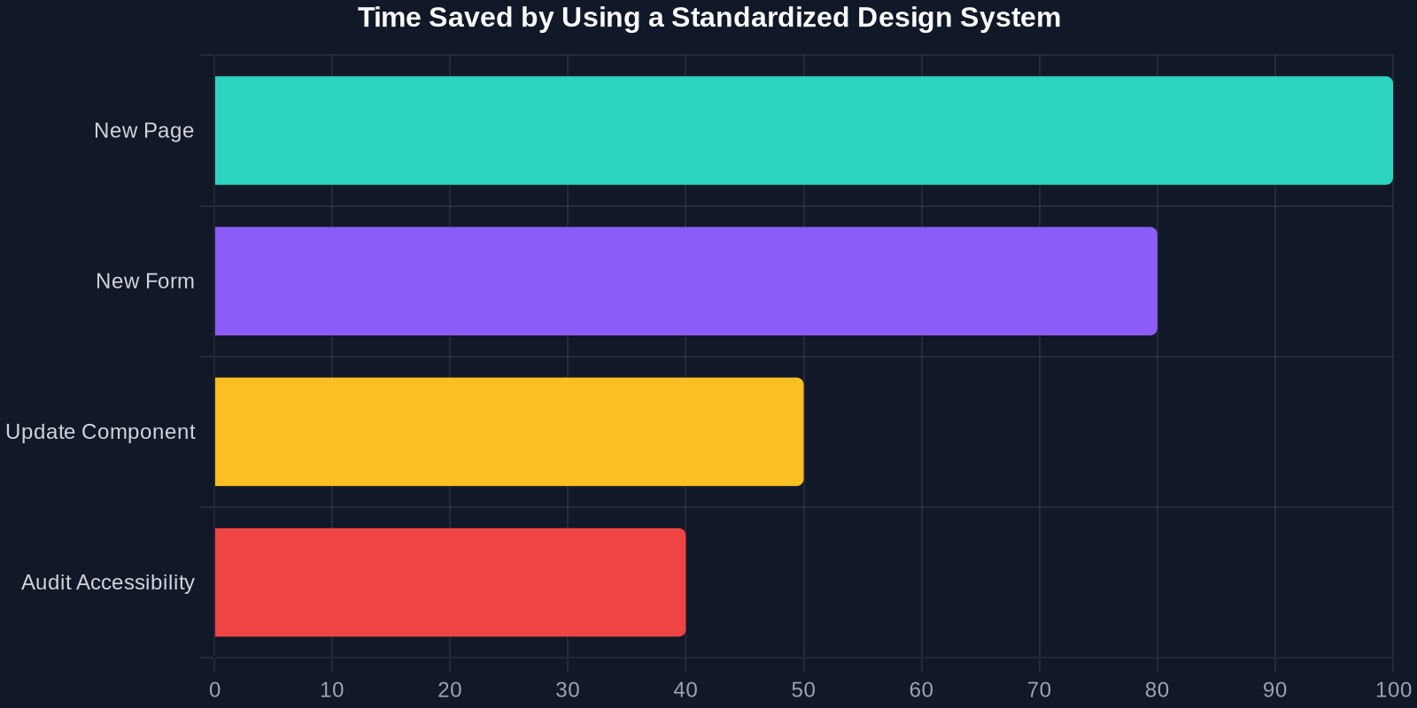
Comparison: Traditional vs. Design System Approach
To appreciate the impact, let’s compare the old way of building government sites with the new standardized system.
Real-World Impact: What Developers Can Learn
Accessibility Is Not a Feature; It’s a Foundation
The Texas initiative proves that accessibility must be the first consideration, not an afterthought. Developers should adopt tools like axe-core or Lighthouse to audit their own code, but even better: choose a design system that bakes in compliance from the start.
Version Your Design System
Just like software, a design system needs semantic versioning. A change to a button’s hover color could break countless pages. Use a changelog and communicate breaking changes with stakeholders.
Document Everything
The most valuable part of Texas’ system is the documentation. Component previews, code snippets, accessibility notes, and usage guidelines. Without documentation, a design system is just a pile of CSS.
Steps to Build Your Own Design System (Inspired by Texas)
Phase 1: Audit Your Existing UI
Catalog every button, form field, card, and modal. Use DivMagic to capture the current CSS and HTML. Look for inconsistencies.
Phase 2: Define Design Tokens
Extract colors, spacing, typography, and shadows from your best-performing pages. Store them in CSS custom properties.
Phase 3: Build Components
Start small: buttons, inputs, alerts. Ensure each component passes accessibility checks. Use a tool like Storybook to document them.
Phase 4: Test & Iterate
Use real user testing and analytics to see how components perform. Update tokens and styles in a systematic way.
Conclusion
Texas’ move to an accessible, standardized web design system is a win for citizens, developers, and the future of public-sector technology. It demonstrates that when you invest in reusable, accessible UI patterns, everyone benefits: faster development, lower costs, and better user experiences.