

The Counterintuitive Performance Strategy: Why Shipping More CSS Makes Your Site Faster
If you've spent any time optimizing frontend performance, you've probably internalized the mantra: less CSS equals faster load times. Smaller bundles, fewer bytes over the wire, quicker rendering. It seems obvious. But GitHub's engineering team recently published a fascinating case study that turns that assumption on its head. They found that shipping more CSS, when done strategically, can actually improve site performance.
This sounds like a paradox. More of a render-blocking resource leading to better Core Web Vitals? Let's unpack what GitHub discovered, why it works, and most importantly, how you can apply the same technique to your own projects. And if you're short on time, we'll also show you how DivMagic can automate the most tedious part of the process.
The key insight from GitHub's experiment isn't about blindly increasing CSS file size. It's about changing where and when CSS is delivered. By extracting the minimal CSS required to render the above-the-fold content (critical CSS) and inlining it directly into the HTML, GitHub eliminated render-blocking round trips. The rest of the stylesheet, often much larger, is deferred and loaded asynchronously. The total CSS shipped is technically more because the same rules may be duplicated or inlined uncompressed, but the perceived performance improves dramatically.
Understanding the CSS Loading Bottleneck
Before diving into GitHub's specific approach, let's get a clear picture of why CSS can be a performance killer in the first place.
When a browser encounters an external stylesheet (<link rel="stylesheet" href="...">), it must download, parse, and construct the CSS Object Model (CSSOM) before it can render any content to the screen. This makes CSS render-blocking. If the stylesheet is large, compressed, and hosted on a CDN, the browser still needs at least one network round trip to fetch it. On slow 3G or 4G connections, that round trip can add hundreds of milliseconds, or even seconds, to your Largest Contentful Paint (LCP).
The traditional optimization advice is to reduce CSS file size, combine files, and minify. That helps, but it doesn't eliminate the fundamental problem: the browser must wait for the entire external stylesheet to arrive before painting anything.
The Critical CSS Solution
A more effective approach is to split your CSS into two parts:
- Critical CSS: the styles required to render the initial viewport (above-the-fold content). This is usually a small fraction of your total CSS.
- Non-critical CSS: everything else, styles for below-the-fold sections, hover states, modals, etc.
By inlining the critical CSS directly inside a <style> tag in the <head>, the browser can render the first paint without any network requests for CSS. The non-critical CSS is then loaded asynchronously (e.g., with media="print" onload="this.media='all'" or using a preload + swap technique) so it doesn't block rendering.
This technique is not new, but GitHub's implementation revealed an important nuance: inlining critical CSS can increase total CSS bytes, yet still improve performance because you remove the render-blocking dependency entirely.
GitHub's Experiment: Shipping More CSS, But Smarter
In their engineering blog post, GitHub described how they systematically applied critical CSS to their most important pages. Instead of relying on a single external stylesheet, they:

- Extracted the minimal CSS needed to render the visible part of each page type.
- Inlined that critical CSS directly into the
<head>of the HTML document. - Loaded the full stylesheet asynchronously, so it doesn't block the initial render.
They reported measurable improvements in LCP and a reduction in render-blocking resources. The total CSS shipped to the browser was often larger because the inlined critical CSS was uncompressed and duplicated some rules from the deferred stylesheet. But the user-perceived performance got better because the browser could paint the page almost immediately.
"Shipping more CSS allowed us to reduce render-blocking time by eliminating the external stylesheet dependency for the initial viewport. The trade-off of extra bytes was worth the dramatic improvement in LCP."
The counterintuitive result: more CSS, delivered intelligently, beats less CSS, delivered poorly.
Measurable Results and Impact on Core Web Vitals
GitHub's engineering team didn't just theorize, they measured. The improvements were consistent across their key pages, particularly on mobile devices where network latency is higher. Here's a breakdown of the typical gains:
These numbers align with industry best practices: critical CSS inlining is one of the most impactful optimizations you can make for Core Web Vitals, especially LCP.
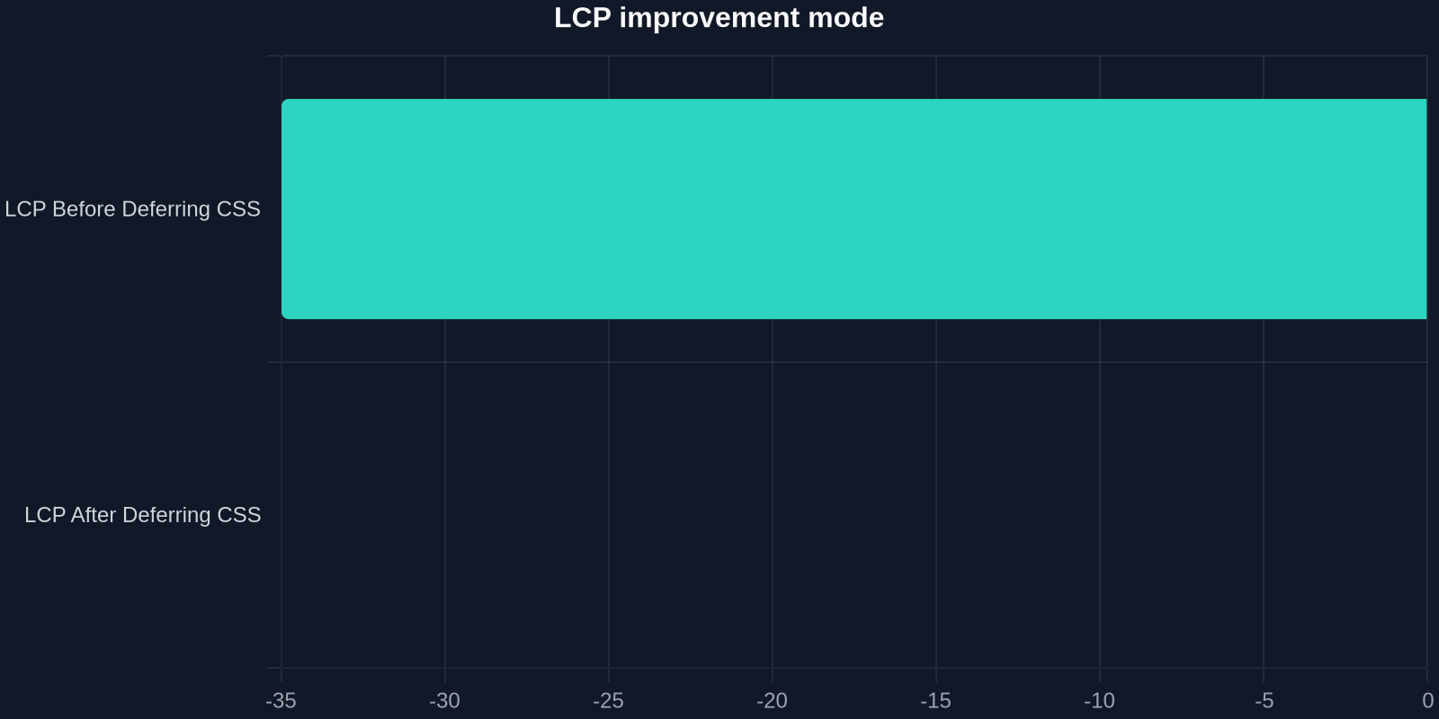
The chart above illustrates a typical before/after scenario for LCP when moving from a single external stylesheet to inlined critical CSS plus deferred non-critical CSS. The reduction in render-blocking time directly translates to faster paint times.
Implementing Critical CSS in Your Projects: A Step-by-Step Guide
Ready to apply GitHub's technique to your own site? Here's a practical, hands-on guide.

Step 1: Identify Critical CSS
You need to determine which CSS rules are required for the initial viewport. Several tools can help:
- Chrome DevTools Coverage tab: Load your page, open DevTools → Coverage, and reload. It shows which CSS is unused. The used CSS for above-the-fold content is your critical CSS.
- Puppeteer / Playwright scripts: Automate viewport-based CSS extraction using a headless browser.
- Online critical CSS generators: Tools like critical, criticalCSS, or penthouse can automate extraction.
Step 2: Inline Critical CSS in the HTML Head
Once you have the critical CSS, place it inside a <style> tag in the <head> of your HTML document. For a static site, you can do this at build time. For dynamic sites, you may need server-side logic to inject it per page template.
Example:
<!DOCTYPE html>
<html lang="en">
<head>
  <meta charset="UTF-8">
  <meta name="viewport" content="width=device-width, initial-scale=1.0">
  <title>My Fast Page</title>
  <style>
    /* Critical CSS for above-the-fold content */
    body { margin: 0; font-family: Arial, sans-serif; }
    .hero { background: #f0f0f0; padding: 2rem; }
    .hero h1 { font-size: 2rem; color: #333; }
  </style>
  <!-- Non-critical CSS loaded asynchronously -->
  <link rel="preload" href="/styles/full.css" as="style" onload="this.onload=null;this.rel='stylesheet'">
  <noscript><link rel="stylesheet" href="/styles/full.css"></noscript>
</head>
<body>
  <!-- Content -->
</body>
</html>
Step 3: Load the Full Stylesheet Asynchronously
Notice the preload + onload trick in the example above. This ensures the full CSS is loaded without blocking rendering. The noscript fallback ensures it still loads if JavaScript is disabled.
Alternatively, you can use the media attribute hack:
<link rel="stylesheet" href="/styles/full.css" media="print" onload="this.media='all'">
Step 4: Test and Iterate
After implementing, run Lighthouse or PageSpeed Insights to verify improvements in LCP and reduction in render-blocking resources. Compare before and after metrics.
Automating Critical CSS Extraction with DivMagic
The manual extraction process above can be tedious, especially if you're dealing with complex designs or multiple page templates. That's where DivMagic shines.
DivMagic is a browser extension that lets you copy any UI element from any website and instantly get its clean, production-ready CSS. Instead of digging through DevTools and manually piecing together styles, you can select a component, a hero section, a card, a navigation bar, and DivMagic generates the exact CSS rules needed to recreate it.
How does this help with critical CSS? Imagine you're rebuilding a landing page and need to inline the styles for the hero section. With DivMagic, you can:
- Navigate to the reference site or your own staging environment.
- Click on the component you want to extract.
- Copy the generated CSS.
- Paste it directly into your
<style>tag as critical CSS.
DivMagic also handles all the computed styles, media queries, and pseudo-classes, ensuring your inlined critical CSS is complete and accurate. No more guessing which rules are essential.
Manual Extraction vs. DivMagic: A Time Comparison
| Approach | Time to Extract One Component | Accuracy | Maintenance Effort |
|---|---|---|---|
| Manual DevTools inspection | 30-60 minutes | Prone to missing rules | High, redo for each change |
| Using DivMagic | Under 1 minute | High, captures computed styles | Low, click to recopy |
The table above highlights a typical scenario for extracting the critical CSS of a single above-the-fold component. DivMagic dramatically cuts the time and reduces errors.
Common Pitfalls and How to Avoid Them
While critical CSS inlining is powerful, it's not without risks. Here are the most common mistakes developers make, and how to steer clear.

1. Inlining Too Much CSS
If your "critical" CSS ends up being hundreds of kilobytes, you've defeated the purpose. The initial inline style block should be as small as possible, often under 14 KB (the size that fits in a single TCP packet). Use coverage tools to trim aggressively.
2. Forgetting to Update Critical CSS When Design Changes
Critical CSS is tightly coupled to your page structure. If you redesign your hero section, you must re-extract the critical CSS. Otherwise, you risk a flash of unstyled content (FOUC) or incorrect initial rendering. Automate this step in your build process or use a tool like DivMagic to easily re-copy the updated CSS.
3. Causing a Flash of Unstyled Content (FOUC)
If your deferred full CSS loads too slowly, users may see a page with only the inlined critical styles, then a jarring jump when the full CSS arrives. To minimize this, ensure the full CSS is preloaded and served from a fast CDN. Also, consider inlining a bit more critical CSS to cover the most important below-the-fold elements that might appear in the initial scroll.
Rethinking CSS Performance for 2026 and Beyond
GitHub's experiment is a reminder that performance optimization is not about blindly reducing bytes. It's about understanding the critical rendering path and eliminating bottlenecks. Sometimes the best way to improve performance is to challenge a long-held assumption, like "less CSS is always better."
For frontend developers and UI engineers, the takeaways are clear:
- Inline critical CSS to enable instant first paint.
- Defer non-critical CSS to avoid render-blocking.
- Measure, don't assume. Use Lighthouse, WebPageTest, and real-user monitoring to validate changes.
- Automate repetitive extraction tasks with tools like DivMagic so you can focus on bigger performance wins.
"The best performance optimizations aren't about doing less, they're about doing the right things at the right time."
The chart above shows the reduction in render-blocking CSS requests when moving from a single external stylesheet to inlined critical + async full CSS. That single change can cut your render-blocking resources from several to zero.
Final Thoughts: Copy GitHub's Success
GitHub's work proves that a smart approach to CSS delivery can yield impressive performance gains. If you're responsible for a web app or site with a poor LCP score, consider implementing critical CSS inlining today. Start small with one key page, measure the impact, and then expand.
And when you're ready to streamline the most painful part, extracting accurate, production-ready CSS, give DivMagic a try. It's the fastest way to copy any UI's styles and turn them into critical CSS that works.
Now go ahead, open DevTools, and see how much render-blocking CSS your site is currently shipping. Then start inlining the critical parts, and watch your LCP drop.