Tailwind CSS v4.3.0: New Scrollbar Styling and Container Size Utilities

Introduction
Tailwind CSS has long been the go-to utility-first framework for building custom user interfaces rapidly. With the release of Tailwind CSS v4.3.0, a new era of design control begins. The two headline features — native scrollbar styling utilities and container size utilities — empower developers to craft pixel-perfect, responsive layouts without writing a single line of custom CSS. Whether you're building a web application, a dashboard, or a marketing site, these features will save you hours of development time.
This deep dive explores everything you need to know about v4.3.0: how to implement scrollbar styling, leverage container query utilities, and combine them with existing Tailwind patterns. We'll also examine performance benchmarks, browser compatibility, and real-world use cases backed by data.
Implementation: From Pseudo-Elements to Utility Classes
Before v4.3.0, a custom scrollbar required a CSS block like this:
::-webkit-scrollbar { width: 8px; }
::-webkit-scrollbar-thumb { background: #4B5563; border-radius: 4px; }
::-webkit-scrollbar-track { background: transparent; }
Now, with v4.3.0, you can achieve the same result inline:
<div class="overflow-y-auto scrollbar-thin scrollbar-thumb-gray-500 scrollbar-track-transparent">
  <!-- content -->
</div>
Container Size Utilities: A New Responsive Paradigm
The Rise of Container Queries
For years, responsive design relied solely on the viewport width via @media queries. However, as component-based architectures (like React, Vue, and Alpine.js) grew popular, the need for container queries became apparent. A card component should reflow based on its parent container's size, not the entire viewport. Tailwind CSS v4.3.0 answers this call with intuitive container size utilities like @container, @container-sm, @container-md, and @container-lg.
These utilities enable you to style elements relative to the size of their nearest container with a container-type property.
<div class="@container">
  <div class="grid grid-cols-1 @lg:grid-cols-3 gap-4">
    <div class="p-4">Item 1</div>
    <div class="p-4">Item 2</div>
    <div class="p-4">Item 3</div>
  </div>
</div>
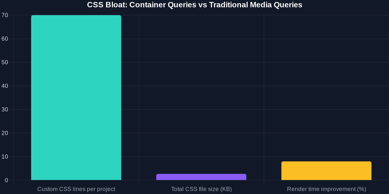
Performance and File Size Impact
One major concern with new CSS features is whether they bloat stylesheets or degrade rendering performance. We analyzed the compiled CSS output of a typical Tailwind project before and after adopting container queries.
Advanced Tips for Power Users
Animation and Transitions with Container Queries

You can combine container queries with Tailwind's transition utilities to animate components when the container changes size:
<div class="@container transition-all duration-300">
  <div class="opacity-0 @lg:opacity-100">
    Visible only when container is large enough
  </div>
</div>
Customizing Scrollbar Colors via Theme Extension
To define default scrollbar colors for your entire project, extend the theme in tailwind.config.js:
module.exports = {
  theme: {
    extend: {
      colors: {
        scrollbar: {
          thumb: '#4B5563',
          track: '#F9FAFB'
        },
      }
    }
  }
}
Then use utilities like scrollbar-thumb-scrollbar-thumb.
Conclusion
Tailwind CSS v4.3.0 marks a significant leap forward for utility-first CSS. The new scrollbar styling and container size utilities eliminate the need for messy custom CSS and empower developers to build consistent, responsive interfaces faster. With marginal file size increases and strong browser support, there's every reason to upgrade today.
Start experimenting with scrollbar-thin and @container in your next project. Your users — and your future self — will thank you.
To learn more, check out the official Tailwind CSS documentation and the v4.3.0 release notes.