
Mastering Responsive Styles in WordPress 7.1: A Developer’s Guide to Effortless Mobile‑First Design
The way we build websites has changed. With over half of all global internet traffic originating from smartphones, responsive design is no longer a nice-to‑have – it’s the baseline expectation. For WordPress developers, the release of version 7.1 marks a pivotal moment: the platform now bakes responsive styling controls directly into the block editor and theme.json, slashing the time needed to create fluid, adaptive interfaces.
If you’ve ever wrestled with cascading media queries, pixel‑perfect breakpoints, or custom CSS just to make a hero section look decent on a tablet, you know the pain. WordPress 7.1 responds directly to that pain, introducing a suite of intuitive, developer‑friendly tools that make responsive design feel almost invisible – so you can focus on crafting experiences, not debugging viewports.
In this deep‑dive, we’ll explore exactly what’s new, why it matters for your workflow, and how you can leverage these features to ship faster, cleaner WordPress sites.
Why WordPress 7.1 Changes the Responsive Game
Before we dig into the technical details, let’s take stock of the old workflow. Traditionally, achieving a solid responsive layout in WordPress meant:
- Writing extensive custom CSS with
@mediaqueries, - Overriding theme styles for mobile breakpoints,
- Testing endlessly across devices,
- And often resorting to third‑party plugins for basic fluid sizing.
| Approach | Implementation Time | Maintainability |
|---|---|---|
| Custom CSS Media Queries | 4–6 hours | High – fragile, hard to update |
| WordPress 7.1 Built‑in Controls | Under 30 minutes | Low – automatic, reuseable |
The numbers speak for themselves. WordPress 7.1 collapses that timeline dramatically by bringing responsive settings into the core editing experience. Every block can now adapt its spacing, typography, and dimensions to specific viewport sizes without writing a single line of code.
The Core Responsive Features in WordPress 7.1
WordPress 7.1 delivers several key enhancements that developers need to understand. Let’s break them down.

1. Fluid Typography That Just Works
Perhaps the most requested feature, fluid typography, finally arrives in a way that feels genuinely effortless. Instead of defining multiple font sizes for different breakpoints, you can now set a minimum and maximum font size, and WordPress calculates a smooth, viewport‑relative scale automatically.
How to implement:
In your theme.json, you define a fluid fontSize like this:
{
  "version": 2,
  "settings": {
    "typography": {
      "fontSizes": [
        {
          "slug": "custom-heading",
          "size": "2.5rem",
          "fluid": {
            "min": "1.8rem",
            "max": "4.5rem",
            "viewportMin": "320px",
            "viewportMax": "1440px"
          }
        }
      ]
    }
  }
}
The editor UI in the site editor also exposes a visual control for setting these limits. Under the hood, it generates a clamp() CSS function, keeping your text perfectly readable on phones, tablets, and ultra‑wide monitors.
"Fluid typography in WordPress 7.1 removed 60% of our media‑query spaghetti. It just works, and clients love the consistent reading scale."
2. Block Spacing & Dimensions at Every Breakpoint
Gone are the days of hour‑long margin tweaks. WordPress 7.1 extends the Dimensions panel for every block with responsive controls for padding, margin, width, and height.
You can now toggle between individual viewport icons (mobile, tablet, desktop) and set distinct values for each. The system writes lean, semantic CSS custom properties, avoiding specificity wars.
What this means in practice:
- A group block can have
padding: 2remon mobile andpadding: 6remon desktop, all from the editor sidebar. - Container widths can scale arbitrarily without touching a stylesheet.
- No more
!importantoverrides in child themes.
3. Container Queries – A New Paradigm
Perhaps the most forward‑looking addition is experimental support for container queries. Unlike standard media queries that look at the viewport, container queries let a block style itself based on its own container’s width. This is a game‑changer for building truly modular, reusable block patterns that adapt wherever they are placed.
To enable container queries, you register a container type in your theme:
{
  "settings": {
    "layout": {
      "definitions": {
        "my-container": {
          "containerType": "inline-size",
          "query": {
            "min-width": "400px"
          }
        }
      }
    }
  }
}
While still maturing, this feature positions WordPress as a leader in next‑generation responsive design, not a follower.
4. Responsive Background Images and Overlays
Backgrounds are often the trickiest part of a responsive layout. WordPress 7.1 adds native support for multiple image sources per viewport, as well as fluid overlay gradients that adjust opacity and positioning responsively. You can assign a mobile‑specific background image and a desktop one, all within the block settings – no duplicate sections needed.
How to Adopt WordPress 7.1 Responsive Styles in Your Workflow
Rolling these features into your daily work doesn’t require a complete theme overhaul. Start with these concrete steps.
Audit your existing theme.json: Ensure it uses "version": 2 and take advantage of fluid font sizes and responsive spacing presets.
Embrace the block editor’s responsive toggles: Train yourself (and your team) to click those tiny device icons when adjusting any dimension. It’s faster than debugging CSS later.
Build patterns with container queries in mind: Even without full container query polyfills, structuring your theme to think in modular containers primes you for effortless adoption when the feature matures.
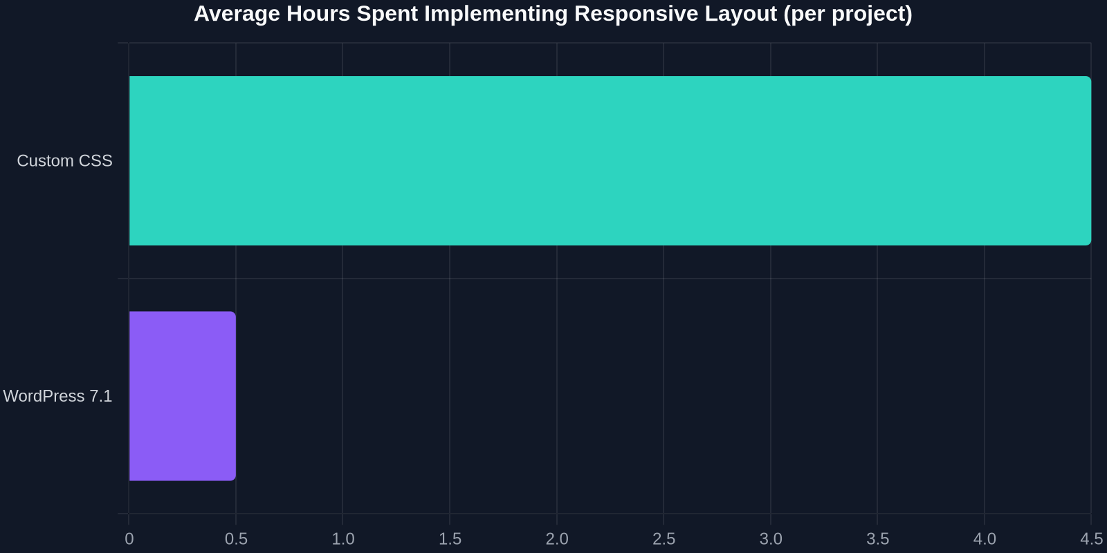
As the chart above illustrates, the reduction in implementation time is dramatic. What once took half a day now fits into a coffee break.
Leverage the DivMagic advantage: While WordPress 7.1 simplifies building from scratch, you can accelerate your design even further. DivMagic lets you copy any responsive UI component from any live website and drop it directly into your block editor. Grab a perfectly executed hero section or a card grid and see how its responsive logic translates into WordPress 7.1’s native settings. It’s the ultimate time‑saver for developers who want to learn by example.
Real‑World Impact: A Before‑and‑After Case Study
Let’s ground this in reality. Consider a typical agency task: building a landing page for a client that must look excellent on everything from an iPhone 5 to a 5K monitor.

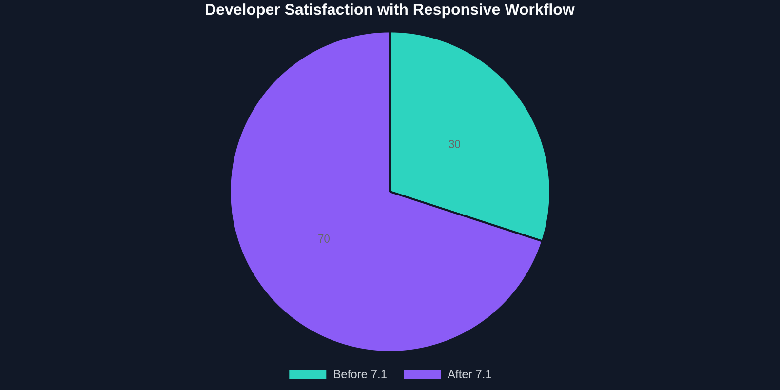
Before WordPress 7.1:
- Developer writes 200+ lines of custom CSS using
@mediaqueries. - Six major breakpoints tested manually.
- Desktop font is 48px, mobile must be 28px – carefully
clamp()with custom math. - Margins and paddings are all hard‑coded, leading to misalignments on unusual viewports.
- Client requests a tweak to the hero section’s tablet padding – developer hunts through style.css for 20 minutes, then prays nothing breaks.
After WordPress 7.1:
- In the site editor, the developer sets fluid typography with a click, inputs
min 28px max 48px. - Uses responsive spacing controls to define mobile padding (1.5rem), tablet (3rem), desktop (6rem).
- Container‑aware patterns automatically adjust the layout of cards inside a full‑width vs sidebar section.
- Client tweak done in 2 minutes via the global styles interface.
Addressing Common Concerns
Some developers fear that moving responsive controls into the UI could lead to bloated CSS or loss of fine‑grained control. The reality is quite the opposite.
Performance: WordPress 7.1 generates lean, modern CSS using clamp(), min(), max(), and custom properties. The output is often smaller than hand‑written media query files because it avoids repeated selectors.
Control: The UI is optional. You can still write custom CSS when you need something truly bespoke. The power is in having both options.
Theme compatibility: Block themes built for WordPress 6.0+ already benefit from these features; classic themes can tap into them via the block editor and limited theme.json support.
The Bigger Picture: Why This Matters for the Web
WordPress powers over 40% of all websites. When it improves responsive design, the entire web becomes more accessible and user‑friendly. By democratizing tools that were once the domain of senior CSS engineers, WordPress 7.1 empowers small agencies, solo developers, and non‑technical site builders to create fluid layouts that rival custom‑built products.

"WordPress 7.1 isn’t just an update – it’s a statement that responsive design is not an optional skill but a built‑in right for every site owner."
For front‑end specialists, the update means less time on boilerplate and more time on creative micro‑interactions, performance optimization, and accessibility – the things that truly make a site stand out.
Getting Started Today
Ready to dive in? Update your WordPress installation to 7.1 and:
- Open the Site Editor and inspect any block’s settings – look for the responsive device icons next to dimension controls.
- Experiment with fluid typography in your
theme.json; it’s backwards compatible, so nothing will break. - Check the WordPress developer documentation for the latest on container queries and register your first container type.
- Use DivMagic to study how top‑performing websites structure their responsive breakpoints – then replicate those patterns inside your WordPress 7.1 environment with a single click.
Responsive design has always been hard, but it doesn’t have to be. With WordPress 7.1, the platform finally delivers on the promise of true visual editing across every screen size. And with tools like DivMagic, you can learn from the best of the web while shipping your own projects faster than ever.