

How a 16-Year-Old's iPhone UI Is Redefining Digital Design, and What Developers Can Learn from It
If you’ve spent any time on TikTok or Instagram lately, you’ve probably stumbled upon a new breed of content: teenagers meticulously arranging their iPhone home screens with custom widgets, pastel-toned app icons, and hand-drawn aesthetic themes. What started as a quarantine hobby has evolved into a full-blown movement that is fundamentally challenging the conventions UI designers have relied on for decades.
A 16-year-old girl’s iPhone X, once considered just another device, is now a canvas, and her radical personalization choices are making seasoned designers question everything they thought they knew about usability, visual hierarchy, and interactivity. This isn’t just a fleeting social media trend; it’s a glimpse into the future of interface design, where users demand unprecedented control over their digital environments.
For frontend developers, the implications are profound. When the next generation of users expects applications to bend to their aesthetic will, how do we build systems that are both structured and infinitely flexible? In this article, we’ll dissect the phenomenon, explore the underlying design principles being broken (and reborn), and show you how to harness these insights in your own development workflow, with a little help from tools like DivMagic.
The Home Screen Revolution: Why Teenagers Are Breaking UI Norms
Apple’s introduction of iOS 14 in 2020, with its support for widgets and the Shortcuts app’s ability to create custom app icons, unexpectedly handed users a powerful customization toolkit. While many adults saw it as a nice-to-have, teenagers, particularly young women, seized the opportunity to turn their phones into intensely personal, visually stunning interfaces.
The results are screens that would horrify a traditional usability expert: icons placed purely for color coordination rather than task flow, widgets that sacrifice glanceable information for aesthetic appeal, and navigation patterns that rely on muscle memory over visual cues. Yet, users report feeling more connected to their devices and even experiencing less stress because the interface reflects them.
Consider the “Neumorphic” trend or the explosion of “iOS 14 aesthetic” packs sold on Etsy. These customizations often violate core heuristics like Fitts’ Law, making touch targets smaller or irregularly spaced, but the engagement metrics tell a different story. When a user invests time into designing their own space, the emotional attachment increases dramatically, a phenomenon known as the IKEA effect.
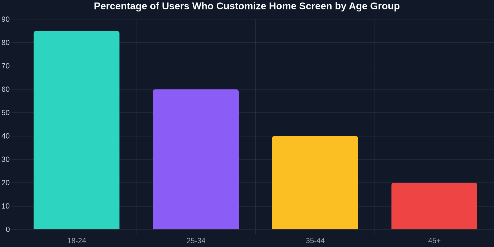
This data illustrates the stark generational divide. Older demographics tend to stick with default layouts for efficiency, while younger users are willing to trade some immediate usability for self-expression. The message for developers: default efficiency isn’t the only path to user satisfaction.
Breaking the Grid: When Asymmetry Becomes the Norm
For decades, we have preached the gospel of the grid. From Bootstrap’s 12-column system to CSS Grid layouts, alignment and consistency have been pillars of good design. A 16-year-old’s iPhone screen, however, might feature app icons arranged in a zigzag pattern, a weather widget floating over a solid color block, and a custom battery indicator shaped like a tiny crystal.
This “broken grid” aesthetic doesn’t just look different; it forces us to reconsider how we build layout components. Instead of rigid templates, we need configurable grid systems that allow users to override positions, sizes, and spacing without breaking the overall structure.
Here’s a practical CSS example: a dashboard layout that developers can control, but which also exposes CSS custom properties for user-defined themes.
/* Base grid with flexible cells */
.dashboard {
  display: grid;
  grid-template-columns: repeat(auto-fill, minmax(100px, 1fr));
  gap: var(--user-gap, 12px);
  background: var(--user-bg, #ffffff);
}

/* Custom icon widget that can morph into any shape */
.custom-icon {
  width: var(--icon-size, 60px);
  height: var(--icon-size, 60px);
  border-radius: var(--icon-radius, 12px);
  box-shadow: var(--icon-shadow, 0 4px 6px rgba(0,0,0,0.1));
  background-image: var(--icon-image, url(default.svg));
  transition: transform 0.2s ease;
}
By defining --user-gap, --icon-radius, and other properties, we hand the aesthetic control to the user while keeping the codebase maintainable. This pattern is essentially a design API for your UI.
Why Traditional Design Principles Are Getting a Teenage Makeover
Let’s map out how classic UX principles are being reinterpreted, and sometimes deliberately ignored, by this new generation of users.

| Principle | Traditional Interpretation | Gen Z Remix | Technical Implication |
|---|---|---|---|
| Fitts’ Law | Larger touch targets are faster to tap | Tiny, nested icons for aesthetics; memorized positions | Support variable hit areas; decouple visual size from interaction area |
| Hick’s Law | Fewer choices reduce cognitive load | Screens packed with dozens of custom actions | Provide powerful search and filtering to manage visual overload |
| Visual Hierarchy | Size, color, and contrast guide attention | Pastel monochrome palettes; hidden elements in plain sight | Offer multiple hierarchy modes: functional vs. emotional |
| Consistency | Similar actions look the same across the system | Every icon and widget is unique to the user’s theme | Separate semantics from aesthetics; use data-attributes for behavior |
This table reveals a crucial insight: the old rules aren’t wrong, but they are incomplete. The next generation of tools must offer dual-layer interfaces, a functional layer that adheres to usability standards, and a presentational layer that is entirely open to manipulation.
The Rise of Emotional UI
When a user spends hours hand-picking icons to match their wallpaper, they aren’t optimizing for task efficiency; they’re optimizing for emotional resonance. This is where the concept of emotional UI comes into play, designing interfaces that users feel attached to, not just comfortable with.
For frontend developers, this translates to supporting whimsical micro-interactions, dynamic themes, and even allowing users to break the interface on purpose. CSS Houdini, for example, lets you create custom paint worklets that users could theoretically modify.
This statistic underlines a key business case: customization drives engagement. Social media platforms like Instagram have already started integrating more customizable widgets for Stories and Reels. The line between a platform and a canvas is blurring.
Learning from the iPhone Wunderkinds: Techniques for Developers
How can a frontend developer capture the essence of this trend without shipping a fragmented product? The answer lies in separating content architecture from visual styling. Think of it as applying the separation of concerns principle up a level.
1. Dynamic CSS Grid with User-Defined Templates
Allow users to define their own grid templates using a syntax inspired by CSS Grid, but exposed through a user-friendly interface. A JSON configuration could look like:
{
  "layout": {
    "gridTemplateAreas": [
      "weather weather spotify",
      "clock health spotify",
      ". calendar calendar"
    ],
    "gap": "16px"
  }
}
Your component would then apply this dynamically:
function CustomGrid({ config }) {
  const style = {
    display: 'grid',
    gridTemplateAreas: config.layout.gridTemplateAreas
      .map(area => `'${area}'`)
      .join(' '),
    gap: config.layout.gap
  };
  return (
    <div style={style}>
      {config.widgets.map(w => <Widget key={w.id} area={w.area} />)}
    </div>
  );
}
This approach gives power users exactly what they want while keeping the underlying components robust.
“The interface becomes a reflection of identity, not just a tool. That emotional bond is what every product should strive for.” – Interaction Design Lead at a major social app
2. SVG Icon Systems That Morph on Demand
The custom icon craze means we need icon sets that are more than static SVGs. Use CSS variables within your SVG markup to allow colors, stroke widths, and even paths to be altered in real-time.
<svg class="app-icon" viewBox="0 0 24 24">
  <path d="M12 2L2 7l10 5 10-5-10-5z" fill="var(--icon-color, #2196F3)" />
  <path d="M2 17l10 5 10-5" stroke="var(--icon-stroke, white)" stroke-width="var(--stroke-width, 2)" />
</svg>
Paired with a user-friendly color picker, these icons become instantly personal.
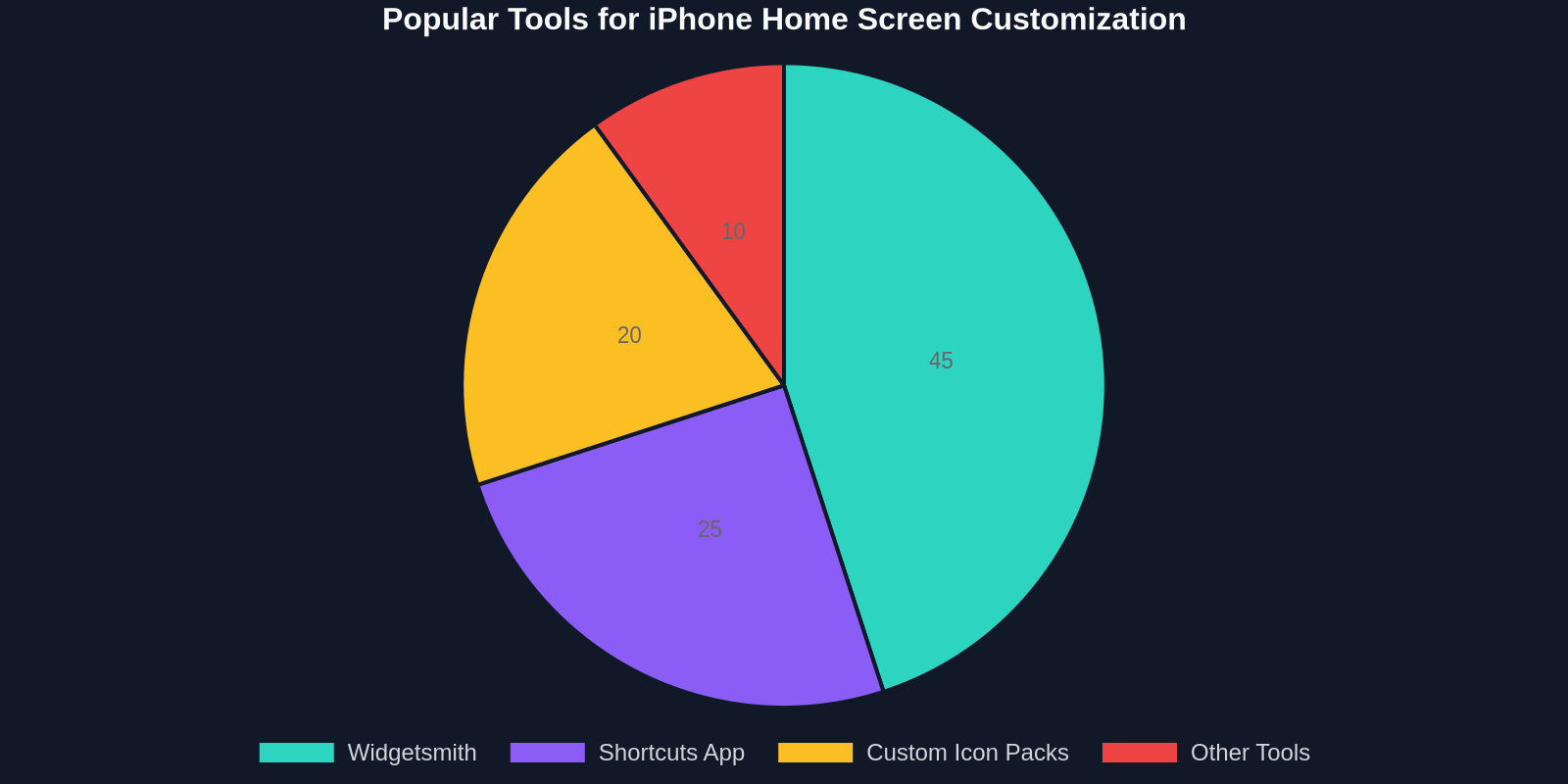
As shown, Widgetsmith and custom icon packs dominate the customization toolbox. Developers building widget frameworks should therefore prioritize flexible styling APIs over complex functionality.
3. DivMagic: Replicate Inspiration Without Reinventing the Wheel
Staring at a breathtaking user-generated home screen, you might wonder, “How can I prototype a similar layout for my web app?” This is where DivMagic comes into play. DivMagic is a browser extension that lets you clone any UI element from any website, styles, structure, and all, and export it as clean HTML/CSS or a React component.
Imagine seeing a beautifully designed widget on an iOS concept site. Instead of dissecting it manually, you can use DivMagic to capture the exact box model, typography, and spacing. Then, you can integrate that into your own design system, tweaking the CSS custom properties to make it user-editable.
For instance, you could:
- Copy a neumorphic card from a Dribbble showcase.
- Paste it into your codebase with the original styling intact.
- Replace fixed values with CSS variables so your users can later adjust shadows and background colors.
This workflow dramatically cuts the time from inspiration to implementation, letting you focus on the architecture of adaptability.
The Dark Side of Complete Freedom: Maintaining Cohesion
While personalization has clear benefits, unconstrained freedom can degrade brand identity and accessibility. A crucial task for developers is to provide guardrails, optional, override-able constraints that keep the interface functional for everyone.

One strategy is to implement a “safety check” system that evaluates user-defined themes for critical metrics:
- Contrast ratio between text and background (minimum 4.5:1)
- Minimum touch target size (at least 44x44 CSS pixels)
- Consistent interactive states (hover, focus, active)
If a user’s custom theme fails, the system can automatically adjust the problematic values, with a polite notification explaining why. This teaches users about inclusive design while preserving their creative freedom.
Designing the Theming Engine
To avoid chaos, implement a theming engine based on design tokens that map semantic intentions to visual styles. For example, a primary-surface token can be set to any color, but will always have a corresponding on-primary-surface text color with sufficient contrast.
:root {
  --color-surface-primary: var(--user-bg, #ffffff);
  --color-on-surface-primary: calculate-contrast-color(var(--color-surface-primary));
}
The calculate-contrast-color function could use a tiny JavaScript utility that returns black or white based on luminance. Such automated helpers keep the design cohesive while the user feels in control.
What the Future Holds: Code as a Canvas
Looking ahead, we’re moving toward interfaces that are programmable by the end-user. Tools like SwiftUI’s WidgetKit and JavaScript’s Web Components already hint at an ecosystem where widgets are small, self-contained apps users can remix.
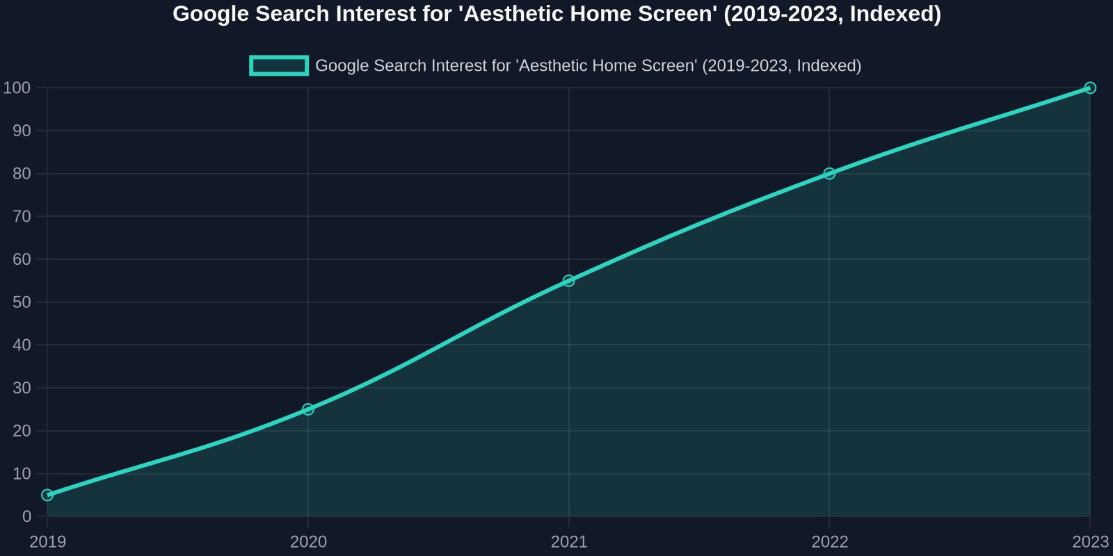
The sharp rise in interest for “aesthetic home screen” over the last five years signals a permanent shift. It’s not a fad; it’s a precursor to how we’ll interact with augmented reality (AR) and mixed reality (MR) spaces, where the entire environment is user-designed.
As a frontend developer, you can prepare now by:
- Adopting component-driven architecture in your projects.
- Exposing design APIs via CSS custom properties and slots.
- Using tools like DivMagic to quickly prototype and deconstruct innovative UIs from the web.
- Learning from the “breaking” of old rules to discover new, emotionally intelligent design principles.
Conclusion: Embrace the Chaos
The 16-year-old with an iPhone X isn’t just arranging app icons; she’s reshaping the digital landscape. Her refusal to accept default interfaces is a lesson in user agency. For UI designers and frontend developers, the message is clear: stop designing rigid products and start building flexible platforms.
Let the grid be broken; let the icons be pastel pink; let the widgets tell a story. The technology exists, CSS, web components, and tools like DivMagic, to make it happen without sacrificing performance or maintainability. The only question is whether we’re ready to listen to the teenagers who are already designing the future, one widget at a time.
So, next time you fire up your editor, ask yourself: “Would a 16-year-old want to use this? And can she make it her own?” If the answer is yes, you’re on the right track.