

सीएसएस कंटेनर क्वेरीज और सबग्रिड: 2026 के लिए रेज़िलिएंट कंपोनेंट लेआउट का ब्लूप्रिंट
रेस्पॉन्सिव डिज़ाइन विकसित हो चुका है। वर्षों तक, मीडिया क्वेरीज ही हमारा एकमात्र उपकरण था लेआउट को विभिन्न स्क्रीनों के अनुसार ढालने के लिए, लेकिन वे कंपोनेंट्स को व्यूपोर्ट पर प्रतिक्रिया करने के लिए मजबूर करते थे, न कि उनकी वास्तविक उपलब्ध जगह पर। 2026 में, CSS कंटेनर क्वेरीज और सबग्रिड वास्तव में रेज़िलिएंट, स्व-निहित कंपोनेंट्स बनाने का मानक बन गए हैं जहाँ भी रखे जाएं, अनुकूल हो जाते हैं।
Combining Container Queries and Subgrid
The real power emerges when you combine both: use container queries to adapt a card’s internal layout based on available space, and subgrid to keep those internal grids aligned with siblings in the same parent container.
Building a Product Card System
Let’s build a product card that works in both wide and narrow containers. The card will contain an image, title, description, price, and a button. When the container is narrow, stack vertically; when wide, use a subgrid-aligned row layout.
HTML```html
Product Title Description text that might vary in length. $29.99 Add to Cart
**CSS**```css
.product-grid {
  display: grid;
  grid-template-columns: repeat(auto-fill, minmax(300px, 1fr));
  gap: 1rem;
}

.product-card-container {
  container-type: inline-size;
  container-name: product;
}

.product-card {
  display: grid;
  grid-template-rows: auto 1fr auto;
  gap: 0.5rem;
  padding: 1rem;
  border: 1px solid #ddd;
  border-radius: 8px;
}

.product-card img {
  width: 100%;
  height: auto;
  border-radius: 4px;
}

.content {
  display: grid;
  grid-template-rows: subgrid;
  grid-row: span 3;
}

@container product (min-width: 400px) \{
  .product-card {
    grid-template-columns: 200px 1fr;
  }
\}
When the container is ≥400px, the card switches to a side-by-side layout with image on the left and content on the right. The subgrid ensures all content rows align perfectly across cards even if one card has a longer title.
2. Dashboard Widgets
Dashboards often place widgets in resizable panels or grid cells. Container queries let each widget reflow its internal content (charts, tables, text) based on the cell width, while subgrid aligns header rows across widgets in the same row.
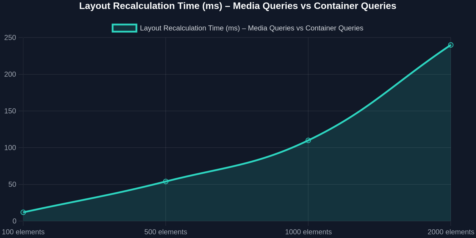
3. E-commerce Product Cards
Product cards appear in search results, recommendations, and category pages, each with different container sizes. Container queries handle the card’s internal layout; subgrid aligns prices and buttons across multiple cards in a grid.
2026 में भविष्य-प्रूफिंग
कंटेनर क्वेरीज और सबग्रिड का संयोजन पहले से ही CSS स्पेक और कार्यान्वयन द्वारा सक्षम है। भविष्य के विकास में शामिल हैं:

-स्टाइल क्वेरीज के लिए कंटेनर क्वेरीज(@container style(--theme: dark)), वर्तमान में प्रायोगिक।
-कंटेनर स्क्रॉल-स्टेट क्वेरीज, स्क्रॉल करने योग्य ओवरफ्लो स्थिति के अनुकूल होता है।
- सबग्रिड में सुधार नेस्टेड सबग्रिड्स (एक सबग्रिड का सबग्रिड) के लिए।
हम एक कंपोनेंट-संचालित CSS की ओर बढ़ रहे हैं जहाँ पुन: प्रयोज्यता प्रथम श्रेणी है। प्रत्येक कंपोनेंट के लिए अलग मोबाइल और डेस्कटॉप CSS लिखने के दिन खत्म हो गए हैं।
निष्कर्ष
कंटेनर क्वेरीज और सबग्रिड केवल नए उपकरण नहीं हैं, वे रेस्पॉन्सिव डिज़ाइन के बारे में सोचने के तरीके में एक मौलिक बदलाव का प्रतिनिधित्व करते हैं। कंपोनेंट लेआउट को व्यूपोर्ट से अलग करके और नेस्टेड ग्रिड्स में सही संरेखण सक्षम करके, वे फ्रंटएंड डेवलपर्स को ऐसे सिस्टम बनाने के लिए सशक्त बनाते हैं जो रेज़िलिएंट, मेंटेन करने योग्य और प्रदर्शनशील हों।
चाहे आप एक डिज़ाइन सिस्टम, डैशबोर्ड, या ई-कॉमर्स साइट बना रहे हों, 2026 में कंटेनर क्वेरीज और सबग्रिड को अपनाने से आपका कोड नाटकीय रूप से सरल हो जाएगा और उपयोगकर्ता अनुभव में सुधार होगा।
छोटी शुरुआत करें: एक कंपोनेंट चुनें, एक कंटेनमेंट कॉन्टेक्स्ट जोड़ें, और अपने व्यूपोर्ट-आधारित ब्रेकपॉइंट्स को कंटेनर-आकार ब्रेकपॉइंट्स से बदलें। आपको आश्चर्य होगा कि आप उनके बिना कैसे रहते थे।