The days of relying solely on viewport-based media queries are numbered. With CSS Container Queries finally gaining widespread browser support, the way we think about responsive design has fundamentally shifted. Tailwind CSS v4, the latest major release of the utility-first framework, embraces this paradigm with native container query utilities that let components respond to their own parent size rather than the global viewport.
In this deep dive, we'll explore how Tailwind v4 implements container queries, walk through real-world examples, compare them with traditional approaches, and show you how to leverage these tools to build truly modular, resilient interfaces. Whether you're designing a complex dashboard or a simple card component, container queries will change how you write CSS.
The Technical Difference: Container Queries vs Media Queries
Media queries act on the viewport or device. Container queries act on a named container. To use container queries, you first define an element as a containment context using container-type: inline-size (or size for both axes). Then, child elements can use @container rules.
/* Traditional media query */ @media (min-width: 768px) \ .card flex-direction: row; \
/* Container query */
.card-wrapper container-type: inline-size;
@container (min-width: 400px)
.card flex-direction: row;
\
Tailwind v4 abstracts this with classes like @container (to set the container), and breakpoint prefixes like @sm:, @md:, @lg: inside utility classes.
How Tailwind CSS v4 Brings Container Queries to Your Workflow
Tailwind v4 introduced a new engine and configuration approach. Container query support is built-in, not a plugin. Here's how you use it:
Setting a Container Add the @container class to any parent element to establish it as a query container. By default, it uses container-type: inline-size.
Container Query Variants Apply responsive utilities with the @ prefix:
@sm:flex-row – applies when container width >= 640px @md:gap-4 – applies when container width >= 768px @lg:text-2xl – applies when container width >= 1024px
You can also use arbitrary values: @[500px]:flex-col.
Advanced Use Case: Dashboard Layout with Nested Containers
Dashboards often use CSS Grid with resizable panels. Traditional media queries break here because panels can be any width. Container queries shine.
<div class="grid grid-cols-1 md:grid-cols-2 gap-4"> <div class="@container p-4 bg-white rounded shadow"> <h3 class="@lg:text-3xl text-2xl font-bold">Sales Chart</h3> <div class="grid @md:grid-cols-2 grid-cols-1 gap-2"> <div class="stat">...</div> <div class="stat">...</div> </div> </div> <div class="@container p-4 bg-white rounded shadow"> <h3 class="@lg:text-3xl text-2xl font-bold">User Activity</h3> <!-- similar responsive inner layout --> </div> </div>
Each panel independently decides its internal grid when its container reaches the breakpoint. If a panel is resized via a drag handle, the layout updates instantly.
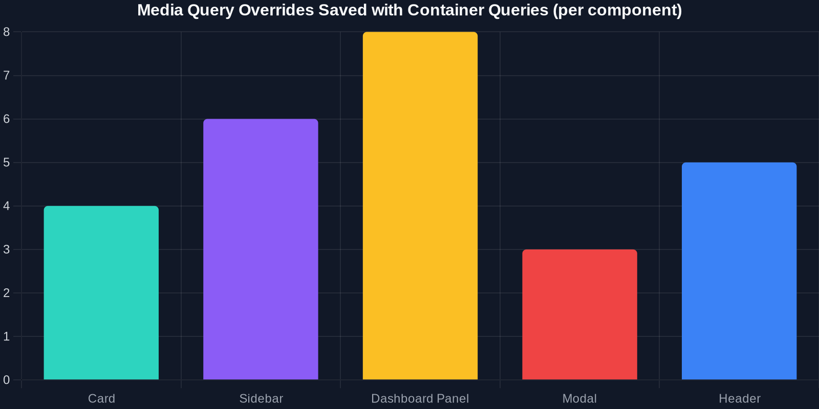
As the chart above shows, container queries drastically reduce the number of media query overrides needed in a typical design system.
Performance Comparison: Container Queries vs. Media Queries
Container queries are not just ergonomic – they can improve performance. Browsers can recalculate styles only for elements inside a given container when that container changes size, rather than recalculating the entire page on viewport resize. This is especially impactful for complex, nested UIs.
Integrating Container Queries with Tailwind v4's New Engine
Tailwind v4 moved from a configuration file to a CSS-first setup. Container queries are part of the core, so no need for plugins. The engine automatically generates all necessary @container variants.
To customize container breakpoints, you can use the new @theme directive:
@import "tailwindcss"; @theme --breakpoint-container-sm: 30rem; --breakpoint-container-md: 40rem; --breakpoint-container-lg: 50rem;
Then use @sm:, @md:, @lg: based on these values. If you don't customize, Tailwind uses the same breakpoints as the viewport ones (640px, 768px, 1024px, etc.), which is a sensible default.
Best Practices for Container Queries with Tailwind v4
-
Always name your containers (optional but recommended) Use container-name: sidebar or the Tailwind utility @container/sidebar to allow multiple containers with different names. This prevents style conflicts when containers are nested.
-
Combine with CSS Grid for maximum layout power Container queries aren't a replacement for grid – they complement it. Use grid for macro layout (page sections) and container queries for micro layout (component internals).
-
Test with container resizing In browser DevTools, you can resize containers by dragging the edge of an element. Use this to verify behavior across container widths without changing viewport size.
-
Fallback gracefully While modern browsers support container queries (Chrome 105+, Firefox 110+, Safari 16+), include a media query fallback for legacy browsers using the @supports (container-type: inline-size) feature query.
@supports (container-type: inline-size)
.card-wrapper container-type: inline-size;
@container (min-width: 400px) ...
@supports not (container-type: inline-size)
@media (min-width: 768px) ...
\
Tailwind v4 doesn't generate fallbacks automatically, but you can wrap your container query utilities in a @supports custom variant using the new plugin API.
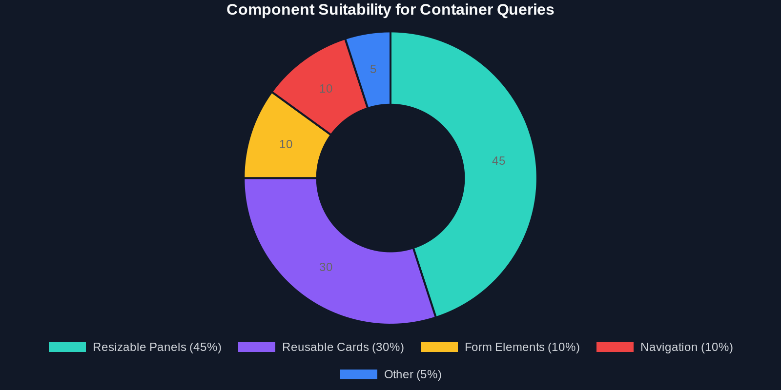
The data shows that most modern websites using responsive components can benefit from container queries, especially in layout-heavy contexts like dashboards and product listing pages.
Real-World Adoption: What's Coming Next
Major design systems (like Shopify's Polaris, Material Design Components) are exploring container queries for component libraries. Tailwind v4's native support will accelerate adoption because developers can incrementally add container query variants without rewriting existing utilities.
We're also seeing CSS frameworks like Open Props aligning with container queries. The trend is clear: the future of responsive CSS is context-aware, not viewport-aware.
Conclusion
Tailwind CSS v4 has made container queries accessible to every frontend developer. By moving from viewport-based thinking to container-based thinking, you unlock truly reusable components that adapt to their environment without magic numbers or brittle overrides.
Start experimenting today:
Add @container to a parent div in your project. Replace some md: utilities with @md: variants. Test your component in different contexts.
And when you need inspiration or a ready-made component, use DivMagic to copy real-world examples – then adapt them with container queries for your design system. The combination of Tailwind v4, container queries, and DivMagic's extraction power will streamline your responsive workflow like never before.