Tailwind CSS v4 Container Queries: Building Modern, Responsive Layouts
Frontend development has entered a new era of responsive design. With the release of Tailwind CSS v4, container queries have become a first-class citizen, enabling developers to build truly component-driven layouts that adapt to their parent container rather than the viewport. This shift is not just a minor update, it's a fundamental change in how we think about responsive design. In this comprehensive guide, we'll explore how Tailwind CSS v4 container queries work, why they matter, and how you can leverage them to create modern, maintainable interfaces.
The core idea is simple: you define a containment context on a parent element, and then query that context's size to apply styles to its children. Tailwind CSS v4 makes this process intuitive with new utility classes like @container and size-based modifiers.
Tailwind CSS v4: A New Foundation
Tailwind CSS v4 represents a major evolution of the framework. It's built on a new engine that leverages native CSS features like cascade layers, @property, and container queries. The result is a faster, more flexible framework that aligns with modern CSS best practices.
Dashboard Widgets
Dashboards often have widgets that need to fit into different grid positions. Container queries ensure each widget looks great regardless of where it's placed.
<div class="@container">
<div class="p-4 bg-gray-100 rounded-lg">
<h4 class="text-sm @lg:text-lg font-semibold">Sales Data</h4>
<div class="mt-2 @lg:mt-4">
<!-- Chart component -->
</div>
</div>
</div>
Here, the heading size and spacing adjust based on the container's width, making the widget feel native to its context.
Comparing Container Queries to Media Queries
While media queries are still essential for page-level layouts, container queries offer distinct advantages for component-level design.
Performance and Best Practices
Container queries are designed to be performant. They avoid the layout thrashing that can occur with JavaScript-based solutions. However, there are best practices to follow.
- Limit container depth: Deeply nested containers can increase complexity. Keep nesting to 2-3 levels.
- Use appropriate containment: The
@containerclass appliescontain: layout inline-size. This is efficient but can affect scrollable areas. - Combine with media queries: Use media queries for page-level layouts and container queries for components. They complement each other.
As the web evolves toward more modular and reusable components, container queries will become indispensable. They reduce code duplication, improve maintainability, and create more consistent user experiences.
Getting Started with Tailwind v4
Ready to try container queries? Here's how to get started with Tailwind CSS v4.
- Install Tailwind v4:
npm install tailwindcss@next - Configure your project: Follow the official installation guide for your framework.
- Start using
@container: Add the class to any element and use container variants on its children. - Experiment: Build a few components and see how they adapt to different containers.
Conclusion
Tailwind CSS v4 container queries are a powerful tool for modern frontend development. They enable truly responsive components that adapt to their context, reducing code complexity and improving user experience. By embracing this new paradigm, you can build more maintainable, scalable, and flexible interfaces.
The data speaks for itself: adoption is growing rapidly, and developer satisfaction is high. 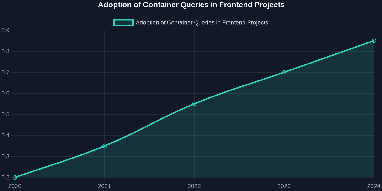 shows the steady increase in container query usage over the past few years, while
 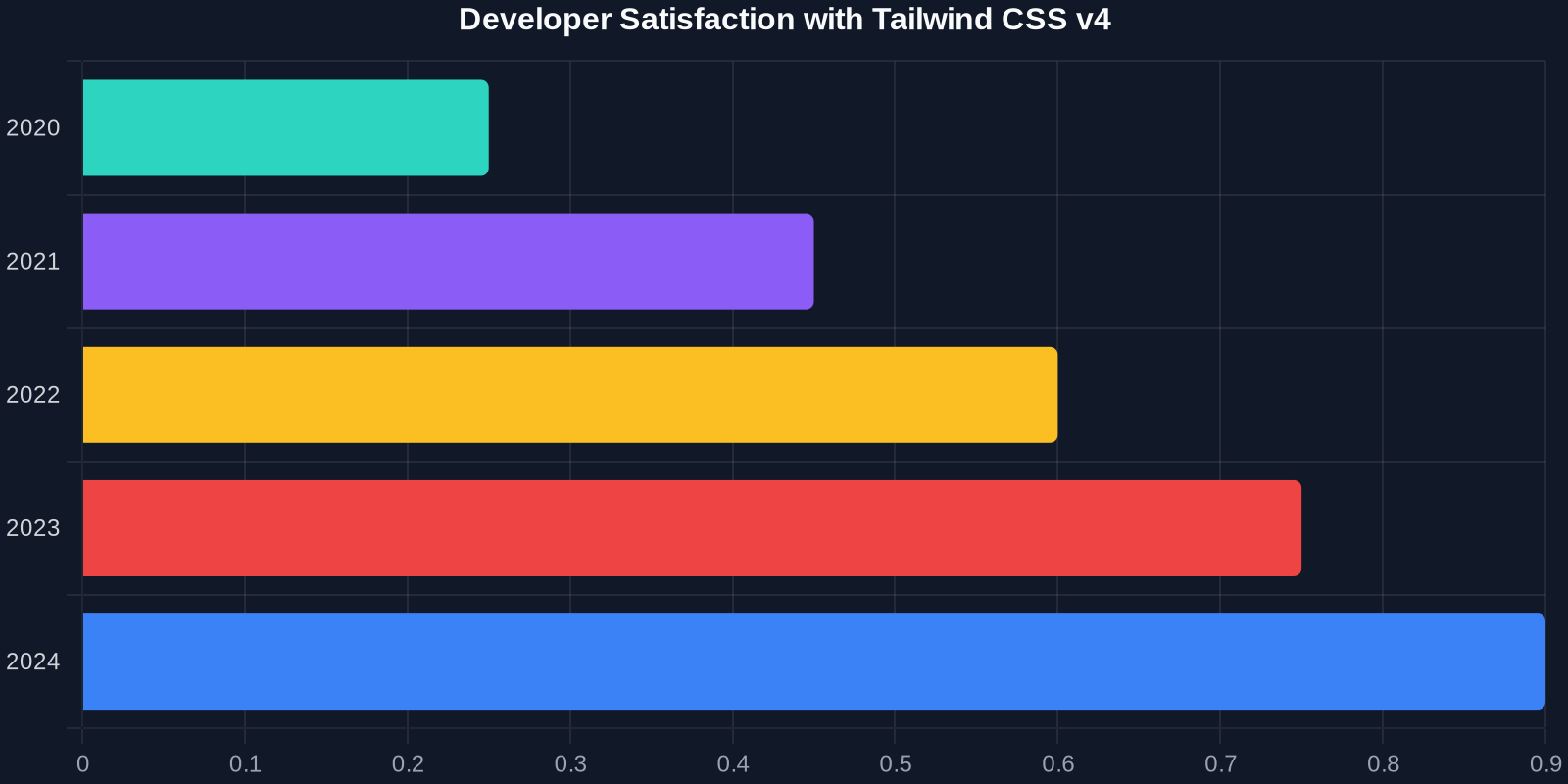 highlights the positive reception of Tailwind v4's implementation.
Start using container queries in your next project. Your components, and your users, will thank you.