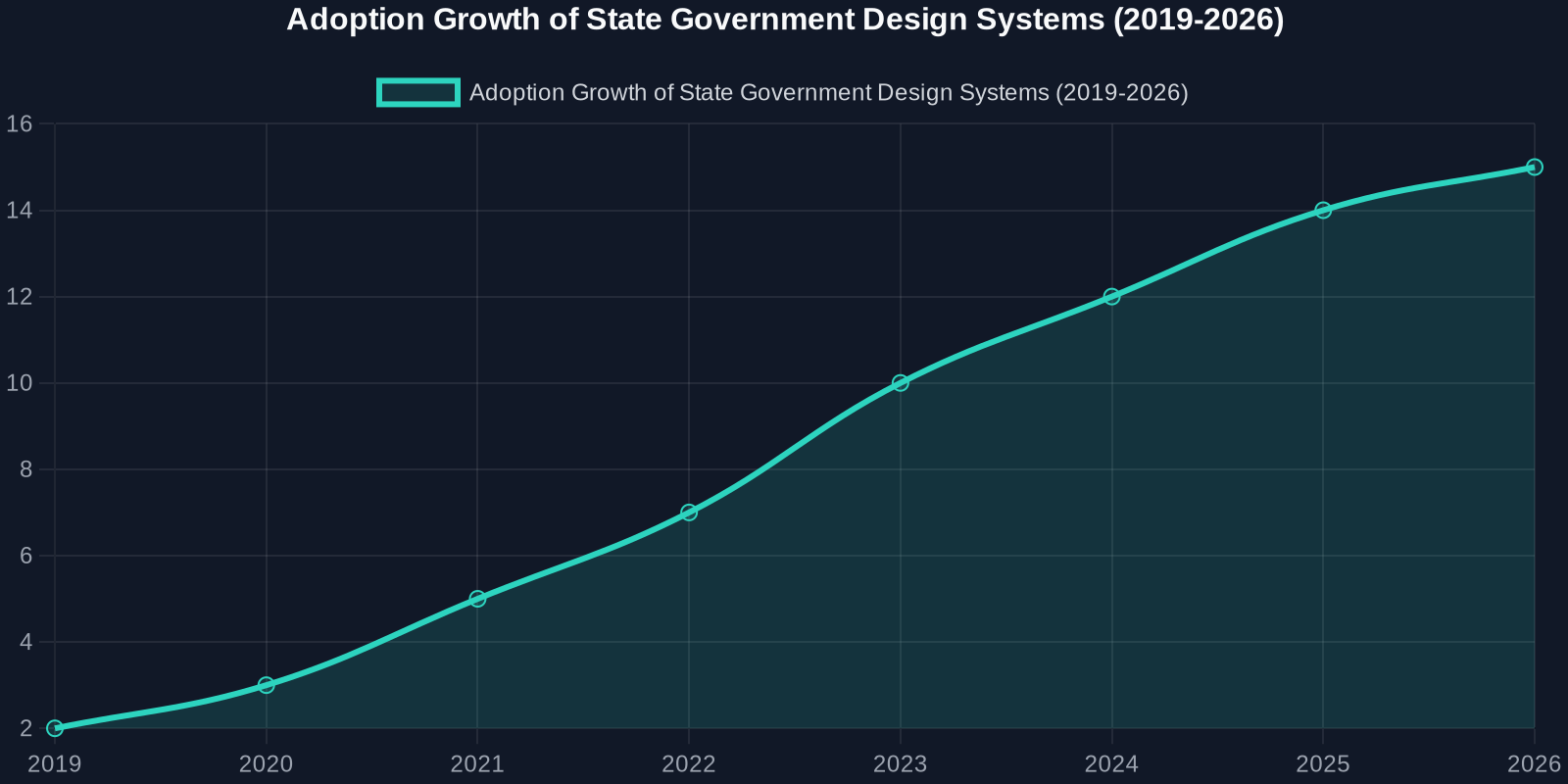
عندما أعلنت ولاية تكساس عن إطلاق نظام التصميم الموحد وسهل الوصول الخاص بها لتحديث مواقع الوكالات، لم يكن ذلك مجرد انتصار للحكومة المحلية، بل كان لحظة فارقة لمطوري الواجهات الأمامية في كل مكان. هذه المبادرة، التي أوردها موقع StateScoop، تهدف إلى تحقيق الاتساق وسهولة الوصول والكفاءة في مئات المواقع الحكومية التي تخدم أكثر من 30 مليون نسمة.
بالنسبة للمطورين، تشير هذه الخطوة إلى تحول أوسع: أنظمة التصميم لم تعد ترفًا اختياريًا للشركات، بل أصبحت بنية تحتية عامة. والتقنيات المستخدمة في بنائها - المكونات القابلة لإعادة الاستخدام، وCSS التي تركز على سهولة الوصول، وأنماط واجهة المستخدم الموحدة - هي بالضبط ما يحتاج مطورو الواجهات الأمامية الحديثون إلى إتقانه.
The Core Technical Challenges Texas Addressed
Building a design system for an entire state government presents unique technical hurdles:
- Diverse legacy systems: Agencies use different CMSes, frameworks, and hosting environments.
- Accessibility compliance: Legal requirements under Section 508 and WCAG 2.1 mean zero tolerance for non-compliance.
- Cross-agency collaboration: Design decisions must work for tourism, health services, transportation, and more.
- Long-term maintainability: The system must survive administration changes.
The Anatomy of an Accessibility-First Design System
Texas’ approach mirrors best practices from industry leaders like Google Material Design, IBM Carbon, and the U.S. Web Design System (USWDS). Let’s break down the key technical components.

1. Component-Based Architecture
Rather than providing templates, the Texas design system delivers reusable components with documented APIs. For example, a button component must support multiple states: default, hover, active, disabled, and focus (with visible outlines for keyboard navigation).
/* Example: Accessible button with focus ring */
.usa-button {
  --btn-bg: #005ea2;
  --btn-text: #ffffff;
  --btn-border: transparent;
  background-color: var(--btn-bg);
  color: var(--btn-text);
  border: 2px solid var(--btn-border);
  padding: 0.75rem 1.5rem;
  font-size: 1rem;
  line-height: 1.5;
  border-radius: 4px;
  cursor: pointer;
  transition: background-color 0.2s, box-shadow 0.2s;
}

.usa-button:focus-visible {
  outline: none;
  box-shadow: 0 0 0 4px #2491ff;
}

.usa-button:disabled {
  opacity: 0.5;
  cursor: not-allowed;
}
2. Accessibility Tokens
Design tokens in CSS custom properties and Sass variables ensure accessibility is built into the visual language. Contrast ratios, spacing, and typography all follow pre-set accessibility thresholds.
:root {
  --color-primary: #005ea2;
  --color-primary-dark: #1a4480;
  --color-focus: #2491ff;
  --font-heading: 'Public Sans', sans-serif;
  --font-body: 'Source Sans Pro', sans-serif;
  --line-height-heading: 1.2;
  --line-height-body: 1.6;
  --spacing-unit: 8px;
}
3. Responsive & Mobile-First
Government sites now see over 60% of traffic from mobile devices. The Texas system uses a mobile-first CSS approach with breakpoints tied to content, not devices.
/* Mobile-first grid */
.grid-container {
  display: grid;
  grid-template-columns: 1fr;
  gap: 1rem;
  max-width: 64rem;
  margin: 0 auto;
  padding: 0 1rem;
}

@media (min-width: 48em) {
  .grid-container {
    grid-template-columns: repeat(12, 1fr);
  }
}
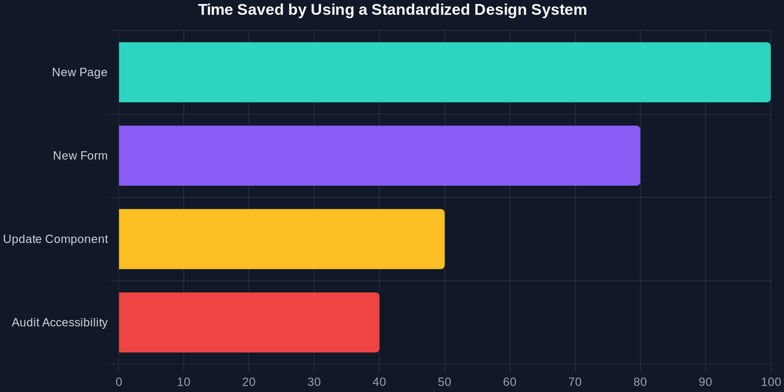
Comparison: Traditional vs. Design System Approach
To appreciate the impact, let’s compare the old way of building government sites with the new standardized system.
التأثير الواقعي: ما يمكن للمطورين تعلمه
سهولة الوصول ليست ميزة؛ بل هي أساس
تثبت مبادرة تكساس أن سهولة الوصول يجب أن تكون الاعتبار الأول، وليس فكرة لاحقة. يجب على المطورين اعتماد أدوات مثل axe-core أو Lighthouse لتدقيق كودهم الخاص، ولكن الأفضل: اختر نظام تصميم يضمن الامتثال منذ البداية.
تحكم في إصدار نظام التصميم الخاص بك
تمامًا مثل البرمجيات، يحتاج نظام التصميم إلى إدارة إصدارات دلالية. تغيير لون التمرير لزر ما قد يكسر عددًا لا يحصى من الصفحات. استخدم سجل التغييرات وأبلغ عن التغييرات الجذرية لأصحاب المصلحة.
وثق كل شيء
الجزء الأكثر قيمة في نظام تكساس هو التوثيق. معاينات المكونات، مقتطفات الكود، ملاحظات سهولة الوصول، وإرشادات الاستخدام. بدون توثيق، نظام التصميم هو مجرد كومة من CSS.
خطوات لبناء نظام التصميم الخاص بك (مستوحاة من تكساس)
المرحلة 1: تدقيق واجهة المستخدم الحالية
قم بفهرسة كل زر، حقل نموذج، بطاقة، ونافذة منبثقة. استخدم DivMagic لالتقاط CSS و HTML الحاليين. ابحث عن التناقضات.
المرحلة 2: تعريف رموز التصميم
استخرج الألوان، التباعد، الطباعة، والظلال من أفضل صفحاتك أداءً. خزنها في خصائص CSS المخصصة.
المرحلة 3: بناء المكونات
ابدأ صغيرًا: أزرار، مدخلات، تنبيهات. تأكد من أن كل مكون يجتاز فحوصات سهولة الوصول. استخدم أداة مثل Storybook لتوثيقها.
المرحلة 4: الاختبار والتكرار
استخدم اختبارات المستخدم الحقيقية والتحليلات لمعرفة أداء المكونات. حدث الرموز والأنماط بطريقة منهجية.
الخاتمة
خطوة تكساس نحو نظام تصميم ويب موحد وسهل الوصول هي فوز للمواطنين والمطورين ومستقبل تكنولوجيا القطاع العام. إنها تظهر أنه عندما تستثمر في أنماط واجهة مستخدم قابلة لإعادة الاستخدام وسهلة الوصول، يستفيد الجميع: تطوير أسرع، تكاليف أقل، وتجارب مستخدم أفضل.